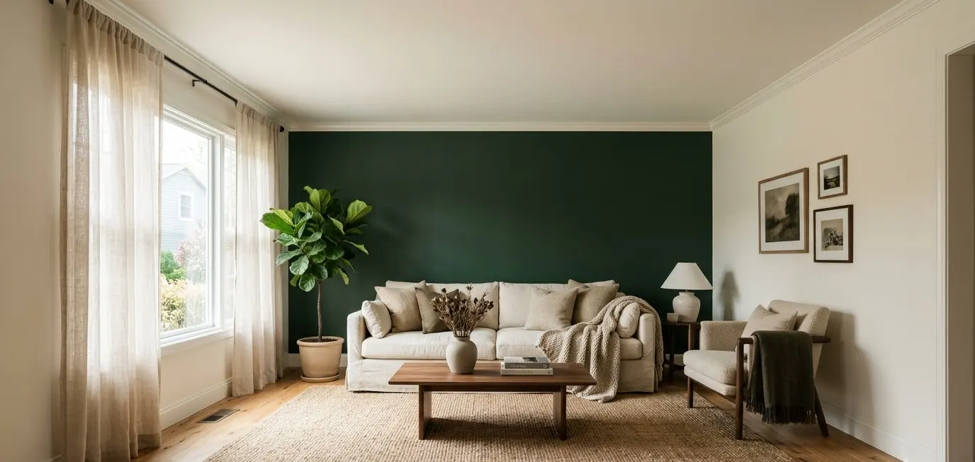
One wall, one can of paint, and a living room that suddenly looks like it belongs on a Pinterest board.
An accent wall pulls that off when the color suits your light, your furniture, and the way you actually use the room. Pick wrong and the wall fights the sofa all year.
Every color below comes with an exact paint name, the pieces that go with it, one fit or fabric tip, and an occasion it suits.
Save the ones that stop your scroll, and keep a sample pot handy before you commit.
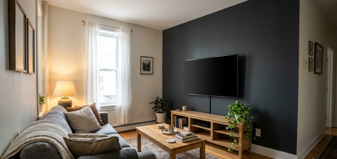
How to pick an accent wall color that works
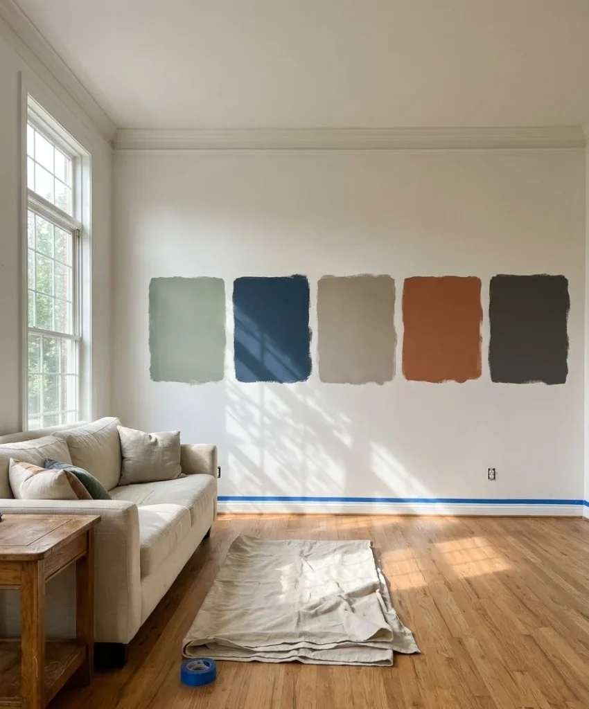
Start with light, because paint changes its personality as the sun moves.
Paint makers rate every color with a Light Reflectance Value (LRV) from 0 (black) to 100 (white).
Low numbers absorb light and feel cozy, while high numbers bounce it around and feel open.
Brands like Benjamin Moore and Sherwin-Williams list LRV on their color pages, so check it before you buy.
A few rules keep the decision simple:
- Test a sample on two walls and look at it at 8 a.m., noon, and after dark.
- Match the undertone of the accent to your flooring. Orange-toned oak fights a cool gray.
- Paint the wall you see first when you walk in. That is usually the sofa wall or the fireplace wall.
- Keep the other three walls in a quiet neutral. I’d pick a warm white over a stark one almost every time, because stark white makes a deep accent look harsh.
- Use a matte or eggshell finish on dark colors. Gloss shows every roller mark, and I find it dates a room faster than any color choice.
| Room light | Wall direction | Colors that behave well |
|---|---|---|
| Cool, dim | North-facing | Warm greige, terracotta, mustard |
| Bright, warm | South-facing | Navy, sage, soft blue |
| Crisp morning sun | East-facing | Teal, olive, charcoal |
| Golden evening sun | West-facing | Deep green, plum, gray-blue |
Which wall gets the color

The sofa wall is the default choice, and it works because the furniture sits against the paint and frames it.
The fireplace wall is the second-best option when you have a mantel, since the architecture already draws the eye there.
The wall with the most windows is usually a poor pick, because glare flattens the color and you rarely face it.
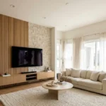
If your room has a TV, paint that wall dark. A deep shade makes the black screen blend in instead of floating on a pale surface.
Blue accent wall colors
Blue is the most requested accent family on Pinterest, and it earns the spot. It reads calm, it flatters wood tones, and it comes in enough undertones to suit almost any room.
1. Deep navy
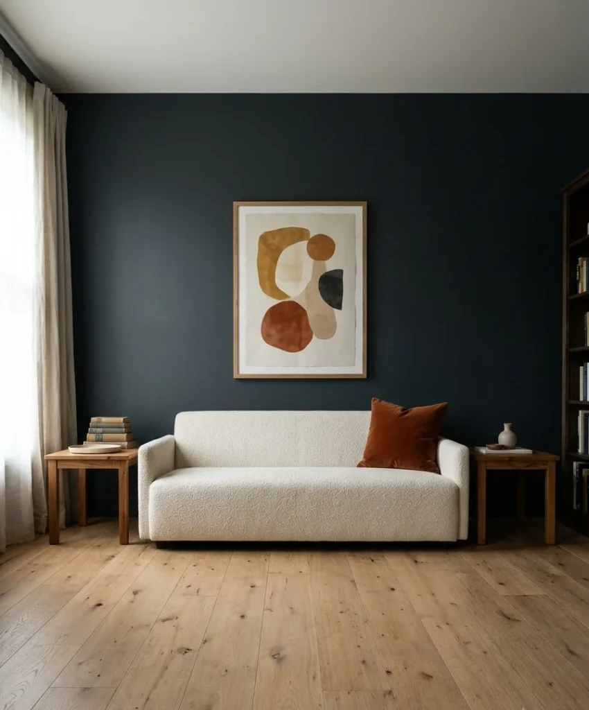
Hale Navy HC-154 from Benjamin Moore looks blue in daylight and close to black by lamplight.
Run it behind an oatmeal linen sofa with a flat-weave jute rug and a pair of brass picture lights.
Choose a tightly woven linen blend or washable velvet for the sofa, since pale upholstery shows every smudge against navy.
An eggshell finish keeps the wall soft and wipeable. This color suits a candlelit dinner party or a movie night, when the lamps are low and the wall becomes the backdrop.
2. Gray-blue
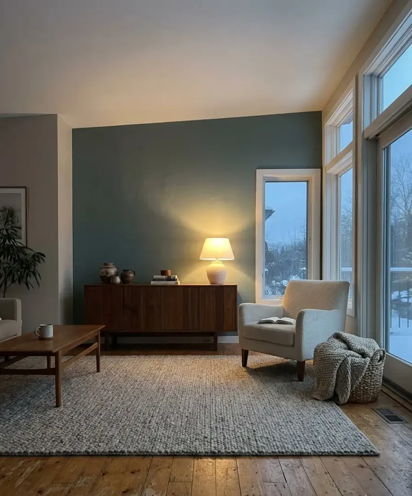
Hague Blue No. 30 from Farrow & Ball is a dark, slightly green-tinged blue that looks inky and expensive.
Hang a large oak-framed print above a cream bouclé sofa and add a rust velvet cushion for contrast.
Bouclé snags easily, so pick a tight loop weave if pets share your space.
Leave 2 to 3 inches between the sofa and the wall so the shadow line looks deliberate. Hague Blue suits quiet Sunday reading, when the room needs a hush.
3. Inky teal-blue
Inchyra Blue No. 289 from Farrow & Ball leans gray-green, which makes it friendlier than a true navy. Pair it with a walnut sideboard, a chunky wool throw in oatmeal, and a ceramic table lamp with a white shade. Wool throws fold into a basket and keep the sofa from looking too styled. The color works well in rooms with north light, where it turns calm instead of cold. Pick it for winter evenings with a book and a mug.
4. Soft sky blue
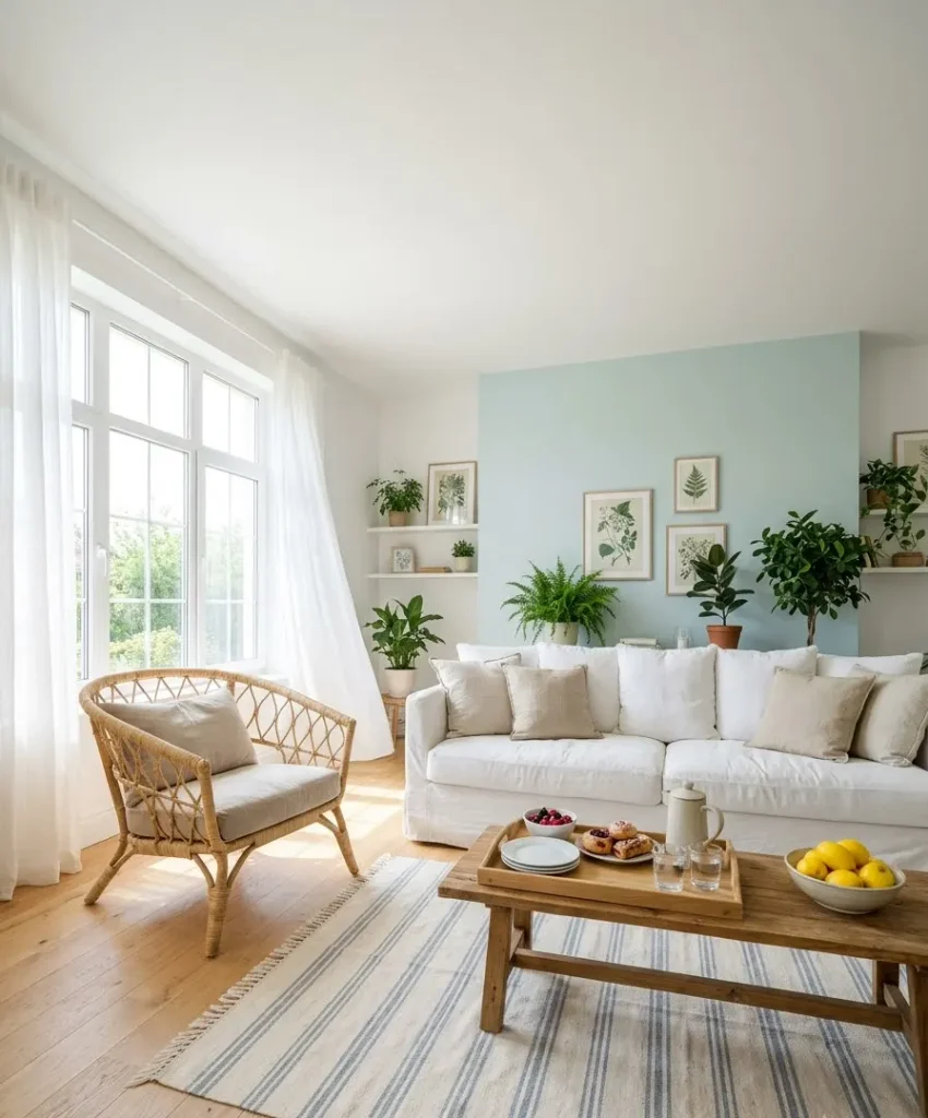
Palladian Blue HC-144 from Benjamin Moore is a pale blue-green that reads like a clear morning.
Pair it with a white slipcovered sofa, a rattan armchair, and a striped cotton rug. Slipcovers in washed linen can go in the machine, which suits busy households.
Hang sheer curtains in white to keep the air light. This is a good match for a brunch with friends or a sunny weekend room.
5. Deep teal
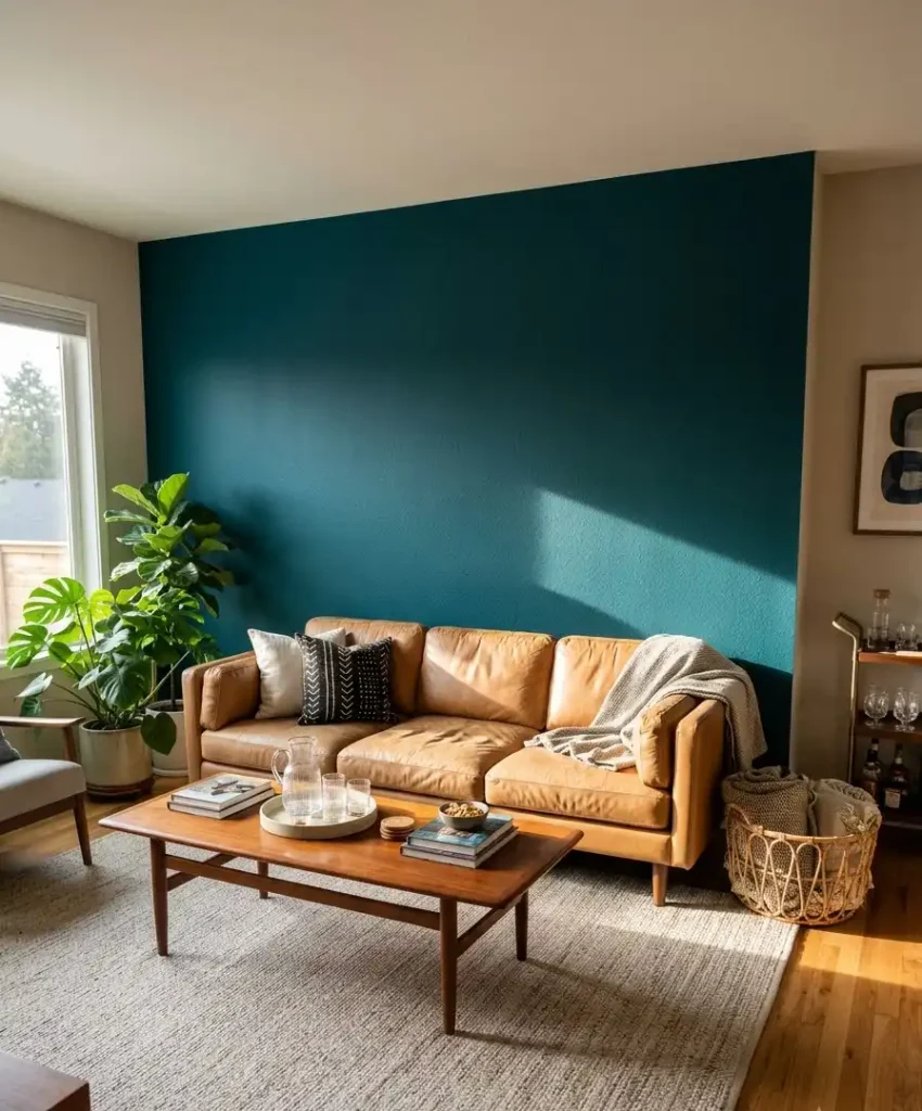
Aegean Teal 2136-40 from Benjamin Moore has enough green in it to feel fresh and enough blue to feel grounded.
Build around a camel leather sofa, a mudcloth pillow, and a mid-century coffee table in teak.
Leather in a cognac or camel shade looks best against teal, so test a swatch beside the paint chip. Keep the sofa about 6 inches shorter than the wall width so the teal frames it.
This color suits entertaining, because guests will comment on it.
Green accent wall colors
Green connects a living room to the outdoors, and Pinterest boards keep proving it. These five run from near-black to barely there.
6. Hunter green
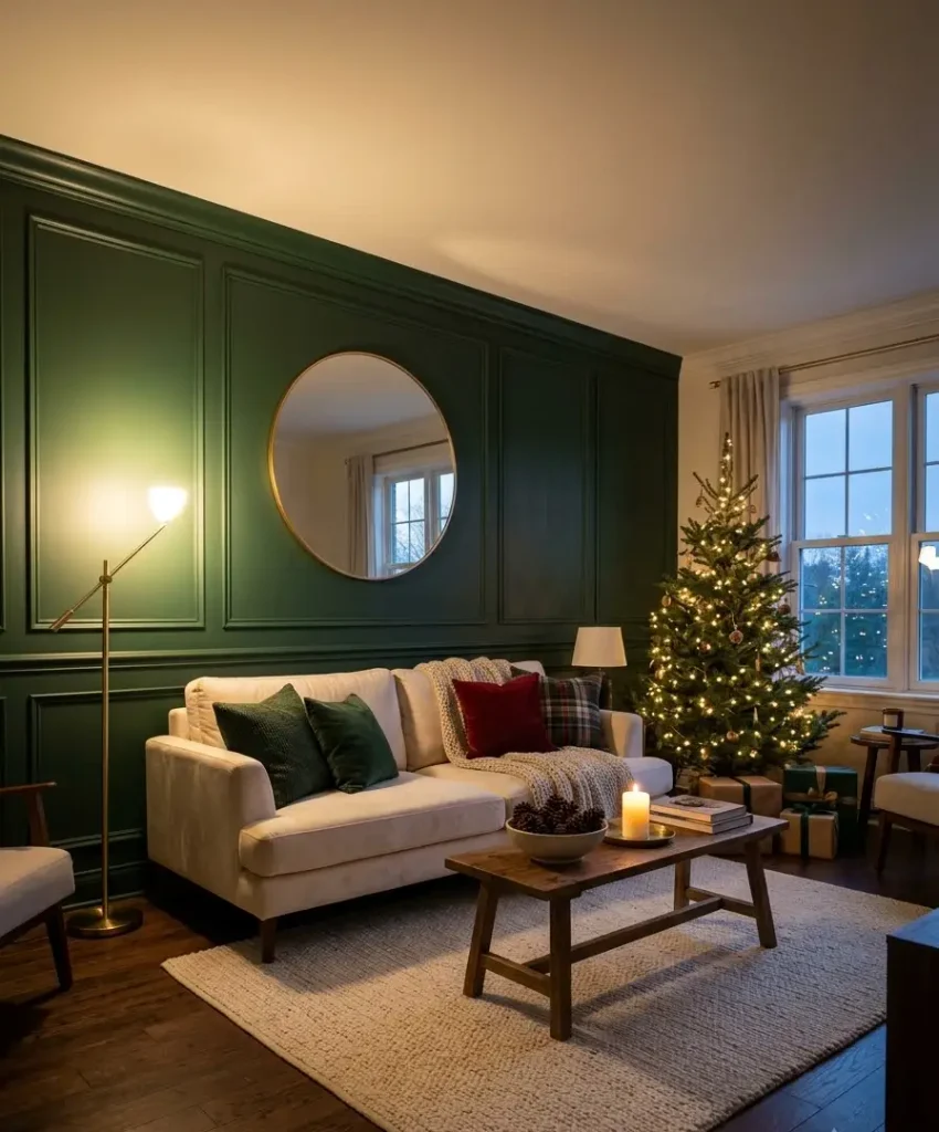
Hunter Green 2041-10 from Benjamin Moore is a classic forest tone with real depth.
Place it behind a cream sofa, a gold-framed mirror, and a woven wool rug in ivory.
Cream velvet looks luxurious here, but a washable performance velvet saves you stress.
Aim lighting upward from a floor lamp to bring out the green. This color suits a holiday gathering, when the wall already looks festive without garlands.
7. Sea Salt
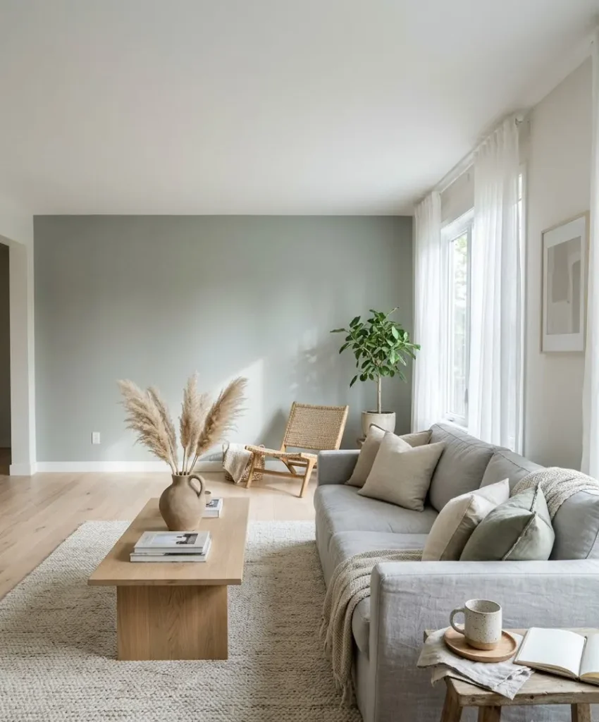
Sea Salt SW 6204 from Sherwin-Williams is a gray-green that changes from sage to silver as the light moves.
Try it with a white oak coffee table, a linen sofa in light gray, and a few dried pampas stems in a clay vase.
Linen wrinkles, and that looks right with this soft color. Pick it for a bright room where you want a calm morning coffee corner.
8. Olive
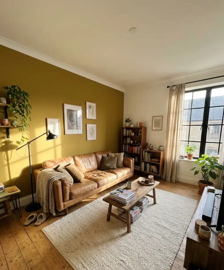
Wethersfield Moss HC-118 from Benjamin Moore is an earthy olive with a yellow undertone.
It looks warm next to a tan leather sofa, a black metal floor lamp, and a cream cotton rug.
Match the lamp finish to the window frames for a tidy line. Leather ages well against olive, so skip faux versions if you can afford the real thing. This color suits a lived-in room where friends drop by without calling first.
9. Near-black green
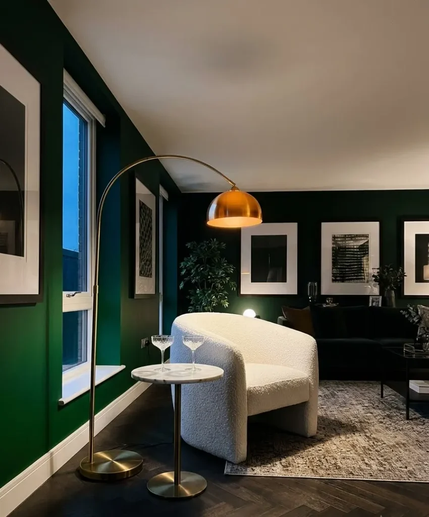
Studio Green No. 93 from Farrow & Ball sits close to black and shifts to green near a window.
Use it behind a white boucle chair, a brass arc lamp, and a marble-top side table. Hang art with wide white mats so it pops against the dark surface.
Keep the ceiling a soft white so the room does not feel like a cave. This one suits dramatic cocktail evenings and late conversations.
10. Gray-green
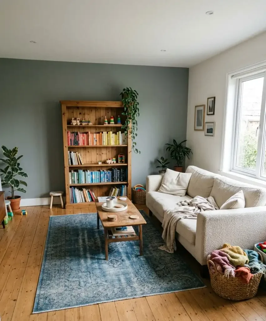
Pigeon No. 25 from Farrow & Ball is a muted gray-green that reads softer than sage and calmer than olive.
It looks lovely with a cream sofa, a pine bookshelf, and a hand-knotted rug in faded blue. Pine pairs well because its yellow tone warms the gray.
Stack books by color to keep the shelves tidy. Pick it for a family room where the kids are in and out all afternoon.
Side thought: paint names get more poetic the more expensive the can.
“Sulking Room Pink” and “Dead Salmon” sound like Victorian novels, while cheaper brands go with “Morning Fog.
” I don’t think the name changes how the color looks, but I’ll admit it changes how many people hit the checkout button.
Neutral and dark accent wall colors

Dark neutrals give a room structure. Light neutrals give it texture. Both suit people who want a statement without a rainbow.
11. Charcoal

Kendall Charcoal HC-166 from Benjamin Moore is a soft, warm charcoal that looks deep without turning blue.
Place a light gray sofa and a leather ottoman in front, plus a black-framed mirror to repeat the dark tone.
Use a washable cotton-linen blend for the sofa, since charcoal hides few dust motes on pale fabric. This wall suits game nights and everyday family life.
12. True black
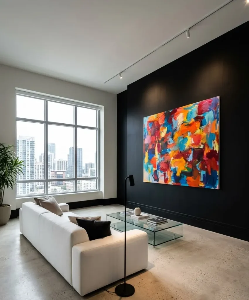
Tricorn Black SW 6258 from Sherwin-Williams is a pure, flat black with no brown or blue lean.
Add a white sofa, a glass coffee table, and one oversized piece of colorful art.
Pick performance fabric for the white sofa, because black walls can leave cloth under cooler light looking grayer than it is.
Keep the finish matte and paint trim the same color for a wrapped look. This suits bold apartments and city living rooms where you want a gallery feel.
13. Warm greige
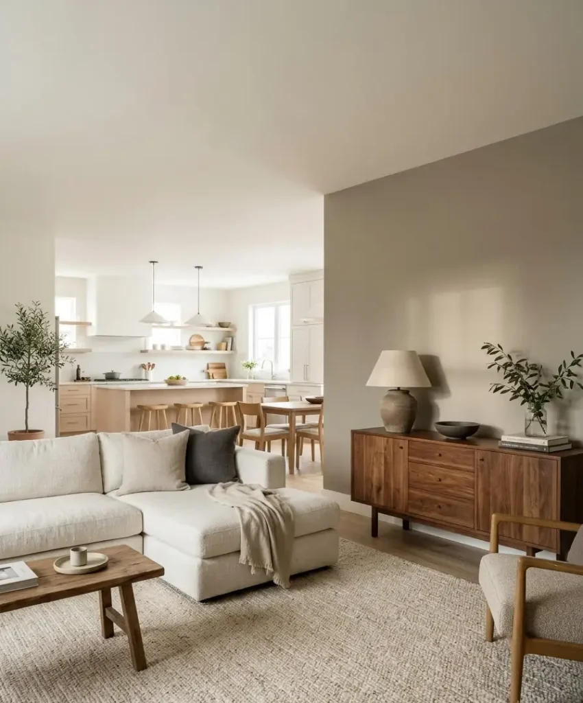
Accessible Beige SW 7036 from Sherwin-Williams is the paint most people choose when they want a neutral that still reads as color.
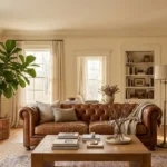
Layer it with an ivory sofa, a walnut console, and a textured wool rug. Choose slubby cotton or linen in cream so the fabric adds depth against the beige.
it looks best in rooms where you want the wall to recede and the furniture to speak. This color suits open-plan homes and anyone selling soon.
14. Stone gray
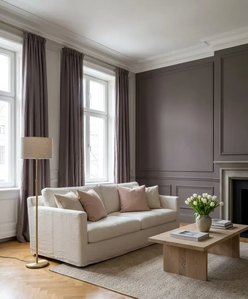
Elephant’s Breath No. 229 from Farrow & Ball is a gray with a purple-brown lean that feels old and elegant.
Use it with a soft blush cushion, a brass floor lamp, and a bleached oak table.
Linen in warm white or sand sits better than cool white, which can look sharp next to it.
Keep curtains close to the wall color for a blended effect. This one suits a reading room or a formal sitting room.
15. Pale oak
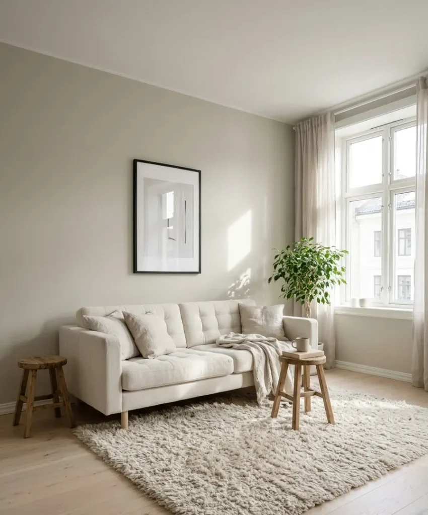
Pale Oak OC-20 from Benjamin Moore is a soft, creamy gray-beige with the lightest touch of warmth.
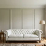
Put it behind a tufted ivory sofa, a pair of wooden stools, and a shaggy cream rug. Use performance chenille to keep the sofa clean in a house with dogs.
Add one black frame for contrast so the room does not blur. This color suits a Scandinavian-style living room and slow weekend mornings.
16. Warm white
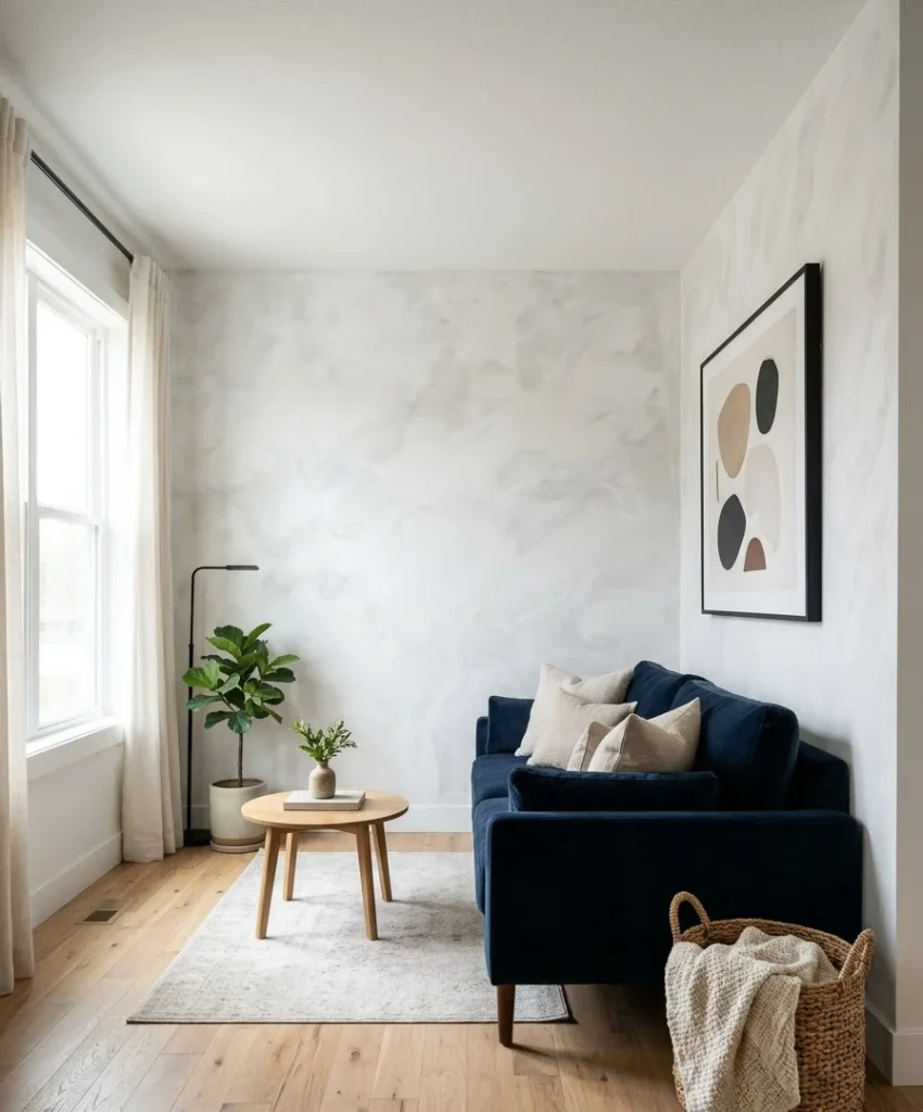
Chantilly Lace OC-65 from Benjamin Moore is a clean, bright white with very little undertone.
Give it texture with a limewash effect or a plaster-style roller. Pair with a navy velvet sofa, a woven floor basket, and black-framed art.
A white accent wall only reads as a statement when the surface has texture, so skip a flat finish. This suits small living rooms that need more light.
17. Bronze brown
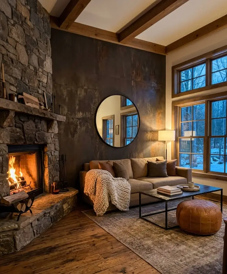
Urbane Bronze SW 7048 from Sherwin-Williams is a warm, dark gray-brown that looks like weathered metal. Try it with a tan sofa, a black iron coffee table, and a leather pouf in cognac.
Leather and wool both look natural beside it, so skip shiny synthetic fabrics. Hang a round mirror to bounce light back into the room.
This suits cabin-style spaces and cold-weather evenings.
Warm and bold accent wall colors
These last six are for people who like color a little loud. They look stunning in photos, and in person they bring warmth to a room.
18. Terracotta
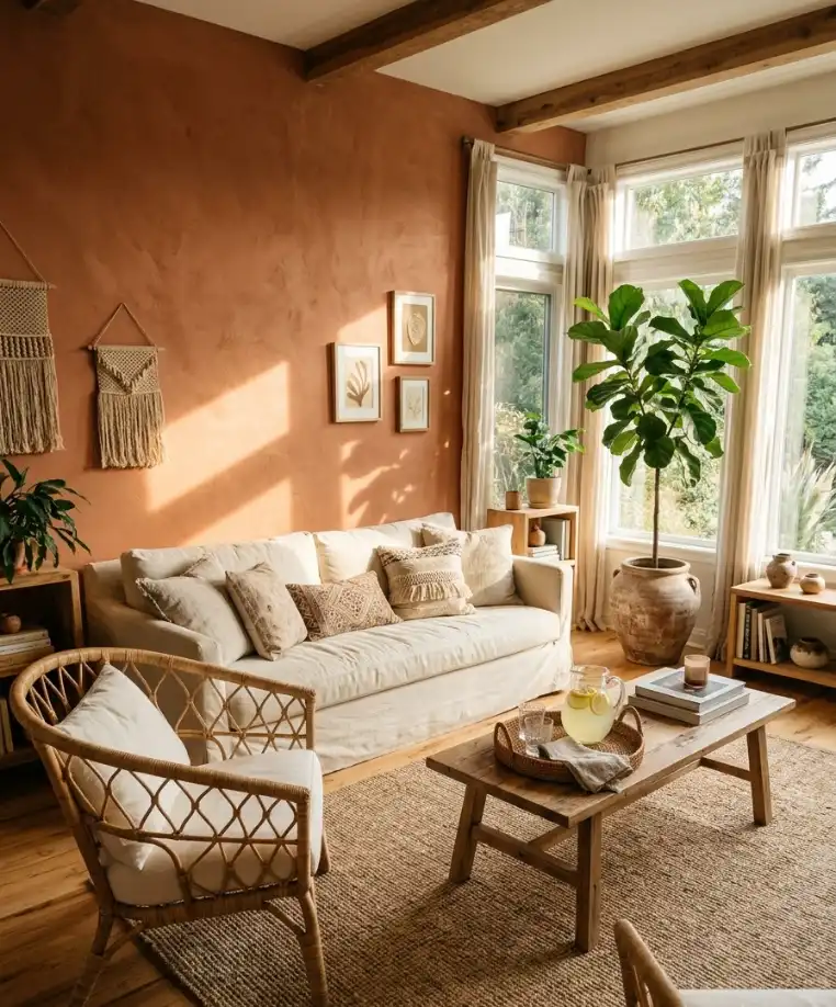
Cavern Clay SW 7701 from Sherwin-Williams is a sunbaked clay tone that works in modern and rustic rooms.
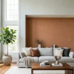
Place a cream sofa, a rattan chair, and a leafy fiddle-leaf fig in front of it.
Cotton canvas in off-white slipcovers keeps the pairing fresh. The clay tone looks richest in rooms with afternoon light.
This color suits boho living rooms and summer gatherings.
19. Dusty pink
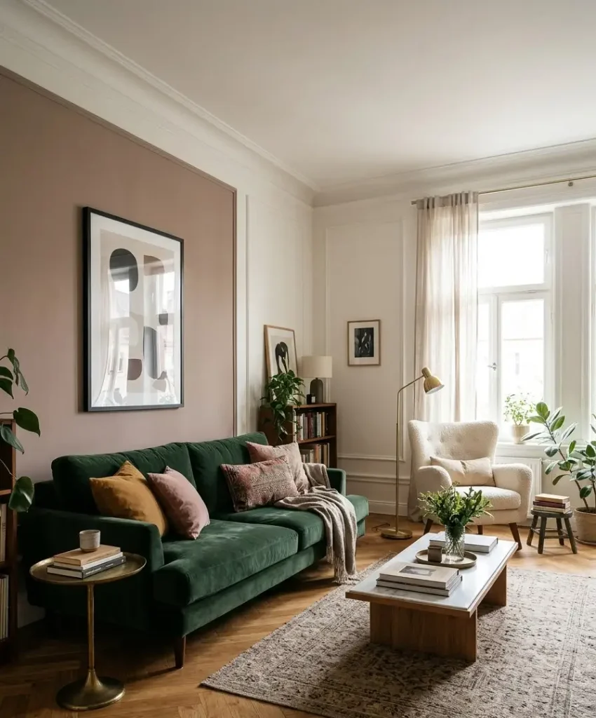
Sulking Room Pink No. 295 from Farrow & Ball is a muted, brownish pink that reads grown-up.
Pair it with a forest green velvet sofa, a brass table, and a black-framed print.
Velvet in deep green balances the sweet tone and keeps the room from looking too sugary.
Keep other walls warm white. This one suits girls’ nights and a bright reading corner.
20. Peachy blush

Dead Salmon No. 28 from Farrow & Ball is a soft pink-beige that glows in morning sun.
Place a cream linen sofa, a pale oak coffee table, and a gray wool throw nearby.
Gray in the throw cools the warmth and prevents a candy-shop look. Add one dried flower arrangement in a glass vase.
This works best for a calm room where you start the day.
21. Mustard

Hawthorne Yellow HC-4 from Benjamin Moore is a golden yellow with a hint of green that glows in daylight.
Place a navy sofa, a walnut sideboard, and a patterned wool rug in front of it.
Wool in blue and cream gives the yellow something to push against. Test it in your room first, since yellow shifts more than any other color. This suits a cheerful family room.
22. Deep red
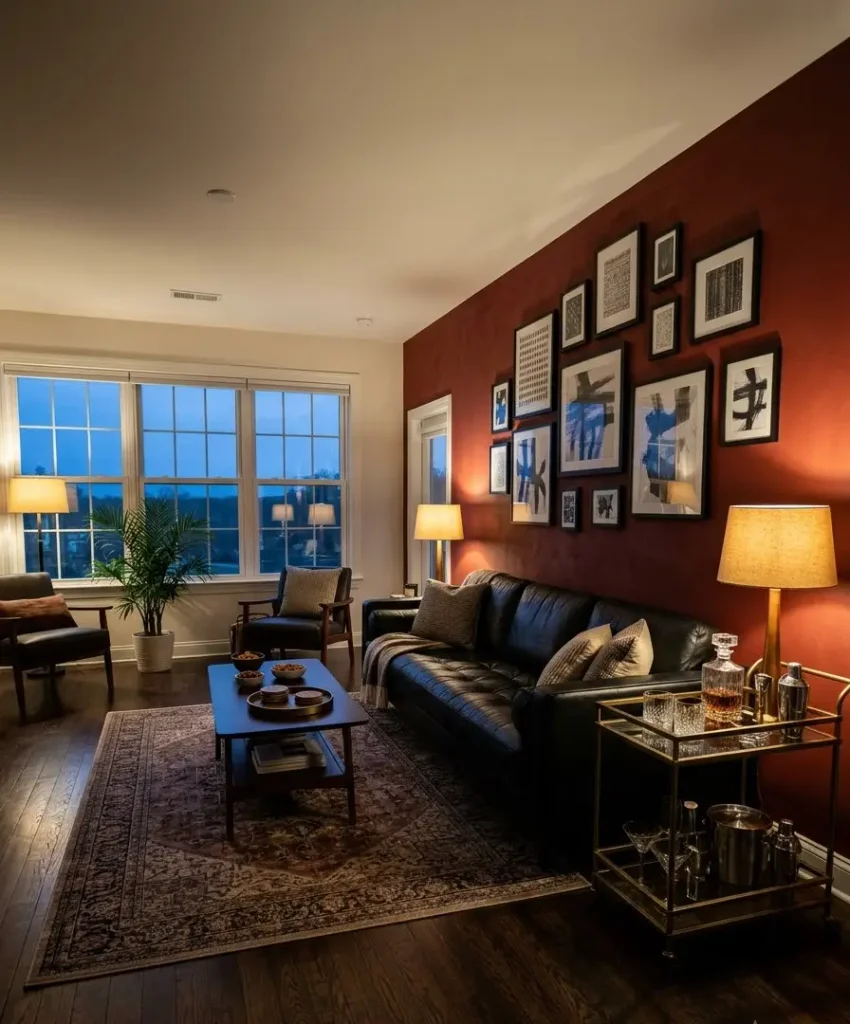
Caliente AF-290 from Benjamin Moore is a rich, saturated red with a hint of brick.
Use it behind a black leather sofa, a brass bar cart, and a gallery wall in black frames.
Leather and red both look sleek, but dark wood adds warmth. Dim the overhead lights and use two table lamps.
This color suits lively hosting and evenings with friends.
23. Aubergine
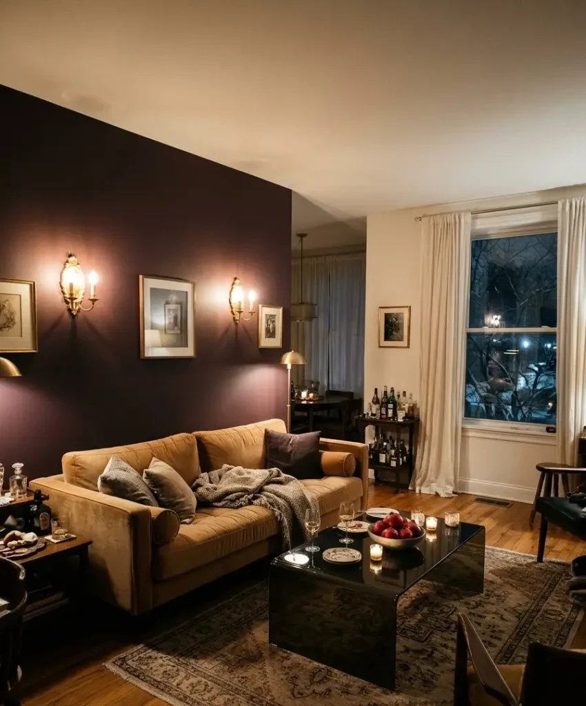
Brinjal No. 222 from Farrow & Ball is a deep, purple-brown that feels rich without turning loud.
Pair it with a camel velvet sofa, a smoked glass table, and a pair of gold sconces.
Camel velvet is a clean match because it warms the purple and keeps the room balanced.
Add sheer curtains in ivory for contrast. This one suits dinner parties and moody winter nights.
FAQs
What is the best accent wall color for a small living room?
Light, cool colors like Palladian Blue or Sea Salt keep a small room open, and a deep color can work too if you wrap it around a single wall.
Dark shades make edges disappear, which can make a compact room feel bigger. Test a sample first, because light matters more than square footage.
Which wall in the living room should be the accent wall?
Choose the wall you see first when you enter the room, which is usually behind the sofa or around the fireplace.
A wall with a TV is another strong candidate, since a dark color helps the screen blend in. Avoid the window wall, because glare flattens the paint.
Can I use more than one accent wall?
Yes, but keep the colors in the same family and limit it to two walls.
Two accent walls in different hues compete for attention and make a room feel busy. If you want more color, bring it in through cushions and art.
Final thoughts
An accent wall rewards patience more than boldness. Test the sample, watch it through a full day, and match it to your furniture before you buy gallons.
Whichever shade you choose, the best paint job is the one you still enjoy in three years.
Which of the 23 colors would you try first, and what would you put in front of it? Drop your pick in the comments and tell me where you’d put the sofa.




1 thought on “23 Accent Wall Colors For Living Room Ideas That Make a Beautiful Statement”