I painted my first green accent wall in a rented flat at 11pm, because apparently that’s when I make all my best decisions. By morning it looked like a hospital corridor. Too minty, too cold, and the sofa looked sad next to it.
I repainted two weekends later and learned more about green than I wanted to. Undertones matter.
Light matters even more. And the wall you pick says a lot about how the whole room feels.
So if you’re scrolling Pinterest at midnight with a dozen green living room pins saved, this one’s for you.
Below are 27 accent wall ideas, from soft sage to moody forest, with real notes on what works and what doesn’t.
I’ve also added a short table, a few mistakes I made so you can skip them, and a FAQ at the end.
Before you pick a green
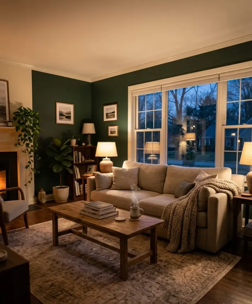
Green is the most forgiving color in a living room, but it still trips people up. The reason is simple: green sits between warm yellow and cool blue,
so it leans one way or the other depending on what surrounds it. A green that looks gorgeous in the shop can turn grey, yellow or blue on your wall.
Check your light first
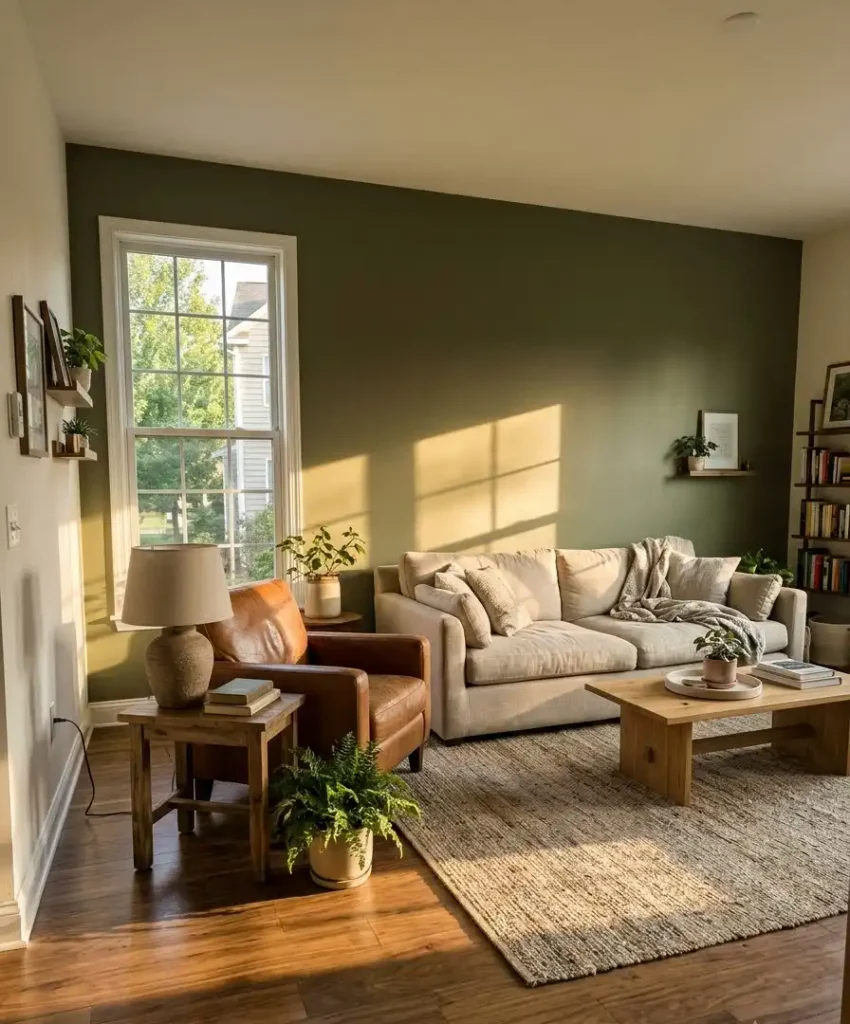
North-facing rooms get cooler, flatter light. Greens with a grey or warm yellow base (think olive, moss, soft sage) stop the room from feeling chilly.
South-facing rooms handle almost anything, and deep greens look fantastic there at about 4pm when the sun hits sideways.
Test samples properly
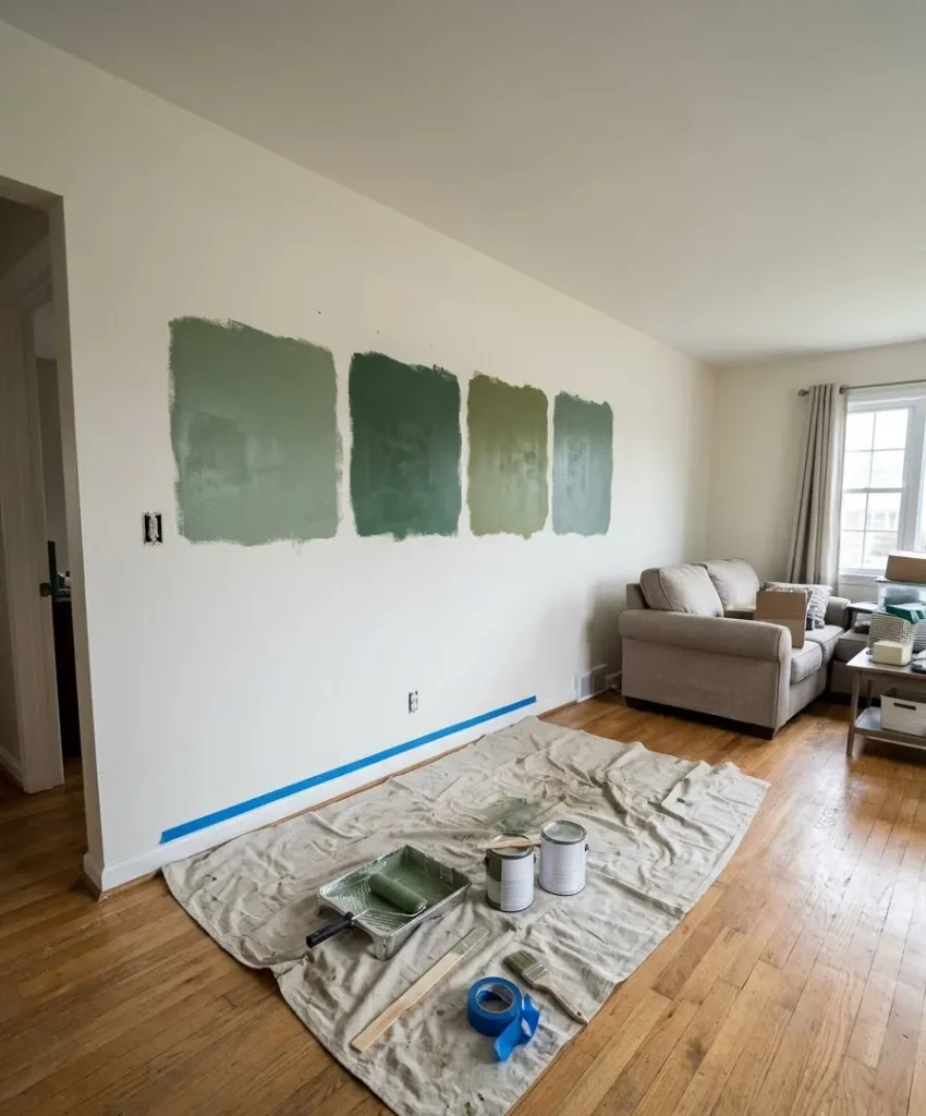
Paint a large swatch, at least 60cm square, and look at it morning, noon and night.
Tape a sheet of card over the existing wall so the old color doesn’t skew what you see. I know it feels slow. It saves you from repainting, and repainting is the worst.
For reliable paint ranges, I keep going back to Farrow & Ball, Benjamin Moore and Sherwin-Williams.
All three publish their green families with undertone notes, which helps a lot.
Painted green accent walls that do the heavy lifting
Paint is the cheapest way to try a green accent wall. It’s also the easiest to undo. These first eight ideas all start with a tin and a roller.
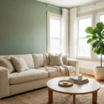
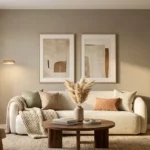
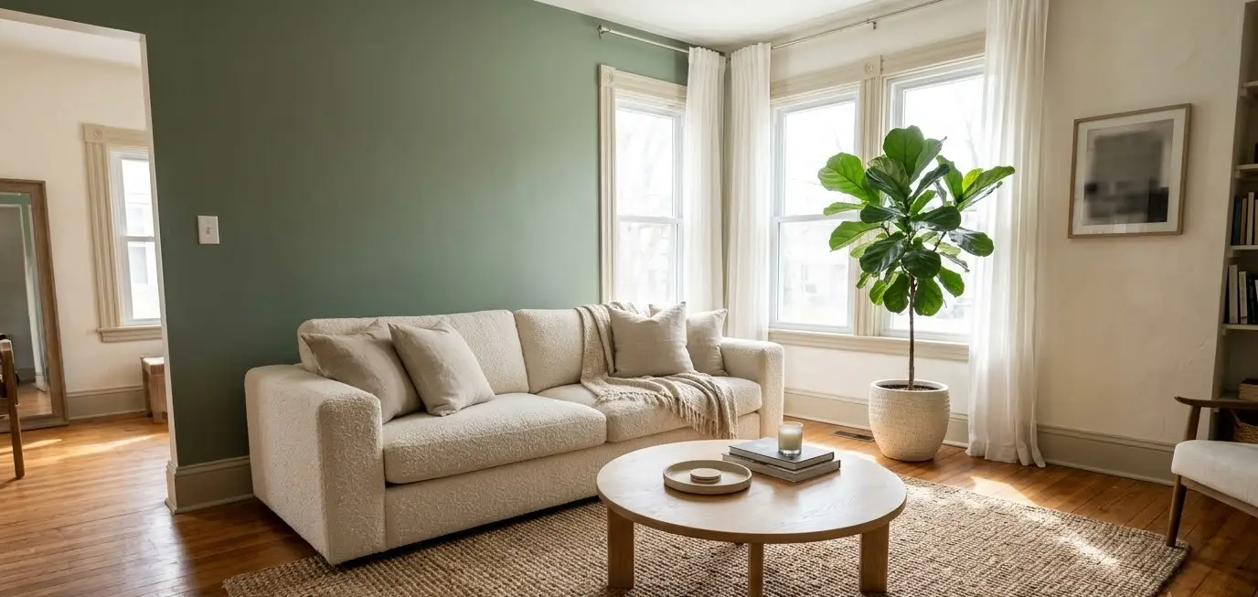
1. Sage green behind the sofa
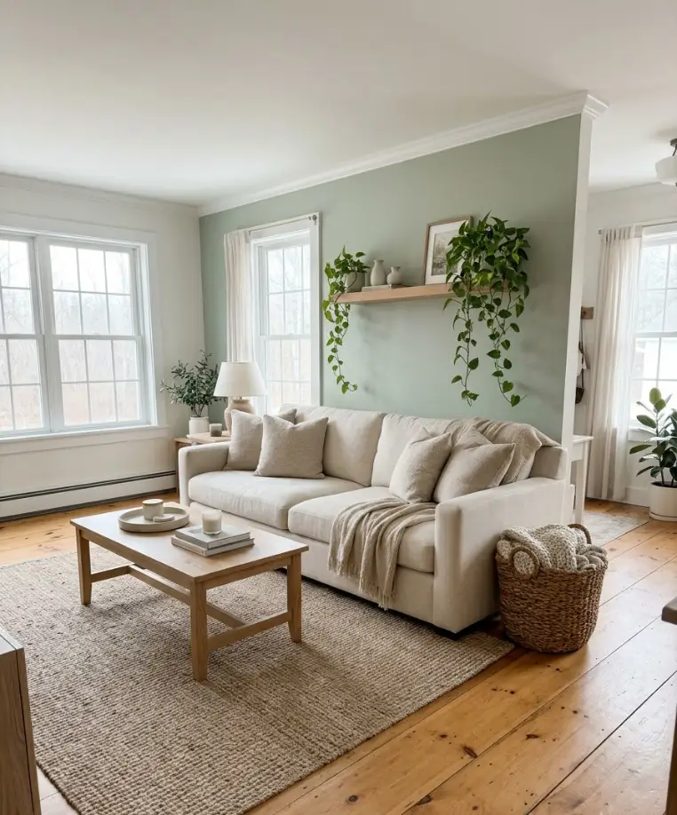
Sage is the gateway green. It’s grey enough to feel calm and green enough to look intentional.
Paint the wall your sofa sits against and let cream, oatmeal and light oak do the supporting work.
I love this one for people who panic about commitment. It works with almost every style,
from farmhouse to Scandi, and it photographs beautifully, which matters if Pinterest is your inspiration source.
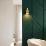
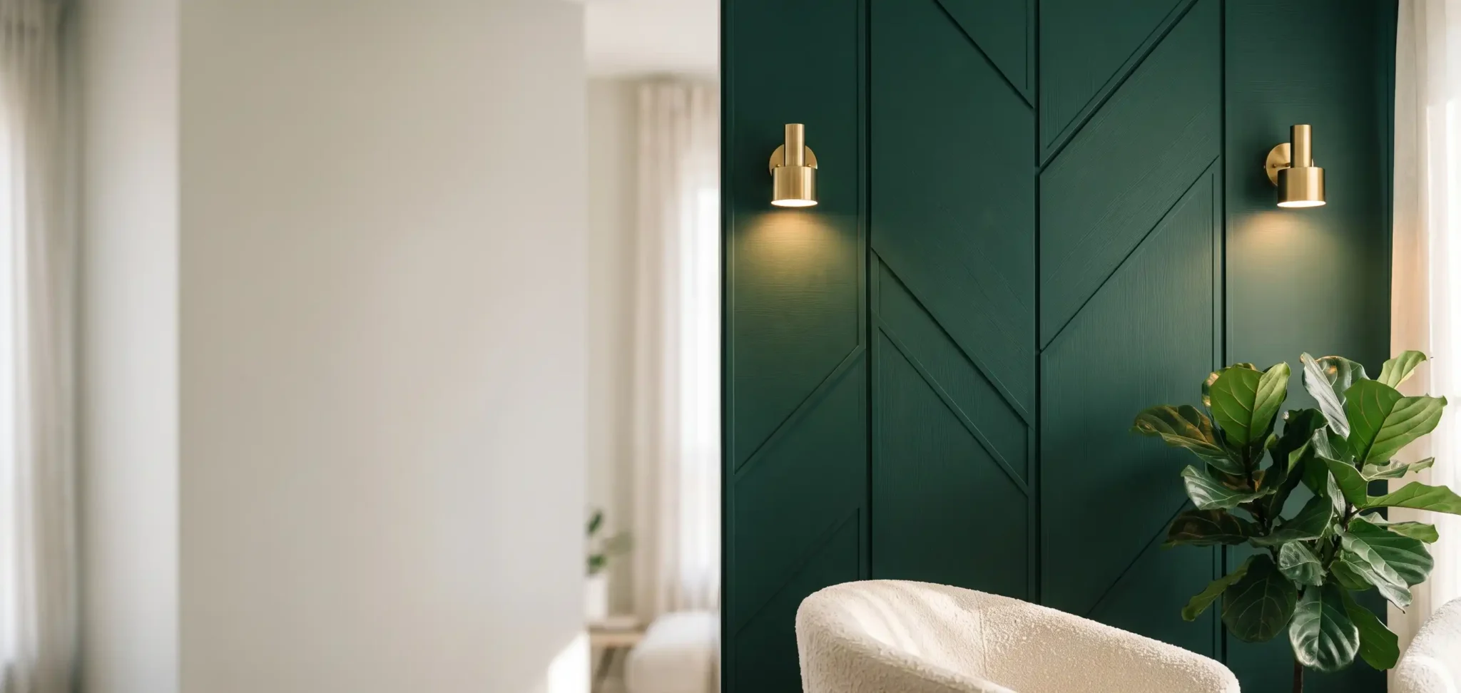
2. Deep forest green with warm lighting
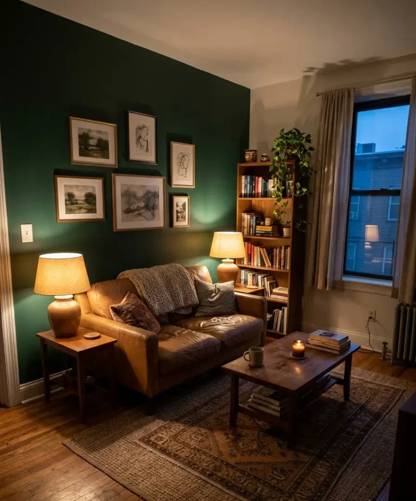
Forest green is the cozy champion. It swallows light, so the room feels wrapped around you on dark evenings.
Pair it with warm 2700K bulbs and a couple of table lamps rather than a harsh overhead.
IMO, this is the best green for a small living room, and yes, I know the usual advice says dark colors shrink spaces. They don’t. They blur the corners, and the room feels deeper instead.
3. Olive green with brass details
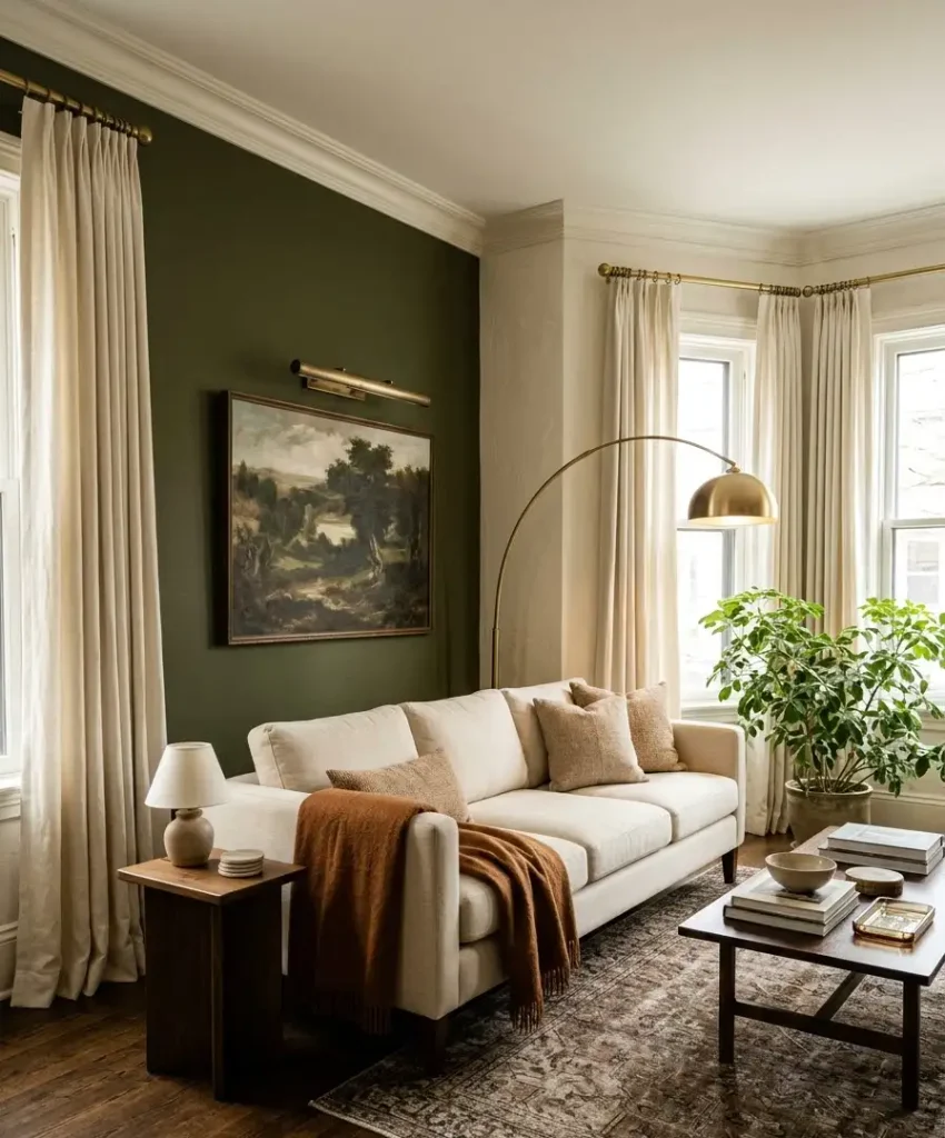
Olive has a slightly dusty, vintage feel. Add brass picture lights, a brass floor lamp or curtain rods, and the whole wall starts to look like it belongs in a boutique hotel.
I’d keep the other three walls a warm white so the olive reads as a choice instead of an accident. A rust-colored throw on the sofa makes it sing.
4. Emerald green with velvet
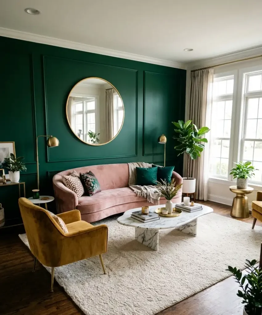
Emerald is loud, and I mean that kindly. It suits a living room where you want drama, a rounded velvet sofa in blush or mustard, and a big mirror to bounce light around.
Wow, this color changes with the time of day. Mid-morning it looks fresh and almost tropical.
By evening it turns rich and jewel-like. Test it in both lights before you buy five liters.
5. Eucalyptus for north-facing rooms
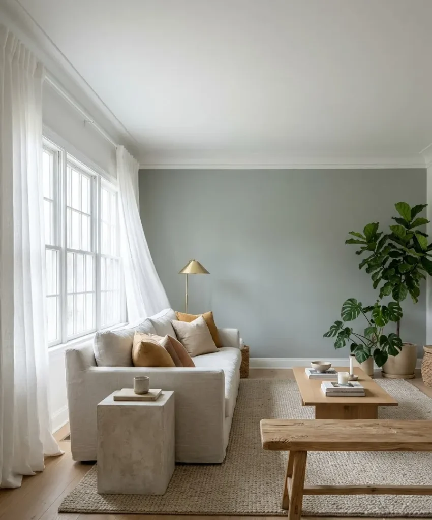
Eucalyptus is a soft grey-green with a silvery finish. It brightens dim rooms without turning sickly, which makes
it the answer for that gloomy north-facing space you keep complaining about.
Pair it with white linen curtains and natural wood. The result feels like a spa, and I mean the expensive kind with the cucumber water.
6. Moss green on the fireplace wall
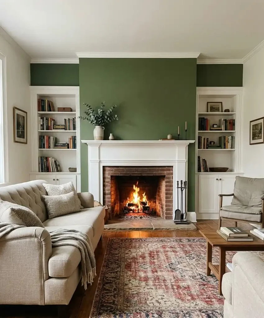
If your living room has a chimney breast, paint it. A fireplace already draws every eye in the room,
so a moss green wall behind the mantel gives that attention something rich to look at.
Frame the fireplace with white or cream trim and the green pops. I did this in my last house and every guest ended
up standing next to it with a drink in hand. Free marketing for your paint choice.
7. Dark teal-green for a cinematic mood
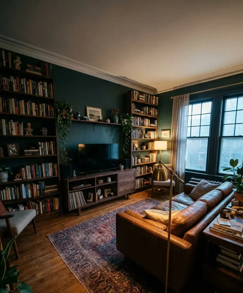
Teal-green sits right on the border of blue and green, which makes it moody and a bit mysterious. It looks great with warm wood, leather sofas and a good rug.
Use it on the wall behind a media console or bookcase. The depth makes books and objects stand out, and the room suddenly feels like a library from a film set.
8. Pistachio for a lighter, playful feel
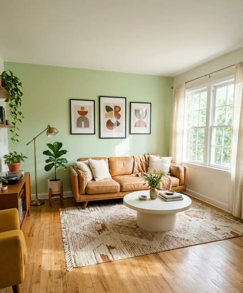
Pistachio is a soft yellow-green that leans retro. It brings a cheerful energy without the intensity of lime, and it works well in sunny rooms with lots of natural light.
Pair it with cream, tan leather and a few black frames. I’d skip it in dim rooms, because it can look a little custard-ish without strong daylight.
Texture and material green walls
Flat paint is fine, but texture gives a green wall depth you can’t get from a roller alone. These seven ideas add something you can see and sometimes touch.
9. Green limewash
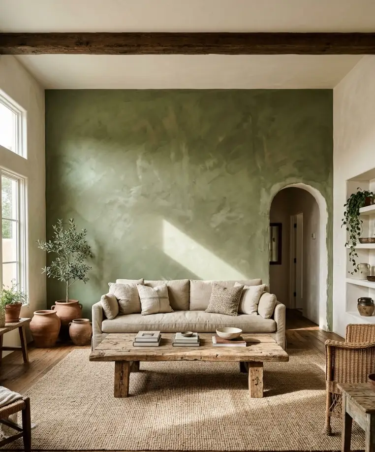
Limewash gives walls a cloudy, hand-brushed look, and in green it resembles old plaster in a Tuscan villa. The color shifts slightly across the surface, so the wall never looks flat.
You can find limewash-style paints at most major paint brands now. Apply it with a wide brush in crisscross
strokes, and don’t aim for perfection. The imperfections are the entire point.
10. Board and batten in green
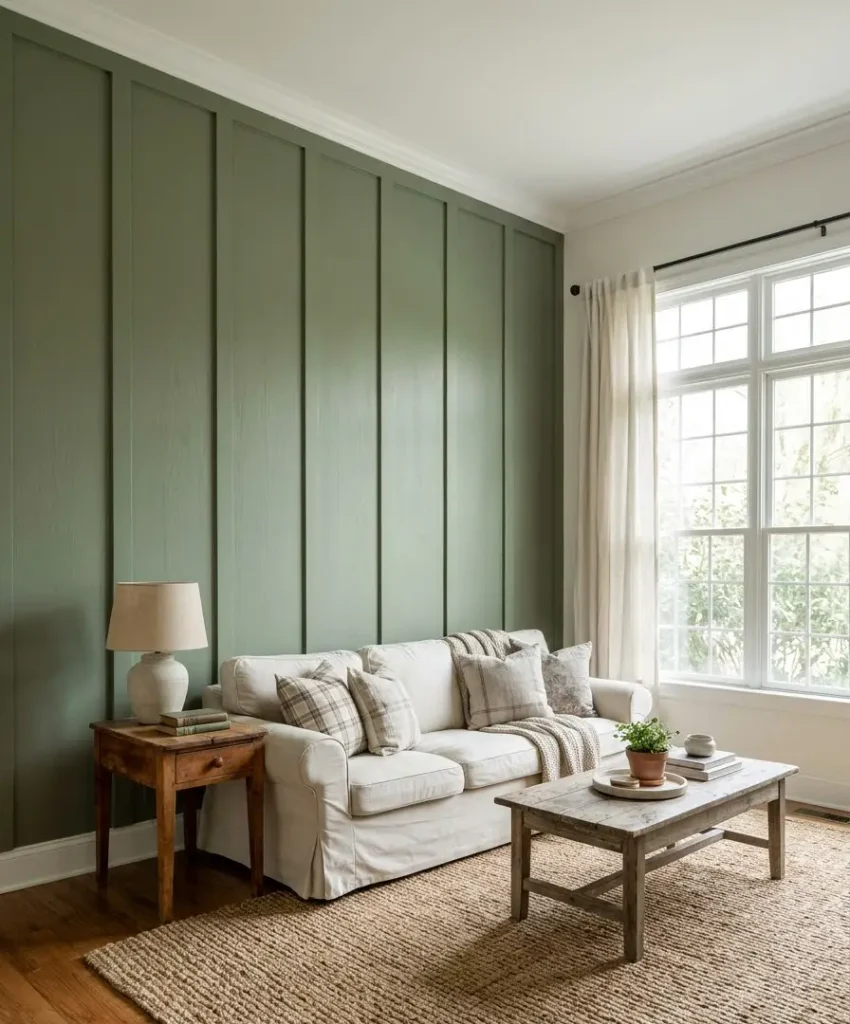
Board and batten adds vertical lines that make ceilings look taller. Painted in a mid-tone green, it brings a traditional, cottage feel to a living room without looking fussy.
Use MDF strips and a nail gun if you have DIY confidence. I built one in a weekend, with one wonky batten I still stare at. Nobody else notices.
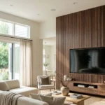
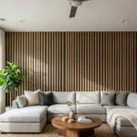
11. Fluted green panelling
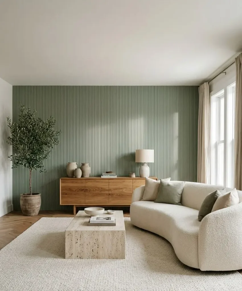
Fluted or slatted wood panels have taken over Pinterest, and green suits them perfectly. The ridges catch light and create shadow lines that shift during the day.
Paint the panels in a muted green such as sage or deep olive. Fit them behind a console or sideboard, and the wall looks custom without costing a fortune.
12. Green tile fireplace surround
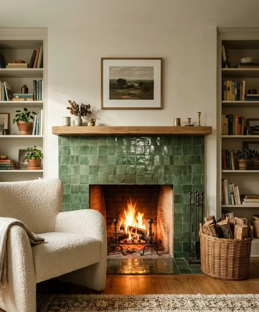
Glazed green tiles around a fireplace give a living room a jewelry-box moment.
Handmade-look zellige tiles shine under firelight, and the uneven surface looks lovely in photographs.
This one costs more than paint, and it takes proper installation. If you’ve got the budget, though, nothing else looks quite like it.
13. Green grasscloth wallpaper
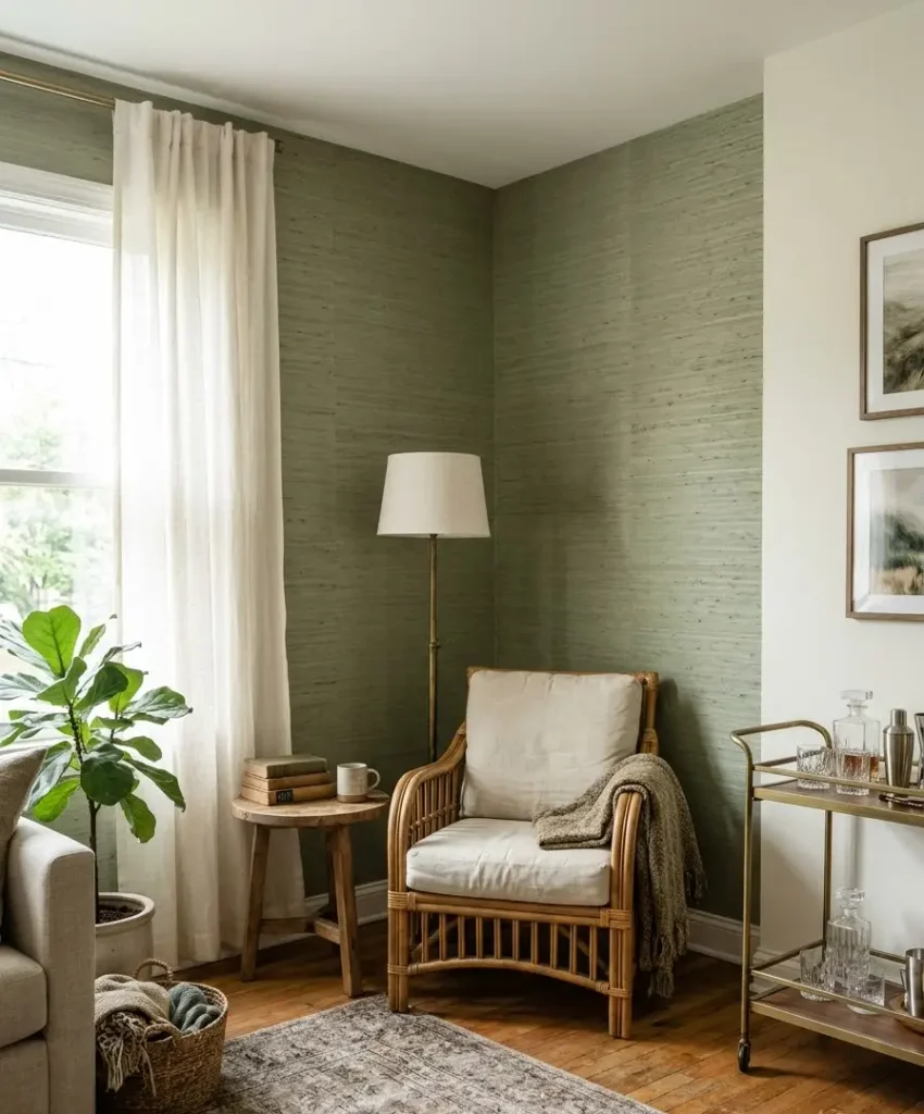
Grasscloth is a woven natural wallpaper, and in green it adds a warm, earthy layer you can’t fake with paint. It works especially well in a reading nook or behind a bar cart.
It costs more than regular wallpaper and marks easily, so keep it away from sticky-fingered kids. For a calm adult living room, though, it looks fantastic.
14. Textured plaster in sage or moss
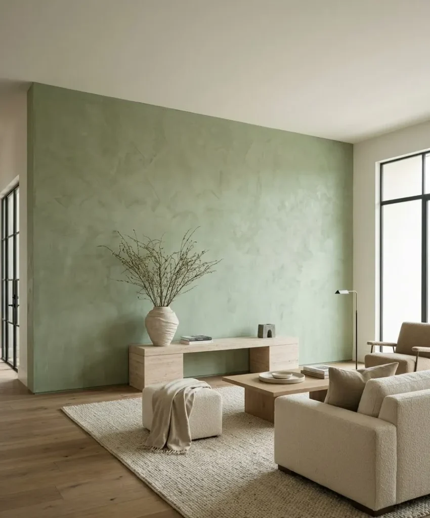
Venetian-style or roughcast plaster creates a stone-like surface in soft greens. It looks heavy and handmade, and it adds quiet luxury without any pattern.
You need a skilled plasterer for the real thing. A faux-effect paint kit gets about 80% of the look for a fraction of the cost, and I think that’s a fair trade for most of us.
15. Living moss or plant wall
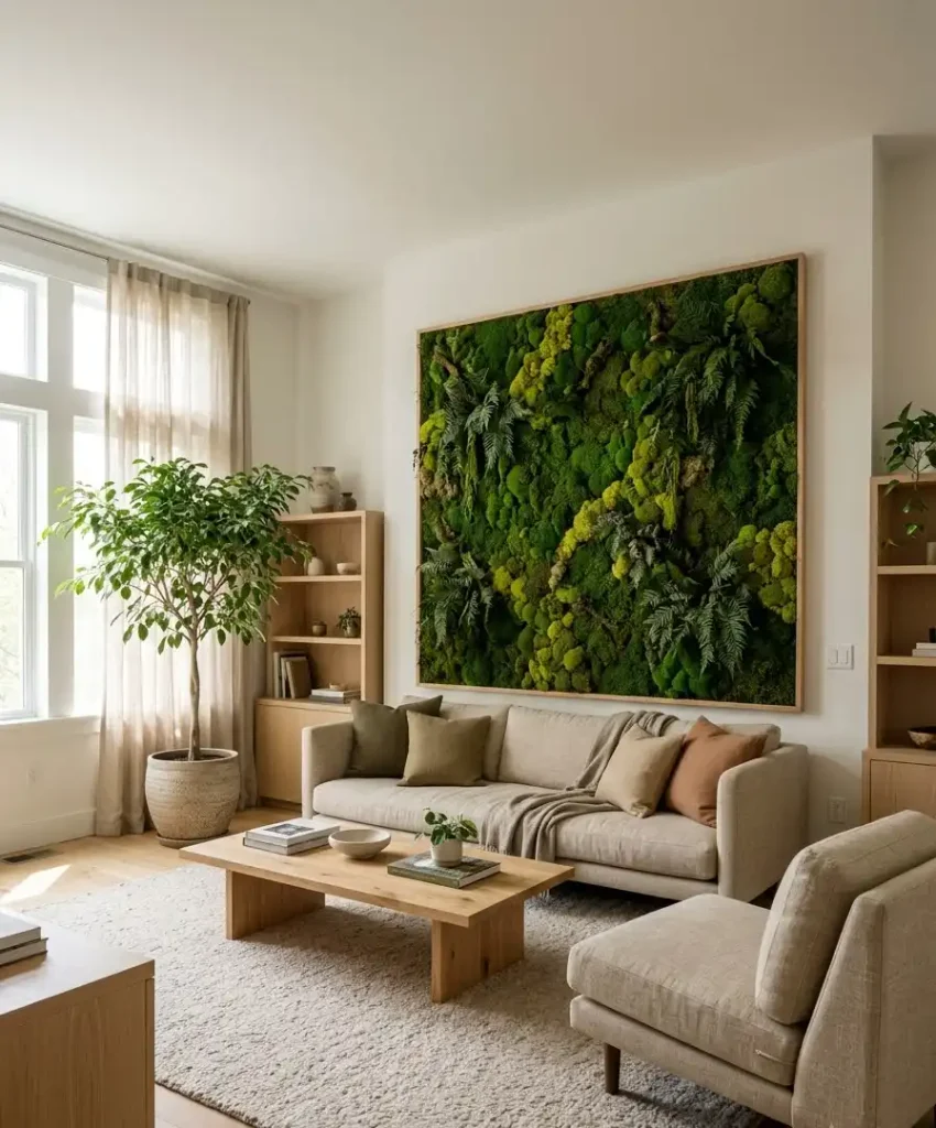
A preserved moss wall brings actual green into the room, and it needs no watering.
Panels of reindeer moss and fern in different shades make a soft, quiet backdrop that muffles sound too.
Real plant walls need a drip system and a lot of care. Preserved moss panels hang like art and look good for years, so I’d pick those unless you love maintenance.
Pattern and pairing ideas
A green accent wall rarely works alone. What you put around it decides whether the room feels polished or random. These seven ideas focus on pairings and patterns.
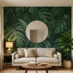
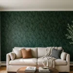
16. Botanical wallpaper
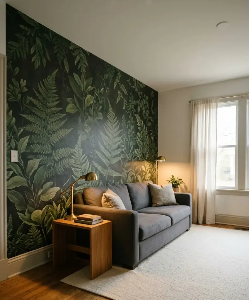
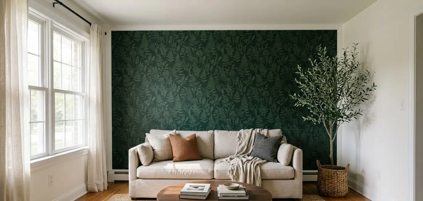
Large-scale leaf or fern wallpaper turns one wall into a garden mural. Dark backgrounds with deep green leaves feel moody. Pale backgrounds with soft sage fronds feel airy and fresh.
Keep the rest of the room quiet. If the wall has a lot going on, keep furniture plain and let the pattern carry the show.
17. Green and cream stripes
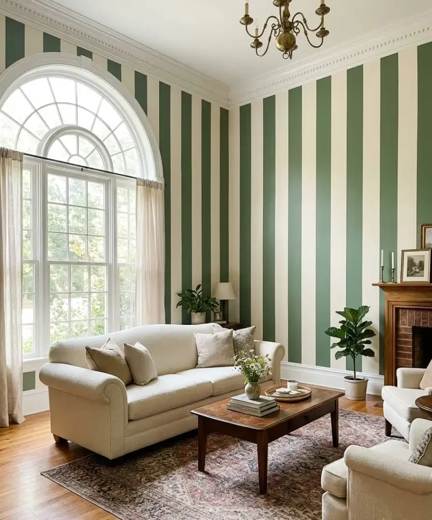
Wide vertical stripes in green and cream bring a classic, slightly English feel. They also stretch the walls upward, so a low ceiling looks higher.
Measure carefully and use a laser level. I once eyeballed stripes and ended up with a slope that made me feel mildly seasick.
18. Art deco scallop in green
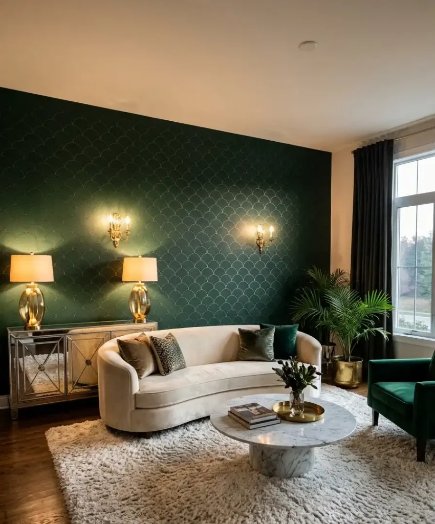
Scalloped patterns, whether painted, tiled or wallpapered, have a soft, curvy rhythm. In deep green with gold or cream accents, they give a living room a glamorous retro feel.
It works best on one focal wall, behind a statement sofa or a sideboard. Anywhere else and the pattern starts shouting.
19. Green wall with a gallery display
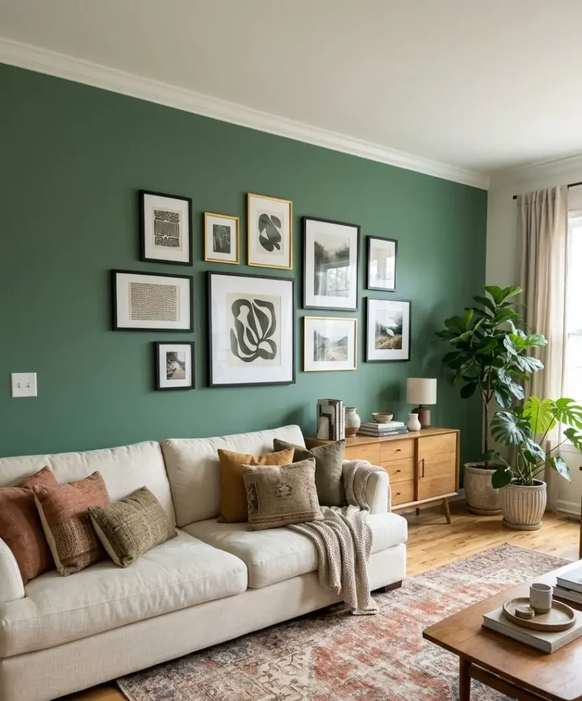
A mid-tone green wall makes a brilliant backdrop for framed art. Black frames look sharp, gold frames look rich, and a mix of both looks collected over time.
Lay your frames on the floor first and take a photo before hammering anything in. It’s a boring step that saves a lot of holes in the plaster.
20. Green with terracotta
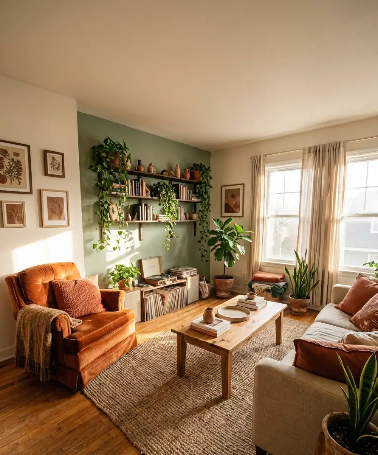
Green and terracotta sit opposite each other in a warm way, like a desert garden. Try a sage wall with terracotta cushions, clay pots and a rust-orange armchair.
This pairing looks earthy and relaxed, and it’s one of the most pinned combinations I see. Keep the terracotta items small so the green still leads.
21. Green with blush pink
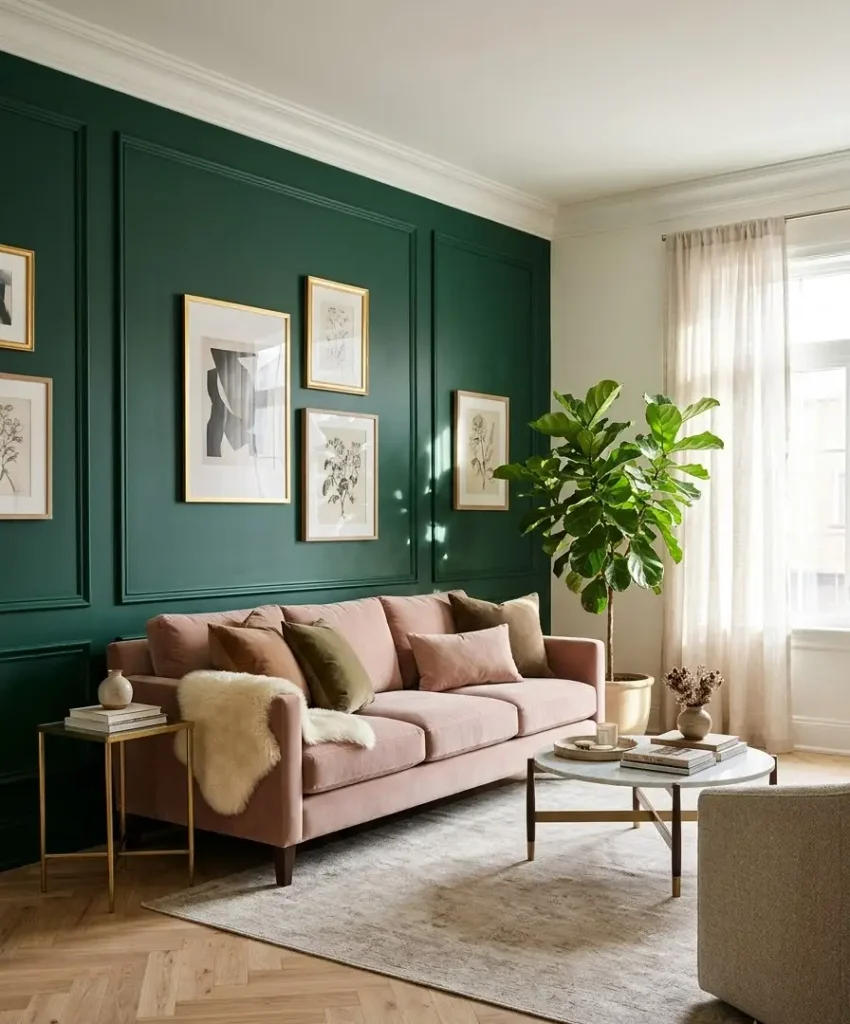
Blush and green feels sweet but grown-up. Pair a deep emerald wall with a dusty pink sofa, and you get that “design magazine” photo without trying very hard.
I’m biased here because I own a blush velvet armchair and I love it. If you’re nervous, start with pink cushions and see how they feel.
22. Green with black and white accents
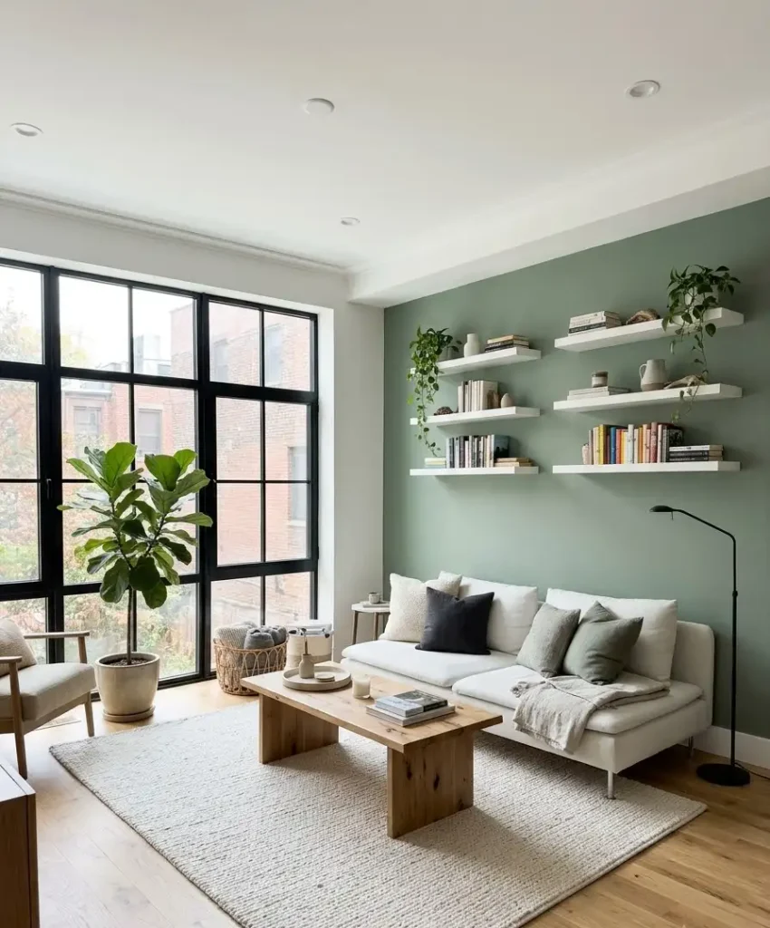
A graphic mix of green, black and white feels crisp and modern. Think black window frames, white shelves and a sage green wall that softens the contrast.
It suits a small flat or a modern build with clean lines. Add one wood piece, like a coffee table, so the room doesn’t feel cold.
Small-space and renter-friendly options
You don’t need a free hand with the walls to get a green look. Here are five ways to try green without losing your deposit or your weekend.
23. Peel-and-stick green wallpaper
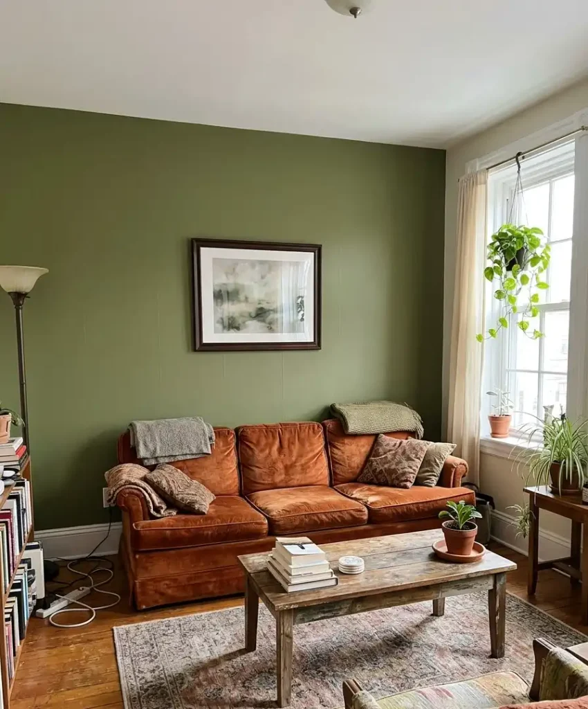
Peel-and-stick wallpaper has improved a lot. Modern versions look decent, stick cleanly and come off without damage if you pull slowly and warm the paper with a hairdryer.
Smooth it with a squeegee and trim edges with a sharp blade. It looks best in a solid or subtle texture, and I’d skip busy patterns because seams show more.
24. Half-painted green wall
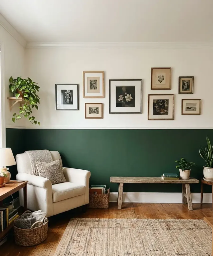
Paint the bottom half of the wall green and leave the top white. It reads like a wainscot without the carpentry, and it grounds the room by pulling the eye downward.
Use painter’s tape and a level. Finish the top edge with a thin trim line in a contrasting color if you want it to look deliberate.
25. Arched green color block
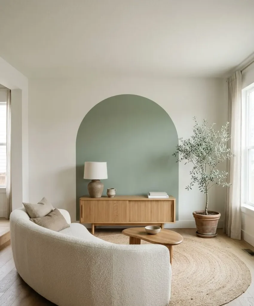
Paint a green arch behind your sofa or a console. It frames the furniture like a doorway and gives a flat wall some shape and personality.
Trace the arch with a string and pencil for a clean curve. This one is popular on Pinterest right now, and for good reason: it looks custom for the price of one small tin.
26. Green behind built-in shelves
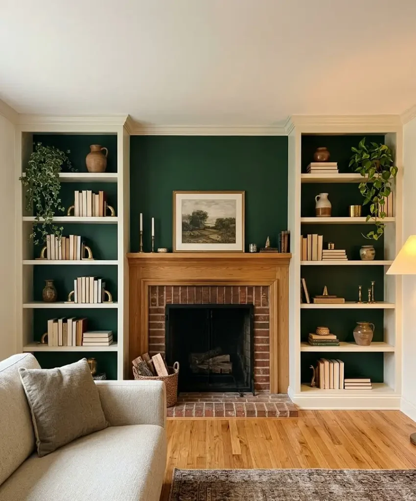
Paint the back panel of a bookcase or alcove shelving a deep green. Books, vases and plants pop against it, and the shelves become a feature instead of a storage afterthought.
You only need a small amount of paint, so splurge on a premium brand. A quart of Farrow & Ball costs about the same as a takeaway for two, and it goes a long way here.
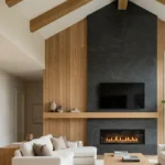
27. Dark green TV wall
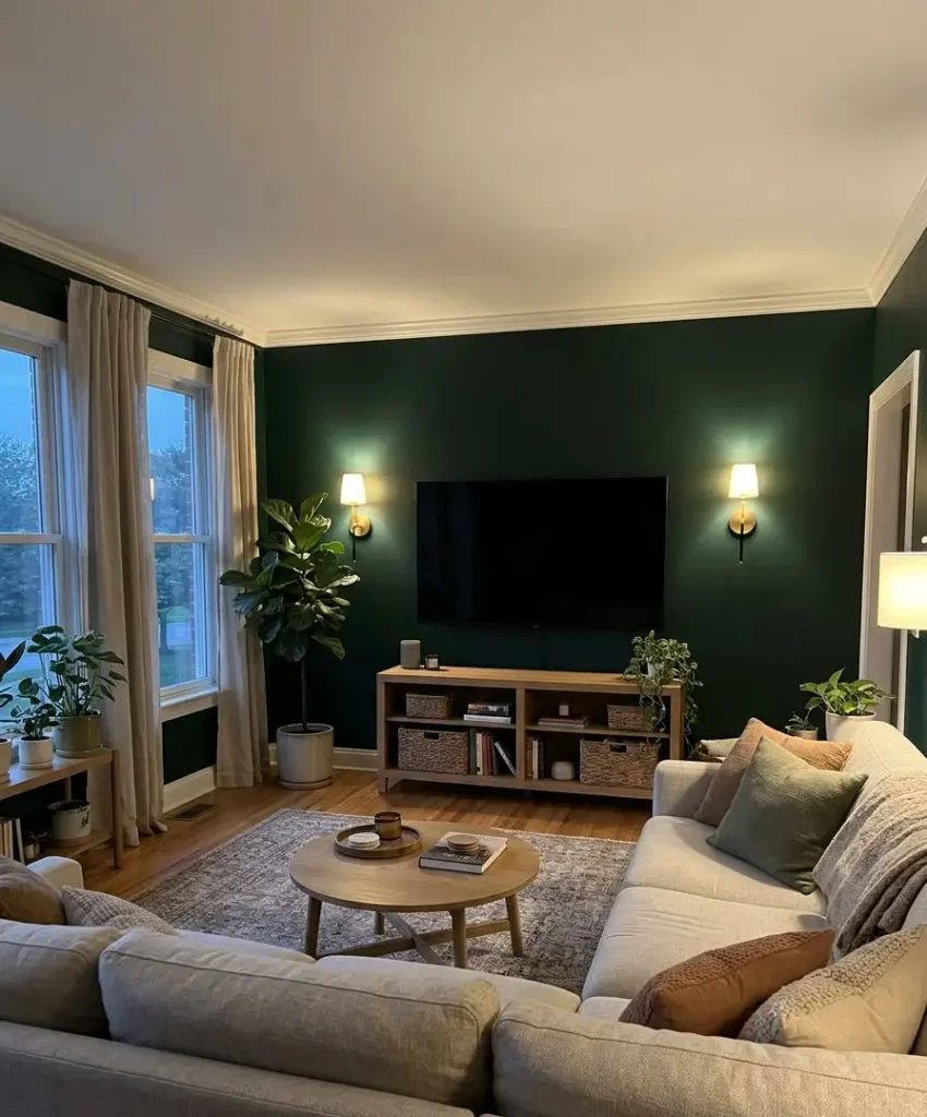
Black screens fight with pale walls, but they melt into dark green. Paint the TV wall a deep forest or bottle green and the screen stops dominating the room when it’s switched off.
Add warm lighting on either side and a few plants nearby. I use this trick in my own living room, and my partner still thinks the TV looks smaller.
A quick comparison table
Here’s a short cheat sheet to compare some of the most popular shades.
| Shade | Best light | Mood | Pairs with |
|---|---|---|---|
| Sage | Any | Calm, soft | Oatmeal, light oak |
| Forest | South, warm bulbs | Cozy, moody | Brass, leather |
| Olive | North or south | Earthy | Rust, cream |
| Emerald | Bright rooms | Dramatic | Blush, gold, velvet |
Quick thought that has nothing to do with green
I keep a notebook of paint colors I’ve tried, with tiny swatches taped in and notes like “too minty” or “looks gorgeous at 4pm.” It sounds nerdy, and it is.
Still, when a friend asks which green they should pick, I flip through it and answer in two minutes. If you plan more than one room, start a notebook too.
Mistakes I made so you don’t have to
I’ve painted green walls in three homes, and I’ve made most of the classic errors.
Here are the ones that cost me real time and money:
- Skipping the large swatch. I trusted a tiny paper chip once and ended up with a living room the color of pea soup. Test big, look often.
- Ignoring the floor and furniture. A cool green looks wrong next to orange-toned wood. Match undertones, or the room fights itself.
- Using one bulb type everywhere. Cold white LEDs flatten green into grey. Warm bulbs make it glow. This one change fixed my second living room.
- Painting the wrong wall. The accent wall should be the one you see first when you walk in, or the one behind your main seating. In my first flat I chose the wall by the window, and the glare washed it out.
For wider color trends, I check Pinterest Trends every few months. Green searches stay strong year after year, which tells me this isn’t a passing fad.
FAQ
What color furniture goes best with a green accent wall?
Neutral pieces such as cream, beige, tan leather and natural wood all work well. For contrast, try blush pink, mustard or rust.
Match the undertone of your furniture to the green so the whole room feels connected.
Does a green accent wall make a living room look smaller?
Dark greens blur corners, and the room feels deeper, not tighter. Lighter greens such as sage or eucalyptus
reflect more light and open the space further. Either way, one accent wall rarely shrinks a room.
Which wall should I paint green?
Pick the wall your eyes land on first, usually the one behind the sofa, the fireplace or the TV. Avoid walls with big windows, because glare washes out the color.
Final thought
Green is about the easiest color to live with, as long as you test it properly and light it well.
Start with one wall, pick one of the 27 ideas above, and see how it feels after a week of morning coffee and evening TV.
So which one are you trying first: soft sage, moody forest or a bold emerald?