I painted my first dark teal wall at 11 p.m. on a Tuesday with a borrowed roller and no plan. By midnight I loved it. By morning I panicked, because my sofa looked like a beige potato next to it.
That panic taught me more than any design book. A deep teal wall has a lot of personality, and it needs supporting actors. Wood, cream, and gold turn out to be the best cast I’ve found.
If you’re scrolling Pinterest at 1 a.m. with 40 saved pins of moody green-blue living rooms, this guide is for you.
I’ll cover the shades I’d pick, where to put the wall, how to mix the three accents without making the room look like a hotel lobby, and the mistakes I made so you can skip them.
Why dark teal works so well in a living room
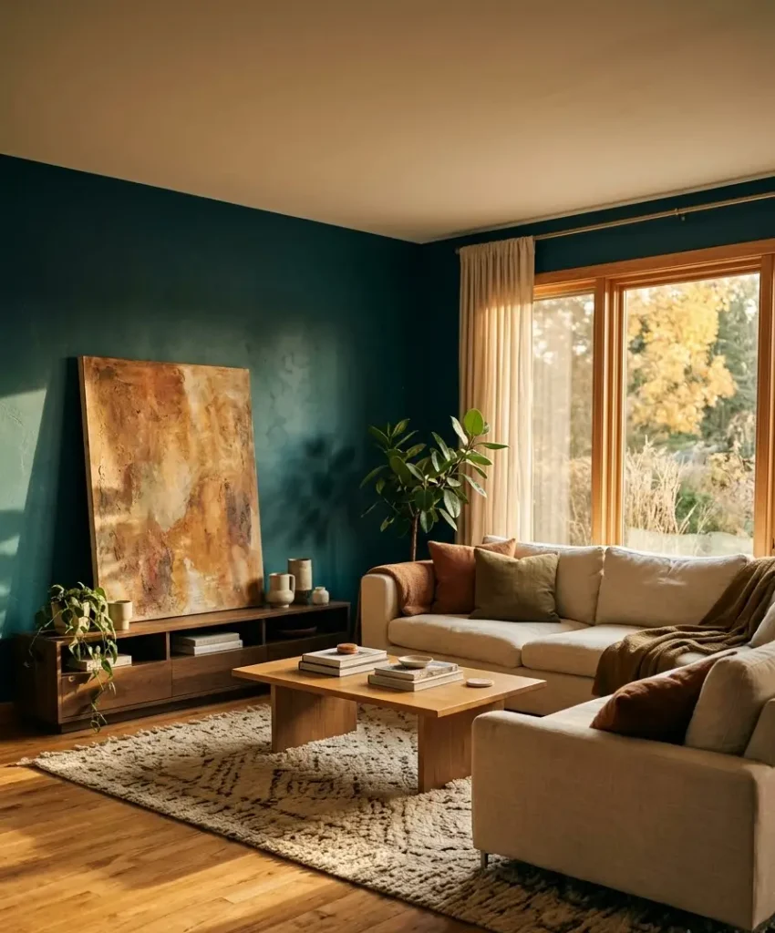
Teal sits between blue and green, so it feels calm and a little mysterious at the same time.
A dark version absorbs light and makes a wall look deeper, which gives a room an instant focal point. Pale walls can’t do that, however much you style them.
Living rooms are where we sit still, talk, and watch TV, so a color with some weight suits the job.
Bedrooms get all the moody paint, and I think living rooms deserve the same treatment.
The color wheel does half the work
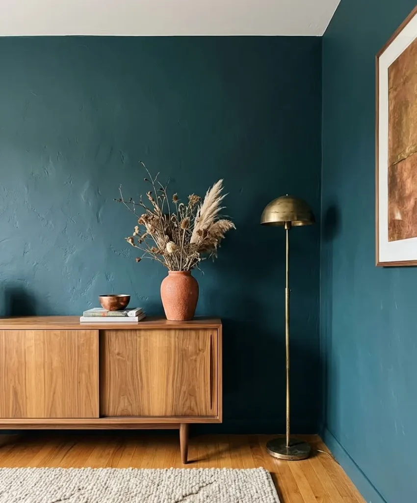
Teal has a warm cousin on the opposite side of the wheel: orange, copper, and golden brown.
That explains why wood and gold look so good against it. The undertones in walnut, oak, and brass all lean warm, and they make the cool teal glow.
Cream sits in the middle as the peacemaker. It gives your eyes a place to rest between all that depth and shine.
Ever notice how a dark wall looks richer when something soft and light sits right in front of it? That’s the cream.
Why this exact trio
Wood brings warmth and texture. Cream brings softness and breathing room. Gold brings a little sparkle in small doses.
Take any one away and the room changes. Without wood, it feels cold and flat. Without cream, it gets heavy. Without gold, it’s pleasant but forgettable.
Choosing your dark teal shade
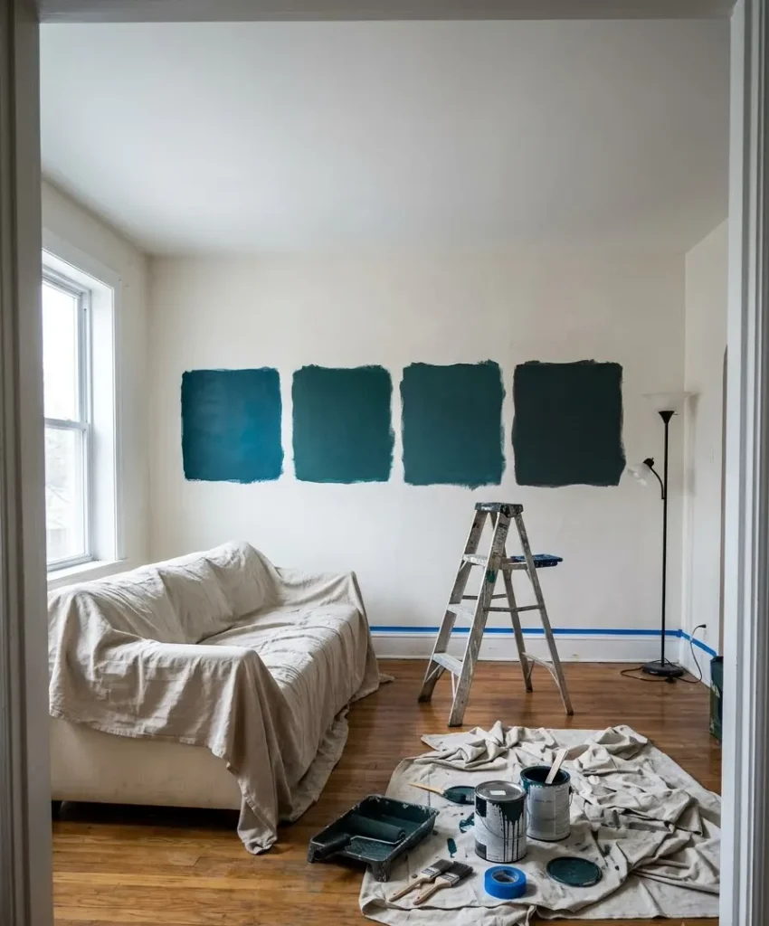
This is where most people stall, and I get it. Paint chips lie under store lighting, and a color that looks like a peacock feather on the card can turn navy on your wall by 4 p.m.
Here are the shades I’d test first. I’m describing how they usually read on a wall, but undertones shift in every home, so buy sample pots.
| Shade | Undertone | Works best in |
|---|---|---|
| Benjamin Moore Salamander | Green-leaning | Rooms with warm light |
| Sherwin-Williams Oceanside | Balanced blue-green | Average light, most homes |
| Farrow & Ball Hague Blue | Blue-leaning | North-facing, bright rooms |
| A custom mix with a drop of black | Smoky, muted | Traditional or older homes |
You can browse full color collections at Benjamin Moore, Sherwin-Williams, and Farrow & Ball.
Order the sample pots and paint a big square, at least two feet wide, on the actual wall.
How light changes everything
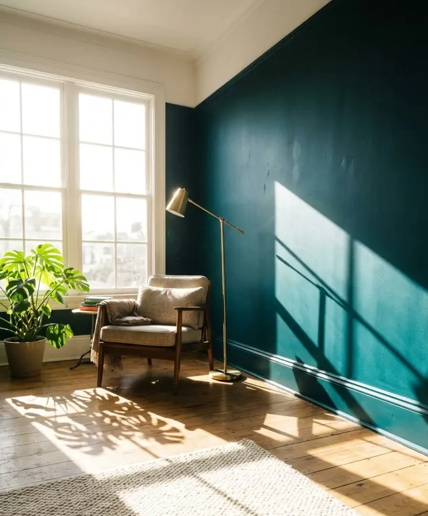
A north-facing room turns teal cooler and darker, so a green-leaning shade keeps it from feeling icy.
A south-facing room warms everything up, so you can pick a bluer teal without worry.
East light is soft and golden in the morning, and west light turns rich and orange in the evening.
Look at your sample at three times of day. I skipped this step once and ended up with a wall that looked fantastic at noon and like a swimming pool at night. Not the vibe.
Matte, eggshell, or something shinier?
I go with matte or a flat-matte finish for a dark teal accent wall. It hides bumps and roller marks, and it makes the color look velvety.
Eggshell reflects more light and wipes clean more easily, which matters if you have kids or a dog with opinions.
Gloss on a full wall is a bold move, and in a living room I’d skip it unless you love a lacquered look. Save the shine for your gold accents.
Picking which wall gets the color
An accent wall works because it stands alone. Choose the wrong one and the room feels lopsided. Choose the right one and the whole space snaps into focus.
The wall behind your sofa
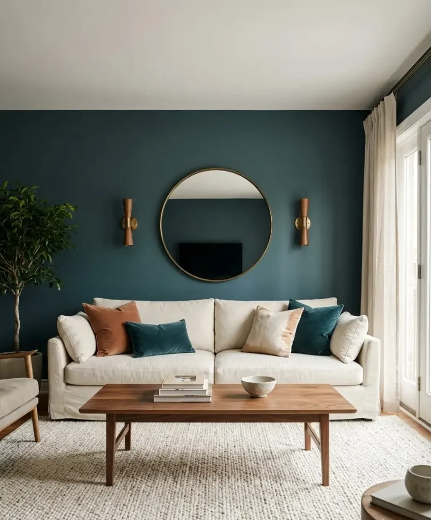
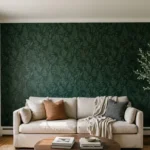
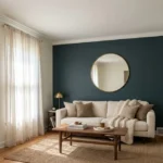
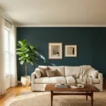
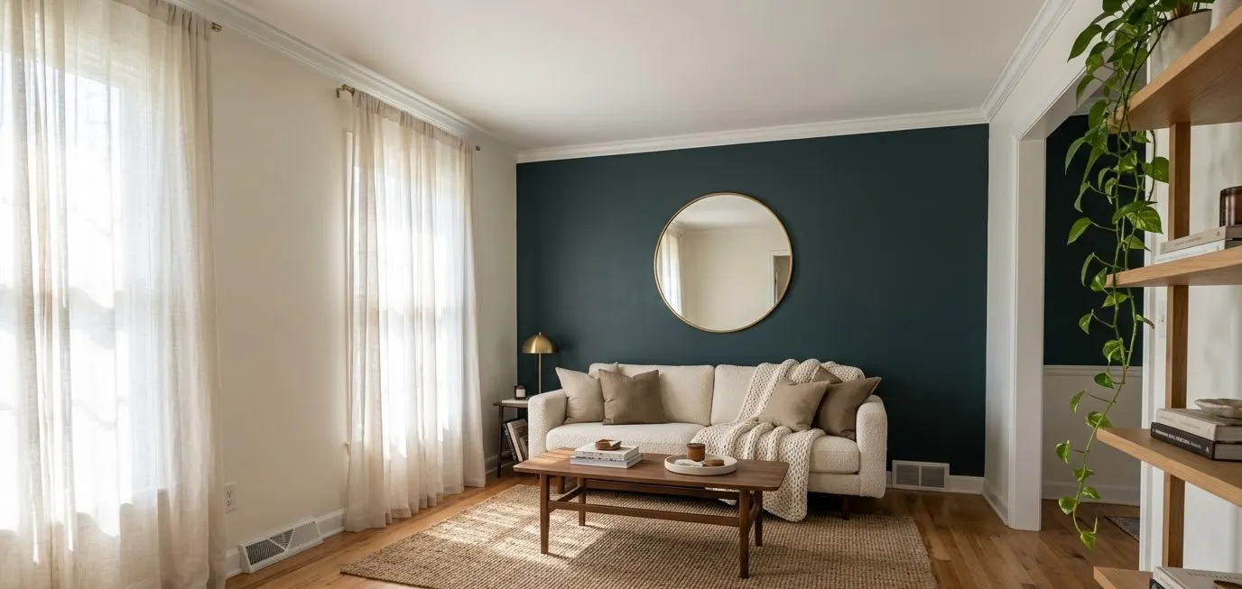
This is my favorite pick, and it photographs beautifully for Pinterest. A cream sofa against dark teal looks like a magazine spread.
You also see this wall from the doorway, so it shapes your first impression of the room.
Hang a large mirror or a gallery wall here and the color does the rest.
The fireplace wall
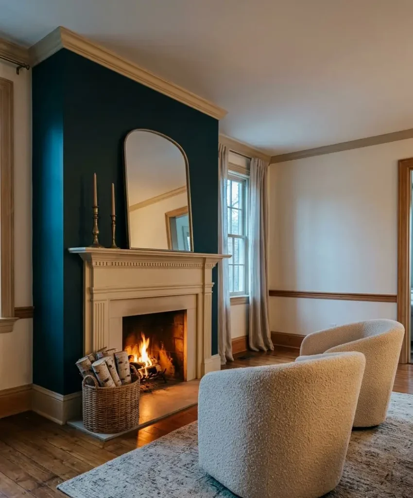
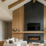
A fireplace already draws every eye in the room, so dark teal turns it into the star.
Pair it with a white or cream mantel and the contrast looks crisp. If your fireplace has a wood mantel, you get the wood element built in.
The TV wall
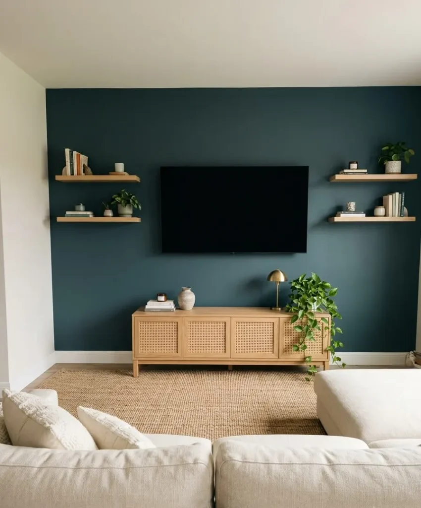
People forget this one. A dark wall makes a black TV screen blend in instead of glaring at you from a pale background.
I think it’s the smartest use of dark paint in a living room, and it costs nothing extra.
Which walls to avoid
Skip a wall with three windows, since the color gets chopped into strips and loses its impact. Skip the wall you see least, too.
An accent wall in a hallway nook nobody looks at wastes a lot of paint and effort.
Wood tones that look best with dark teal
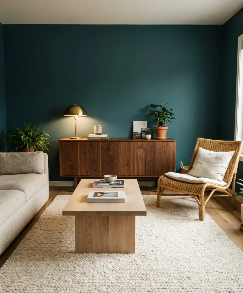
Wood is where you bring in warmth, and the tone you pick changes the mood completely.
- Walnut looks rich and a bit moody. It suits mid-century furniture and gives you the most dramatic contrast.
- White oak and ash read lighter and more Scandinavian, and they keep a small room from feeling heavy.
- Rattan and cane add a relaxed, textured layer. I’m a huge fan of a cane-front sideboard against teal. It looks expensive and costs less than you’d guess.
- Reclaimed or live-edge wood brings rustic character, and it works best in larger rooms.
My personal rule: pick one dominant wood tone and add one secondary tone at most. I once mixed cherry, pine, and walnut in the same room and it looked like a furniture clearance event.
Where wood goes
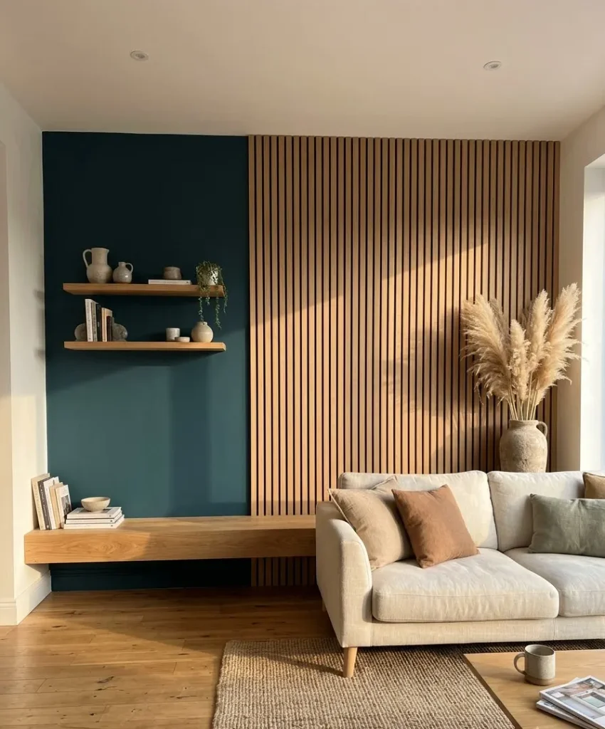
You have plenty of options. A coffee table, floating shelves, a media console, picture frames, a bench, and slatted wall panels all work.
Wood slats on one side of the teal wall add depth and make the whole thing feel custom.
Floors count too. If you have hardwood already, you’re ahead of the game. If you have gray laminate, a big natural jute or wool rug can bring warmth back.
Cream: the soft layer that keeps it all balanced
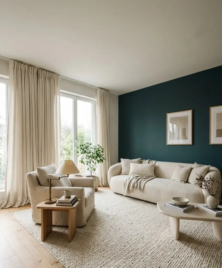
Cream is the unsung hero here. Dark teal can feel heavy without it, and pure white often looks harsh next to deep color.
Warm cream versus cool cream
Pick a cream with a yellow or peachy undertone. Warm cream sits happily beside teal and gold.
A cool, grayish cream looks muddy against them, and I learned that from a sofa I returned.
Hold a swatch of your cream next to your teal paint sample before you buy anything. The two colors should look like friends.
Where to put it
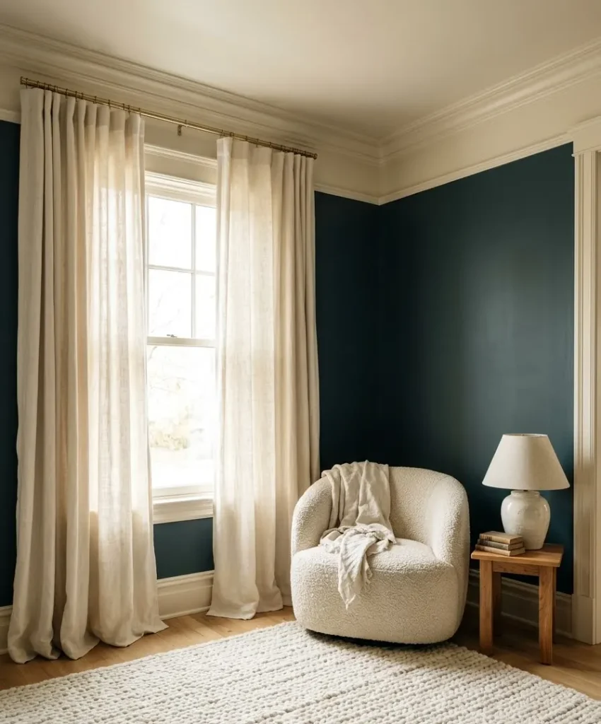
Large pieces carry the most weight, so start there:
- A cream sofa or armchair in boucle, linen, or a textured weave
- Long, floor-length curtains that touch the ground
- A chunky wool rug under the seating area
- Cream trim and ceiling paint to soften the edges of the dark wall
IMO a cream boucle chair is the single best piece you can put against a teal wall. It looks cozy, it catches the light, and it pops in photos.
A small note on white
You don’t need to ban white from the room. A white ceiling and white trim look fine with this palette.
Keep the large furniture warm cream and let the white play a background role.
Gold accents without going overboard
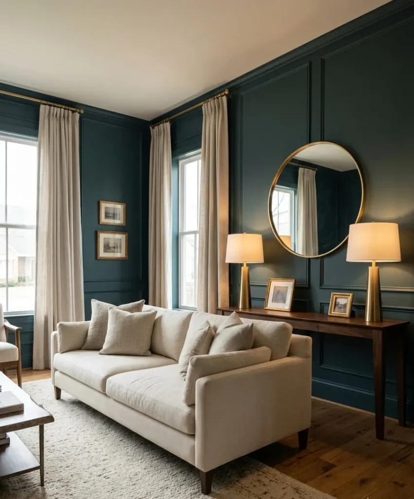
Gold needs restraint. A little looks elegant, and too much makes the room look like a jewelry display.
Brass, brushed gold, or antique gold?
I prefer brushed or antique brass over shiny yellow gold. It looks softer and a bit aged, which suits a cozy living room. Polished gold can feel flashy against dark teal.
Here’s a quick comparison of the finishes I’ve tried:
- Polished gold: Bright and glamorous. Great for a small mirror frame, risky for large pieces.
- Brushed brass: Warm and calm. My top pick for lamps and curtain rods.
- Antique gold: Slightly dark and moody. Beautiful on picture frames and candle holders.
- Gold leaf or paint: Handmade and a little imperfect. I love it on thrifted vases.
Where gold works best
Think small and repeated. A round mirror with a thin gold frame, a pair of table lamps, a curtain rod, cabinet pulls,
a few picture frames, and a candle holder or two. Place gold items in at least three different spots so the eye bounces around the room.
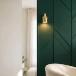
Wow, what a difference a simple brass lamp makes next to a dark wall. The metal picks up the lamp glow and throws it right back at you.
The mixing question
Can you mix gold with black or silver metals? Yes, in small amounts. I add one black metal piece, like a floor lamp, to keep the gold from looking too sweet. Silver tends to fight with the warm palette, so I leave it out.
A quick detour (because I can’t help myself)
Random thought while I’m on the subject of paint: why does painter’s tape always start at a spot on the roll you can’t find? I have lost a full 10 minutes of my life to that, more than once.
Anyway. Pull the tape off while the paint is still slightly damp. Dry paint peels with the tape and leaves a ragged edge, and you’ll want to cry.
Texture and finishes that make teal feel rich
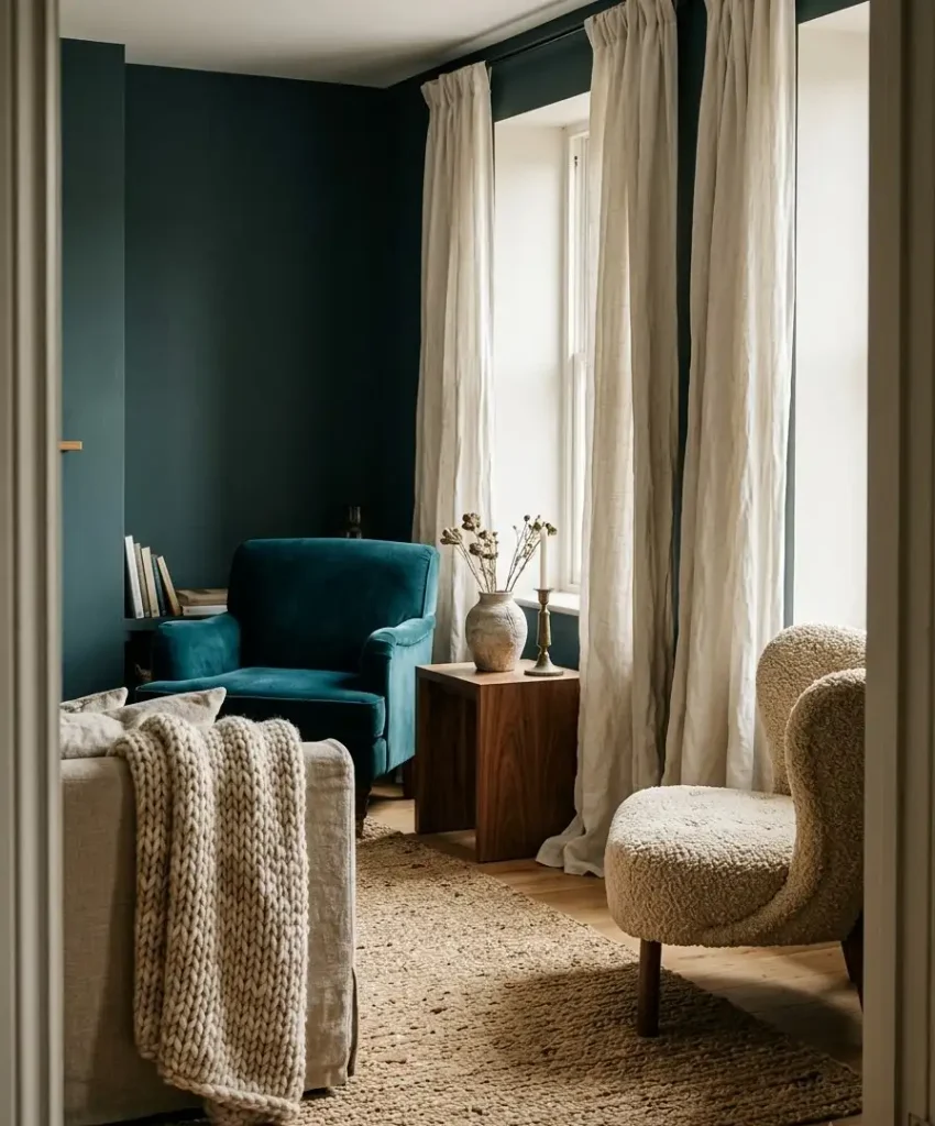
Color gets attention, but texture keeps people interested. A flat teal wall with flat furniture looks like a rendering. Add layers and the room feels lived in.
Fabrics to mix
Velvet loves dark teal. A velvet pillow or a velvet armchair in a deeper or lighter teal adds a tonal layer that looks designer. Pair it with chunky knit throws, linen curtains, and a boucle accent chair.
I’d keep patterns quiet. A subtle stripe or a small geometric on a cushion works nicely. A loud floral next to a dark wall fights for attention.
Plants and natural touches
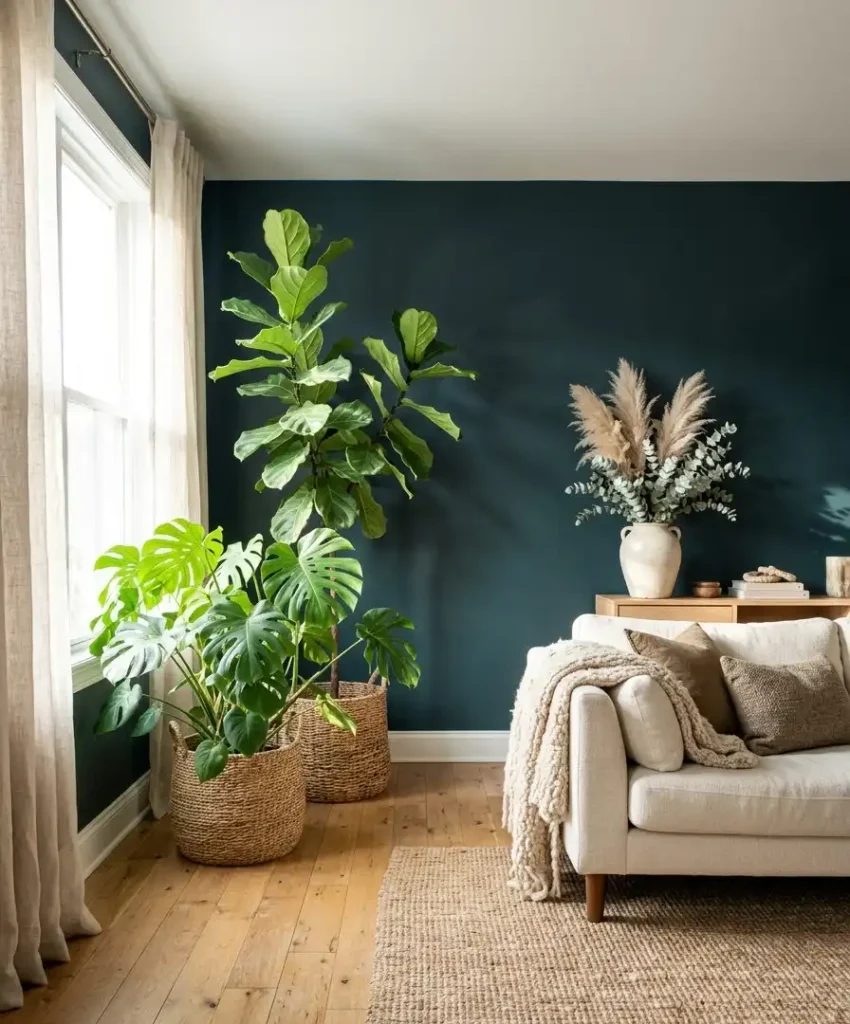
Green plants look gorgeous against teal. A fiddle leaf fig or a big monstera has a fresh look against a deep wall. Dried pampas grass and eucalyptus add soft, airy shapes that photograph well.
One more thing: ceramic vases in cream, with a thin gold rim, tie the whole palette together on a shelf or console.
Paint techniques
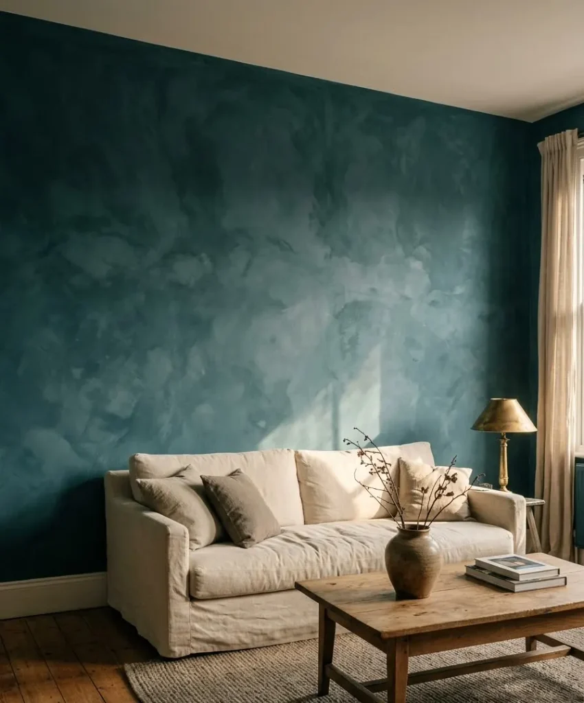
A flat color is easy, but a limewash or a textured paint finish gives the wall a soft, cloudy depth.
I tried limewash teal once and loved how the color shifted across the wall. It does take practice, so test it on a board first.
Lighting a dark teal wall
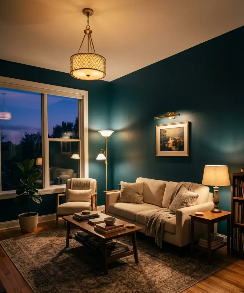
Dark paint absorbs light, and that scares some people. You solve it with layers of lighting rather than by choosing a paler wall.
Three layers I use every time
Start with ambient light from a ceiling fixture or a large floor lamp. Add task light for reading, like a table lamp beside the sofa.
Finish with accent light, like a picture light over art or a small lamp on a shelf.
Warm bulbs, around 2700K, make teal glow. Cool white bulbs turn it flat and a bit hospital-like. Check the bulb color on the box before you buy.
Mirrors are your friend
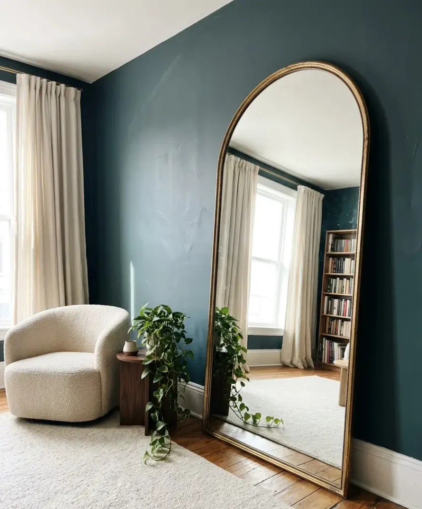
A large mirror opposite a window bounces daylight back into the room. Hang one on the teal wall in a thin gold frame and you get depth, sparkle, and a lighter feel all at once.
Ever wonder why every moody room on Pinterest has a big mirror somewhere? Now you know.
A trick for evening
Put lamps on dimmers. In the evening I turn everything down low, and the dark teal wall turns velvety and intimate. During the day I turn the lights up and the room feels fresh.
Layout ideas for different living rooms
Every space needs a slightly different approach, so here’s what I’d do in three common situations.
Small living room or apartment
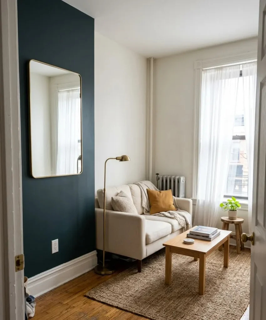
Paint one short wall and keep the rest of the room light. A cream sofa, a light wood coffee table, and a big mirror keep the space open.
Dark paint can make a small room feel snug rather than cramped, if you balance it with light furniture.
Open-plan living and dining
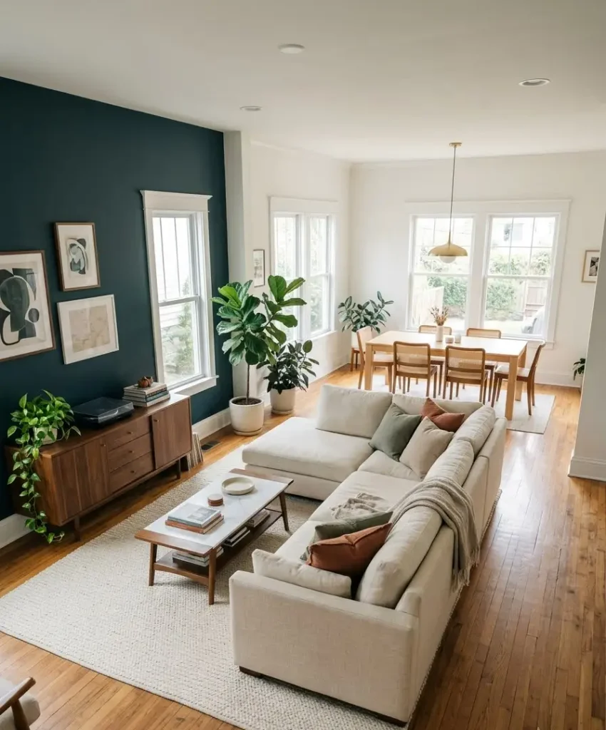
Use the teal wall to define the living zone. Paint the wall behind the sofa and leave the dining side lighter. A cream rug under the seating area reinforces the boundary without any walls.
Rental with a strict landlord
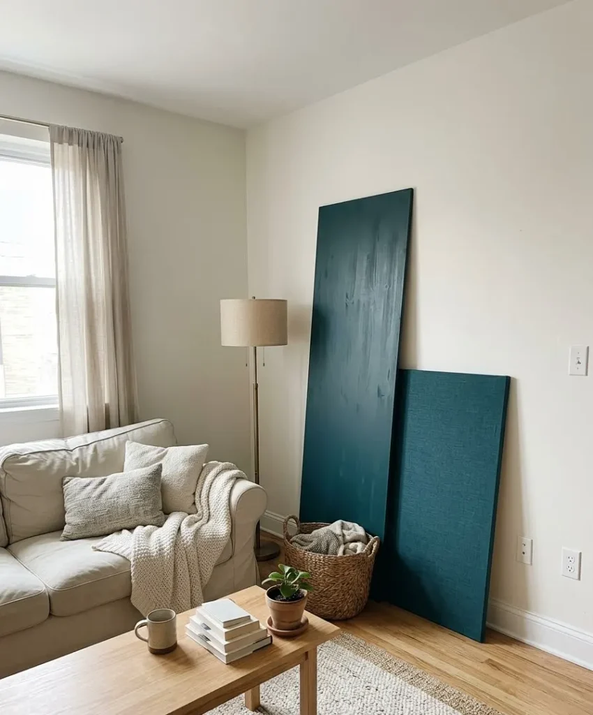
You can still get the look. Peel-and-stick wallpaper in solid teal works on smooth walls, and large teal fabric panels or a big canvas painted in your shade work as removable options.
Some people also build a freestanding painted wood panel and lean it against the wall.
Style directions to try
Dark teal is flexible, and the same palette reads differently depending on your furniture.
Mid-century modern
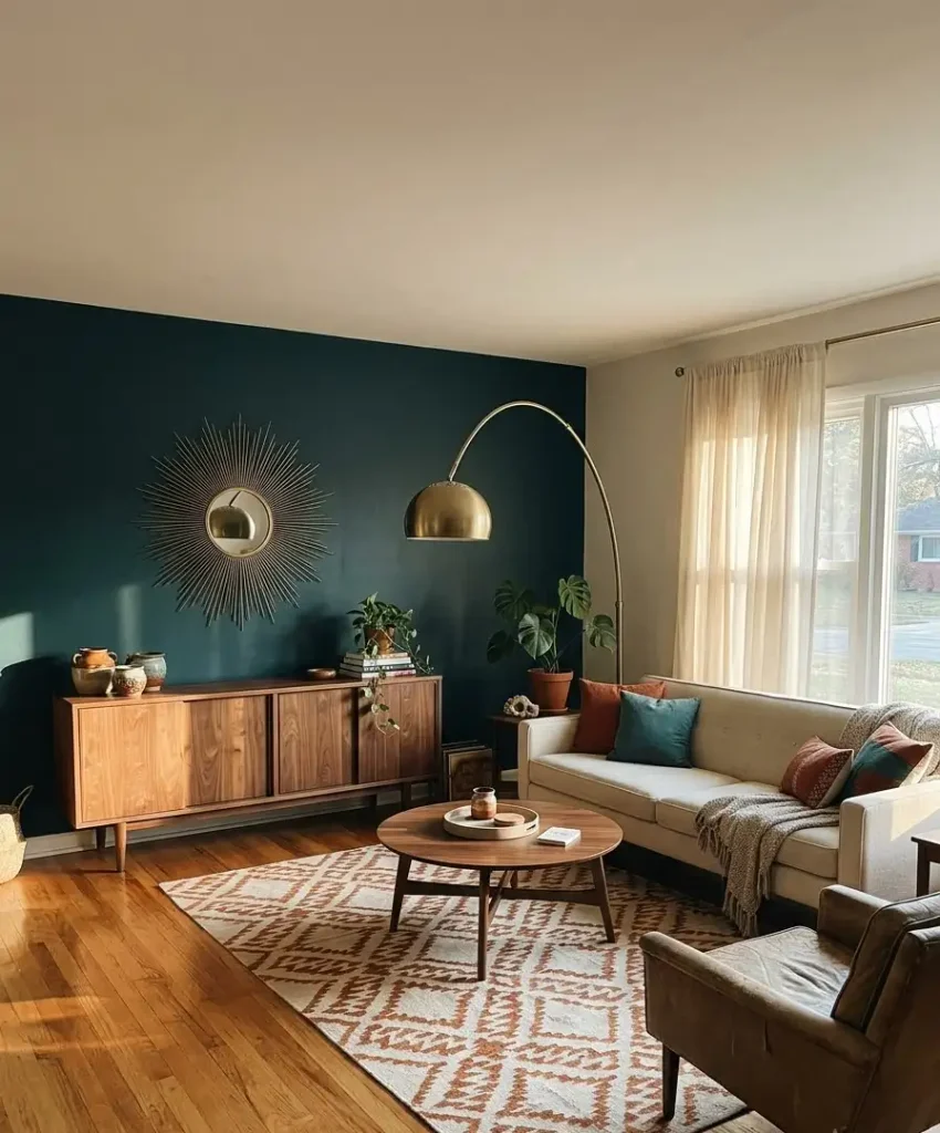
Think walnut credenzas, tapered legs, and a brass arc lamp. Cream upholstery with simple lines suits this style. It’s my favorite direction for the palette, and the pins you see most often use it.
Warm organic
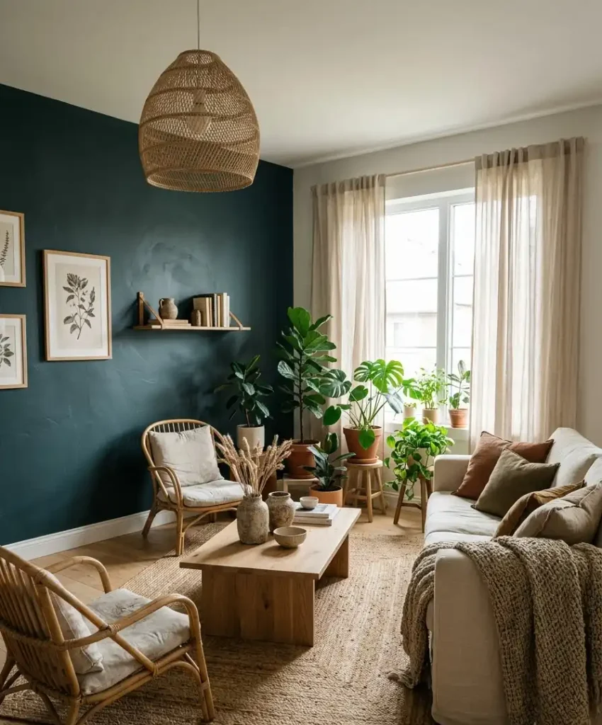
Lean into rattan, jute, linen, and plants. Use light oak, rough ceramics, and soft cream throws. The teal becomes a calm backdrop for a relaxed, earthy room.
Classic and moody
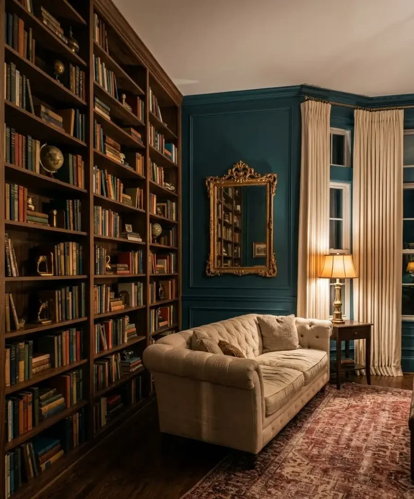
Use a rich walnut bookcase, a tufted cream sofa, and a gilded mirror. Add a patterned rug in warm reds and creams, and lean on antique brass. The room looks like a cozy library.
Styling the wall itself
An accent wall deserves something on it, though not too much.
Gallery wall
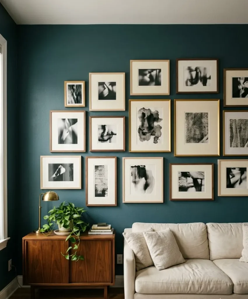
Cream mats and thin wood or gold frames pop against dark teal. Mix black and white photography with a few colorful prints.
Lay your layout out on the floor first and trace each frame onto paper to tape up before you drill.
One big statement piece
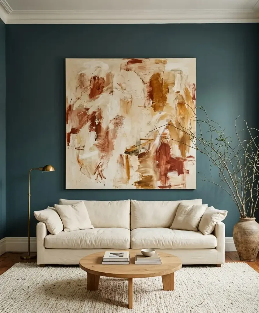
A single oversized piece of art can look more confident than a cluster of small frames.
Pick artwork with cream, rust, or ochre tones so it ties into the palette. A large framed textile or a round wood wall hanging works well too.
Floating shelves
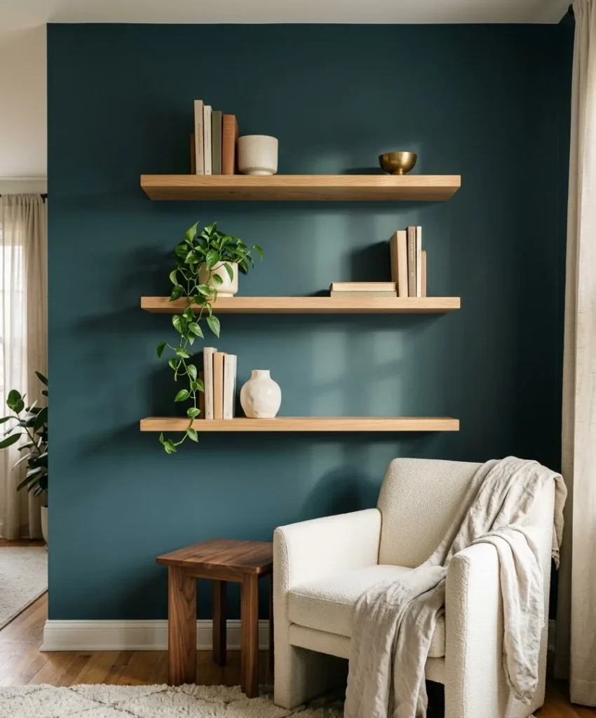
Wood shelves against teal look sharp. Style them with books, a few cream ceramics, a small plant, and one gold object.
Leave breathing room between items, because crowded shelves look messy fast.
Making your room Pinterest-ready
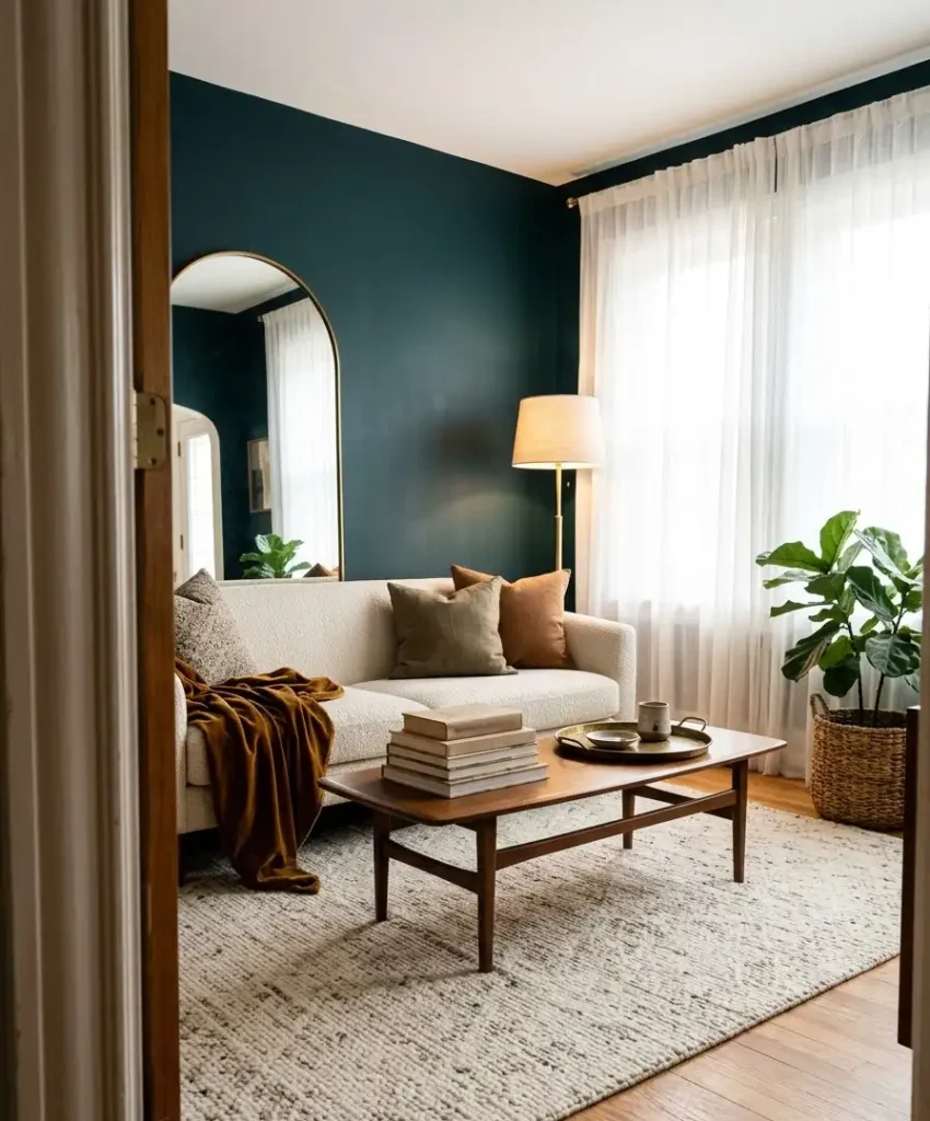
Since you’re probably planning to photograph the room, or at least compare it to your saved pins, a few tips help.
- Shoot vertical. Pinterest favors tall images, so hold your phone upright.
- Use daylight. Morning light makes teal look rich without turning it blue.
- Style in odd numbers. Three pillows or five books look more natural than pairs.
- Show texture. A close-up of a velvet cushion beside a brass lamp performs well.
My honest opinion: the pins that get saved most aren’t the most expensive rooms.
They’re the ones with a clear color story and a soft, welcoming feel. Pin boards at Pinterest show this over and over.
Mistakes I made (so you don’t have to)
I’ve painted this color in two homes, and I’ve made most of the classic errors.
- Skipping samples. I committed to a color after looking at a tiny chip. The wall looked navy. I repainted.
- Using one coat of primer. Dark colors need good coverage. I use a gray-tinted primer and two coats of paint.
- Buying a cool cream. It looked dingy against teal, and I spent a weekend returning furniture.
- Hanging everything gold. The room looked like a showroom. I cut the metal count in half and it felt right.
- Forgetting the ceiling. A stark white ceiling against a dark wall looked harsh, so I switched to a warm off-white.
None of these mistakes ruin a room permanently, and paint costs less than a sofa. You can fix almost anything in a weekend.
A simple budget breakdown
Costs vary a lot by region and brand, so treat these numbers as rough ranges from my own projects.
- Paint and primer for one wall: about $50 to $100
- A cream accent chair: $200 to $600
- Brass lamp or mirror: $40 to $250
- Wood shelves: $30 to $150
- Cream curtains: $40 to $200
You can build the whole look for under $500 if you thrift the wood and gold pieces.
Secondhand shops often carry brass lamps for $15 to $30, and I find walnut side tables at estate sales all the time.
Frequently asked questions
Will a dark teal accent wall make my living room look smaller?
It depends on the size and light. In a small room with good daylight, a single dark wall can add depth and make the room feel cozy.
If your room has very little natural light, pick a mid-tone teal and add plenty of warm lamps.
What color furniture goes with a dark teal wall?
Cream, off-white, and warm neutrals work best for large pieces. Walnut and oak wood tones look great too, and brass accents finish the look. Rust and ochre make good accent colors for pillows or art.
Should I paint all four walls teal instead of just one?
You can, and a fully enveloped room feels dramatic and cozy. I’d test an accent wall first, live with it for a few weeks, and then decide. Repainting three more walls takes a weekend, so there’s no rush.
Final thoughts
Dark teal, wood, cream, and gold make a combination that looks rich and feels warm. The teal gives you depth, the wood gives you grounding, the cream gives you softness, and the gold gives you a little spark.
Start with a big sample on your wall, pick one wood tone, and add gold slowly.
I still love my first teal wall, even though that beige potato sofa had to go. Which wall in your living room would you paint first, and what’s the one piece of cream furniture you’d put in front of it?