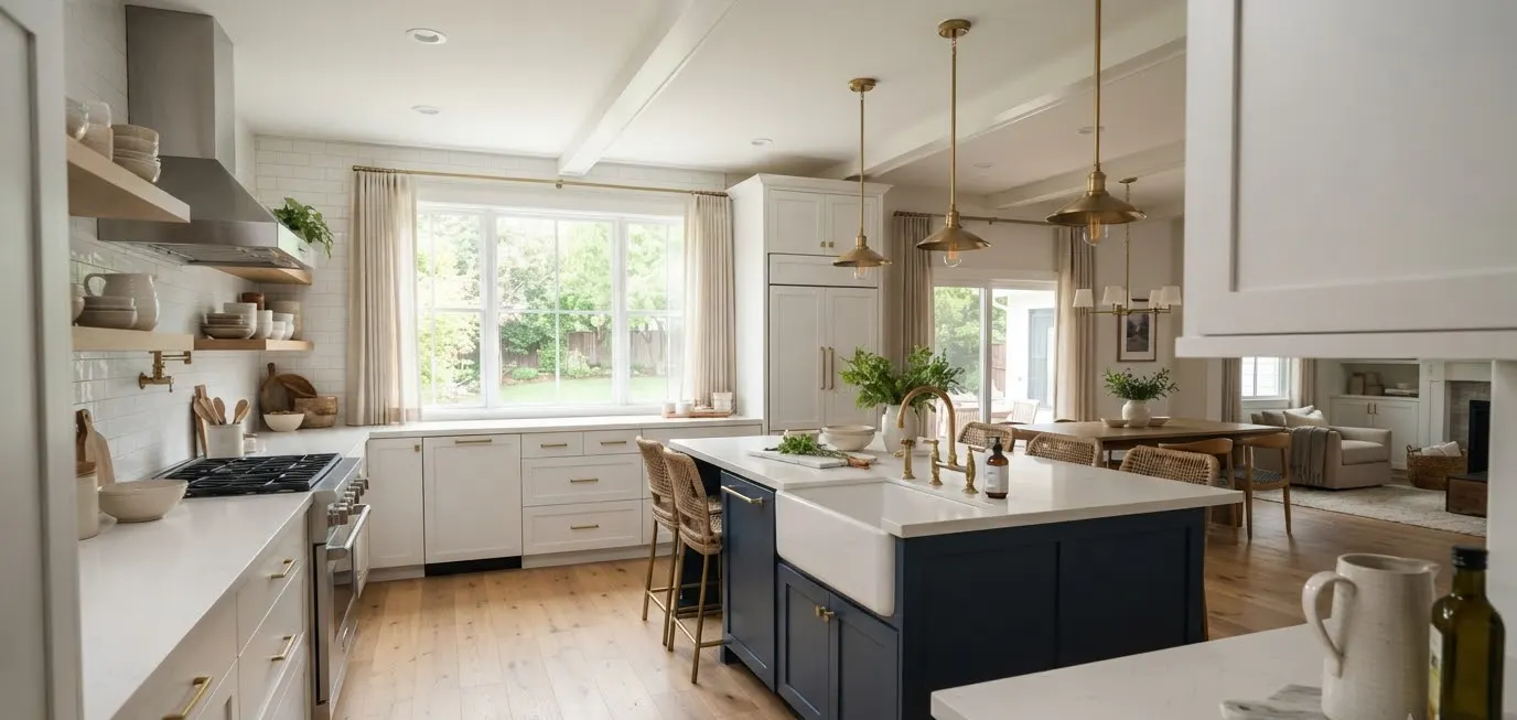
I redid my own kitchen island twice before I got it right. First time, I picked a color because it looked good on someone else’s Pinterest board.
Six months later I hated it. Lesson learned: what works in a photo doesn’t always work in your actual kitchen, with your actual light, at 7am on a Tuesday.
So this isn’t a generic roundup. It’s what I’d tell a friend who just pinned forty different islands and now feels more confused than when she started. If that’s you, welcome. Let’s fix that.
Why the island became the whole point of the kitchen

A decade ago, the island was just extra counter space. Now it’s the centerpiece.
It’s where guests gather, where kids do homework, where you eat cereal standing up because sitting at a table feels like too much commitment on a Wednesday.
That shift changed how people design them. Homeowners now treat the island as a piece of furniture, not just a workstation.
It gets its own color. Its own material. Its own seating plan. The rest of the cabinetry often plays a supporting role.
Farmhouse style leans into that. Think white or cream perimeter cabinets with a bolder island in the middle, doing all the visual heavy lifting.
It’s a formula, sure, but it’s a formula that works, and there’s no shame in using a formula that works.
Paint colors that actually hold up on a farmhouse island

Here’s where most people get stuck. There are a thousand shades of “greige” and they all look identical on a paint chip under fluorescent hardware-store lighting.
Pick wrong and you’re repainting in a year.
Navy blue is the color I see recommended most, and for good reason.
It reads as farmhouse without tipping into nautical, and it photographs beautifully against white shaker cabinets.
It’s also, according to recent Houzz survey data cited by usacabinetexpress’s farmhouse island guide, the most-requested island color right now.
Sage green and dusty blue come in right behind navy. Both feel softer, more cottage than farmhouse-industrial, and they’re forgiving in rooms that don’t get a ton of natural light.
I’ll be honest, I almost went sage on my second attempt and only backed off because my kitchen already had a lot of green outside the window. Redundant, IMO.

Warm greige is the safe pick, and safe isn’t a bad word here.
It’s what you choose when you’re not ready to commit to color but still want the island to stand apart from the perimeter cabinets.
One thing worth knowing: cool gray, the kind that dominated kitchens for years, has fallen out of favor.
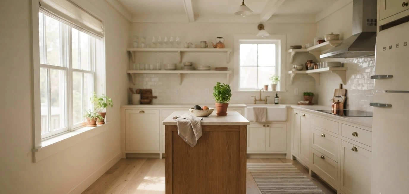
Designers have flagged it as dated. If you want neutral, lean warm, not cool.

Black or soot is the dramatic option. It’s not for everyone, but paired with brass hardware and a butcher block top, it looks intentional rather than heavy.
I’d only push someone toward black if their kitchen already gets good light. In a dim room it can swallow the space whole.

Here’s a quick reference so you’re not scrolling back through paragraphs later:
| Color | Best paired with | Light requirement |
|---|---|---|
| Navy blue | White shaker cabinets, brass hardware | Works in most light |
| Sage or dusty blue | Natural wood floors, matte finishes | Best with some natural light |
| Warm greige | Almost anything, very flexible | Any |
| Black or soot | Brass or black hardware, butcher block top | Needs strong light |
A quick word on finishes on the paint itself

Don’t skip the sheen conversation. A factory conversion-varnish or catalyzed-paint finish holds up for 15 to 20 years against the daily dings an island takes.
Site-painted MDF, on the other hand, starts showing wear within 3 years of normal use. If your budget allows it, spend the extra money on the finish, not just the color.
You’ll notice the difference the first time someone sets a hot pan down without a trivet.
Choosing the actual material for the island top
Color gets the attention, but the surface material is what you’ll live with every single day. This is where I think people rush the decision.
Butcher block is the classic farmhouse choice, and I get why. It’s warm, it’s forgiving, and it lets you cut directly on the surface if you seal it right.
It’s also the most budget-friendly option, running roughly $20 to $60 per square foot in materials, according to Bob Vila’s breakdown of butcher block pros and cons.
The catch: it needs real maintenance. Keep it dry, reseal it periodically, and accept that it will show its age in a way stone doesn’t.

Quartz is the low-maintenance answer. Non-porous, no sealing, wipes clean with soap and water.
It costs more, generally $50 to $100 or higher per square foot installed, but you’re paying for the ability to basically ignore it once it’s in.
If you cook a lot and don’t want a second chore added to your week, quartz wins.

Soapstone sits in an interesting middle ground. It’s naturally heat resistant, develops a patina over time that a lot of people find genuinely beautiful, and can last 50 to 100 years with basic care.
It’s softer than granite or quartz, so it will scratch, but those scratches sand out.
I’m a little biased toward soapstone for farmhouse kitchens specifically. It has a handmade quality that quartz just can’t fake.

A quick honest comparison, because everyone always asks:
- Want the coziest look and the lowest upfront cost? Butcher block.
- Want zero maintenance and don’t mind the higher price? Quartz.
- Want something with real character that ages well? Soapstone.
- Mixing materials? A lot of designers pair a butcher block island with quartz or granite perimeter counters. It creates contrast without going overboard, and it’s genuinely one of my favorite combinations to see done well.
Getting the base and hardware right

The countertop gets the credit, but the base is doing more visual work than people give it credit for.
Shaker-style doors are the backbone of farmhouse design. They’re clean, they photograph well, and they don’t fight with whatever’s happening above them.
A few things I’d actually pay attention to:
- Turned or fluted legs at the corners add character without looking fussy.
- Open shelving on one end of the island is a farmhouse staple, but only add it if you’ll actually keep it tidy. An open shelf with clutter looks worse than no open shelf at all. Ask me how I know.
- Hardware finish should tie back to your faucet and lighting. Mixing brass and black can work, but it needs to feel deliberate, not accidental.
- An apron-front sink, if your layout allows it, reinforces the farmhouse look more than almost any other single choice.
Seating layouts that people actually use

This is the part everyone gets wrong, and it’s the part that actually matters for daily life. A gorgeous island with seating nobody uses is just an expensive place to stack mail.
Counter height versus bar height
Standard counter height is 36 inches, which pairs with 24 to 26 inch stools.
Bar height runs 42 inches, paired with taller 28 to 30 inch stools. Counter height feels more like sitting at a normal table.
Bar height creates a clearer visual break between the kitchen and dining space, which some people love and others find a little too much like a restaurant.
The overhang is non-negotiable
This is the detail that ruins otherwise perfect islands. For counter-height seating, you need a minimum of 12 to 15 inches of overhang for comfortable knee clearance.
According to This Old House’s guide to sizing a kitchen island, anything less and people end up sitting sideways or just not sitting at all.
For bar-height counters, 12 inches is generally the workable minimum, per Angi’s overhang guide for countertop seating.
Ever seen a beautiful island where nobody ever sits at the stools? Nine times out of ten, it’s the overhang.
Too shallow, and knees hit the cabinet front. People notice fast, even if they can’t articulate why the seat feels wrong.
How much edge space per person
Give each stool about 20 to 22 inches of edge, with roughly 20 cm (about 8 inches) of clear space at each end so nobody’s elbow-to-elbow with the wall or the range.
Skimping here is how you end up with a seating plan that photographs fine but functions terribly.
One-sided, wraparound, or waterfall
- One-sided seating is the most common and the easiest to plan around a working kitchen triangle.
- Wraparound (L-shaped) seating works well for bigger families who need more than three seats.
- Waterfall edges, where the countertop drops straight down the side instead of stopping at the top, look incredible but need real structural support and a bigger budget. Worth it if you can swing it. Genuinely one of the more dramatic upgrades you can make to an island.
Small kitchen islands still get to have opinions

Not everyone has room for a 10-foot island with wraparound seating, and that’s fine. A smaller island can still carry the farmhouse look.
Stick to two seats instead of four, choose a lighter paint color to keep the room feeling open, and skip the waterfall edge in favor of a simple overhang.
A narrow island with two counter stools does more for a small kitchen than an oversized one crammed in to match a photo online.
Mistakes I keep seeing on Pinterest boards

A few patterns show up again and again, and they’re worth naming so you can avoid them:
- Choosing a color from a photo, not a swatch in your own kitchen. Lighting changes everything. Test the actual paint before committing.
- Skipping the overhang math. A stunning island with unusable seating is a design failure, not a design win.
- Matching every finish exactly. A little contrast (wood against stone, brass against black) reads as intentional. Perfect matching often reads as flat.
- Forgetting storage. An island that’s just a pretty box wastes an opportunity. Deep drawers and pull-out shelves matter more once the excitement of the paint color wears off.

Frequently asked questions
What’s the most popular kitchen island color for a modern farmhouse look right now? Navy blue currently leads, with sage green, dusty blue, and warm greige close behind.
Cool gray has fallen out of favor and is generally considered dated for this style.
How much overhang do I actually need for island seating? Plan for 12 to 15 inches at counter height and around 12 inches at bar height. Less than that, and knee clearance becomes a real problem.
Is butcher block or quartz better for a farmhouse island? It depends on your priorities. Butcher block costs less and looks more traditionally farmhouse, but needs regular sealing.
Quartz costs more upfront but needs almost no maintenance. Plenty of homeowners split the difference by putting butcher block on the island and quartz on the perimeter counters.
Final thought
An island is one of the few kitchen features you’ll touch, lean on, and sit at every single day, so it deserves more thought than a quick scroll through inspiration photos.
Pick a color you’ll still like in five years, choose a material that matches how you actually cook, and get the overhang right so the seats don’t just sit there for show.
What’s holding your island plan back right now: the color, the material, or figuring out seating that actually works for your space?
Drop it in the comments. I read every one, and I’ve probably made the same mistake you’re about to make.



1 thought on “Modern Farmhouse Kitchen Island Inspiration: Colors, Finishes, and Seating Layouts”