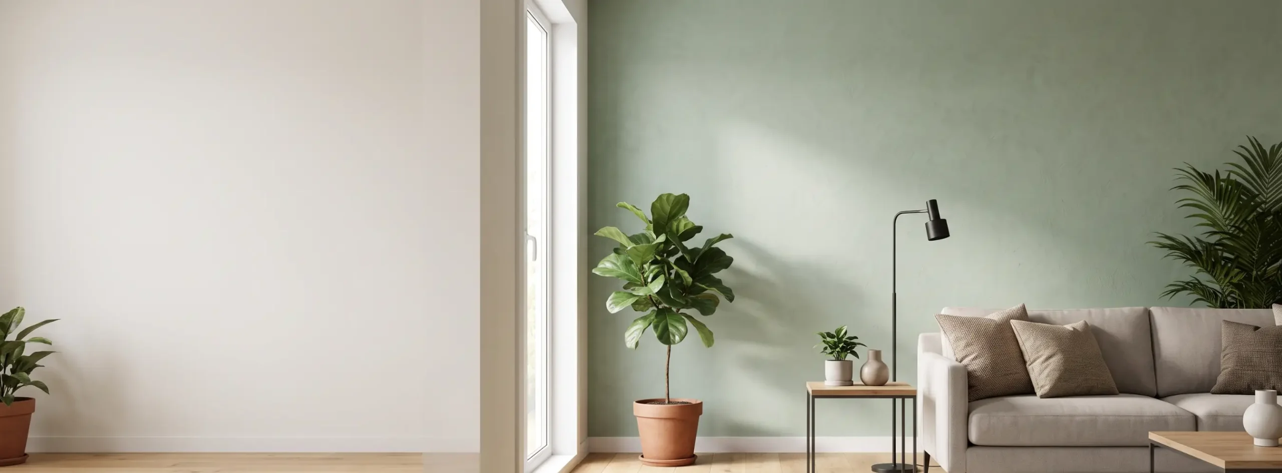
You want a living room that looks finished without screaming for attention. I get it. I spent two years staring at a plain beige wall, scrolling Pinterest at midnight, and pinning 400 rooms I never copied.
Then I tried a subtle accent wall, and the whole room finally made sense. No neon teal, no black geometric stripes.
Just one wall with a little more depth, a little more warmth, and a texture you want to touch.
This guide covers everything I learned the slow, slightly expensive way.
You’ll find color pairings, texture options, placement tips, lighting advice, and the mistakes I’d happily save you from.
What a subtle accent wall actually means
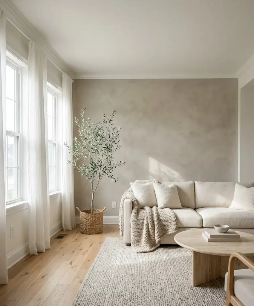
A subtle accent wall is one wall that gets a different treatment from the other three, using colors and materials close enough to the rest of the room that your eye reads it as depth, not drama.
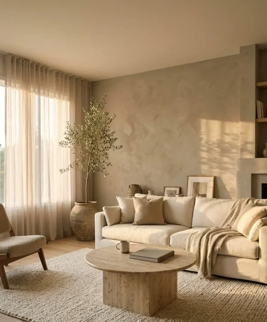
Think warm greige against soft white. Think oatmeal limewash behind a cream sofa.
The goal is a room that feels layered. Guests might not say “nice accent wall.”
They’ll say “this room feels so calm,” and you’ll nod like you planned it (you did).
How it differs from a bold feature wall
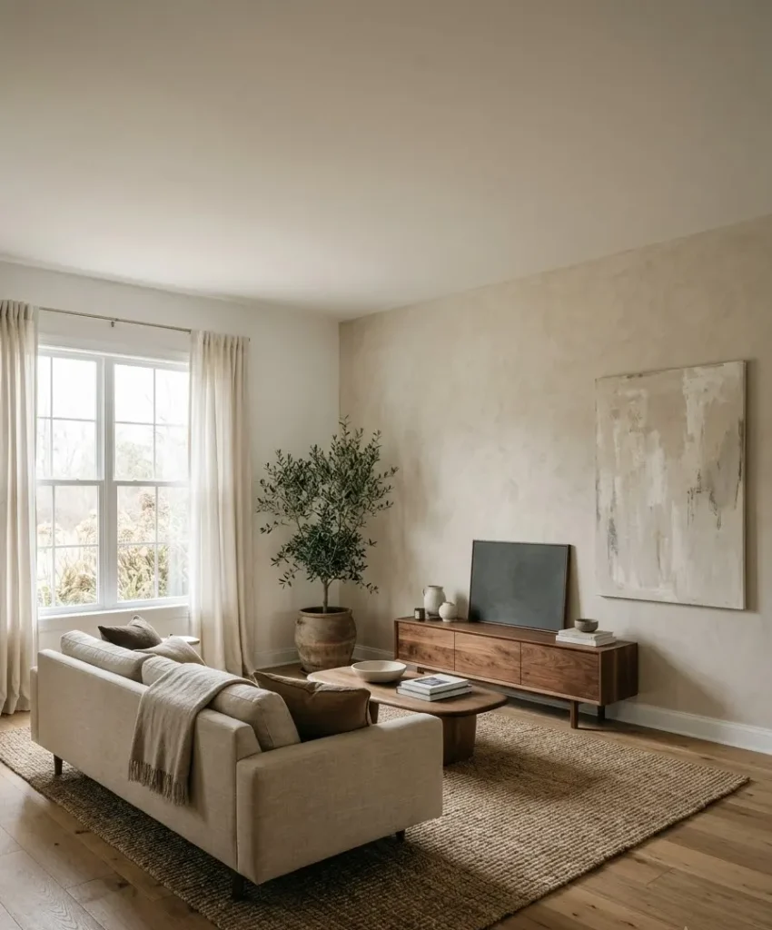
A bold feature wall grabs attention in the first second. A subtle one rewards attention in the tenth.
Both have a place, but the subtle version ages better, photographs softer, and survives your changing taste.
I painted a deep green wall in a rental once. By month eight, I hated how it dominated every photo I took.
The neutral textured wall I did later still looks good after three years.
Who this style suits
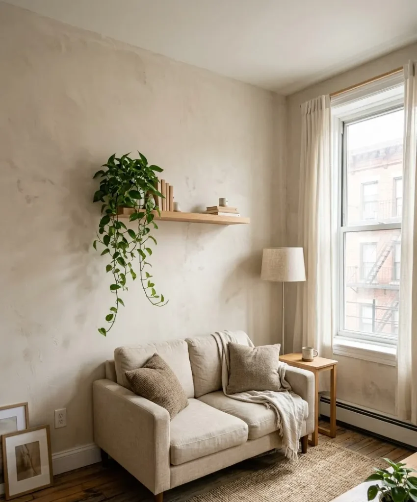
- Renters who want change without a fight over the deposit
- Small living rooms where dark colors shrink the space
- Anyone who loves Pinterest minimalism but wants some warmth
- People who change their minds often, because neutrals swap easily
Why neutral colors work so well
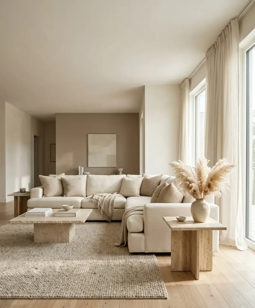
Neutral colors give you a stable base, and your furniture, art, and plants do the talking on top of it.
They also bounce light around, which matters if your living room faces north like mine does.
Here’s the part many people skip. Neutrals only look calm when you match their undertones.
A cool gray wall next to a yellow-cream sofa looks like a mistake, and your brain notices even if you can’t say why.
Understanding undertones
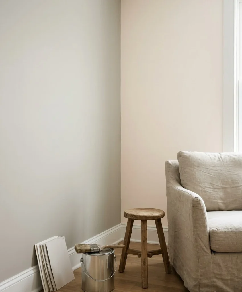
Every neutral leans warm, cool, or somewhere in the middle. Warm neutrals carry yellow, red, or peach.
Cool neutrals carry blue, green, or purple. Hold a white paper sample against your paint chip, and the undertone jumps out immediately.
Ever wondered why two “white” walls look so different in the same room? Undertones.
I tested six whites on my wall before one finally stopped looking pink at 5 PM.
Matching undertones to your light
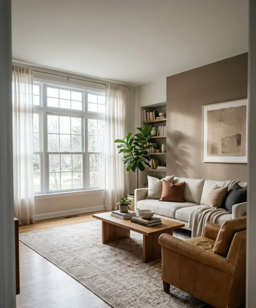
North-facing rooms get cool, flat light, so warm neutrals usually fix the chill.
South-facing rooms get warm light all day, so you can handle cooler tones without the room feeling icy.
East and west rooms swing between the two, which means you must test samples in the morning and evening.
Paint brands like Benjamin Moore and Sherwin-Williams sell sample pots, and I recommend buying three. Paint a large swatch on two different walls, then live with them for a few days.
Choosing your neutral palette
Picking a palette feels overwhelming because every brand sells 40 versions of beige.
I narrow it down by choosing one main neutral, one slightly deeper neutral for the accent wall, and one natural material to tie them together.
This table shows four combinations I’ve used or seen work well in real homes.
| Palette | Wall color | Texture pairing | Best for |
|---|---|---|---|
| Warm greige | Soft taupe | Limewash | North-facing rooms |
| Creamy white | Warm ivory | Plaster finish | Small spaces |
| Sandy beige | Light oatmeal | Grasscloth | Cozy, lived-in rooms |
| Soft mushroom | Muted clay-gray | Wood slats | Modern layouts |
My personal favorite
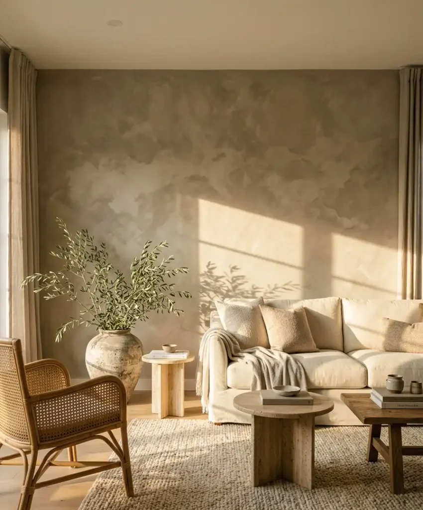
I lean toward warm greige with a limewash finish. It reads as neutral on camera, yet it shifts through the day like a real surface, not flat paint.
IMO, that movement is the secret behind most of those pinned rooms that look expensive.
A quick note on whites
Pure bright white often looks sterile on an accent wall. A white with a drop of cream or stone in it feels softer, and it plays nicely with wood and linen.
Farrow and Ball’s color library shows how many shades of “almost white” exist, and it’s a fun rabbit hole if you have an hour.
Natural textures that make a neutral wall interesting
Color alone can look flat in photos. Texture adds shadow, and shadow adds depth.
When you keep the palette quiet, texture becomes the star without making noise.
I’ll walk through the options I know best, with honest opinions on each one.
Limewash paint
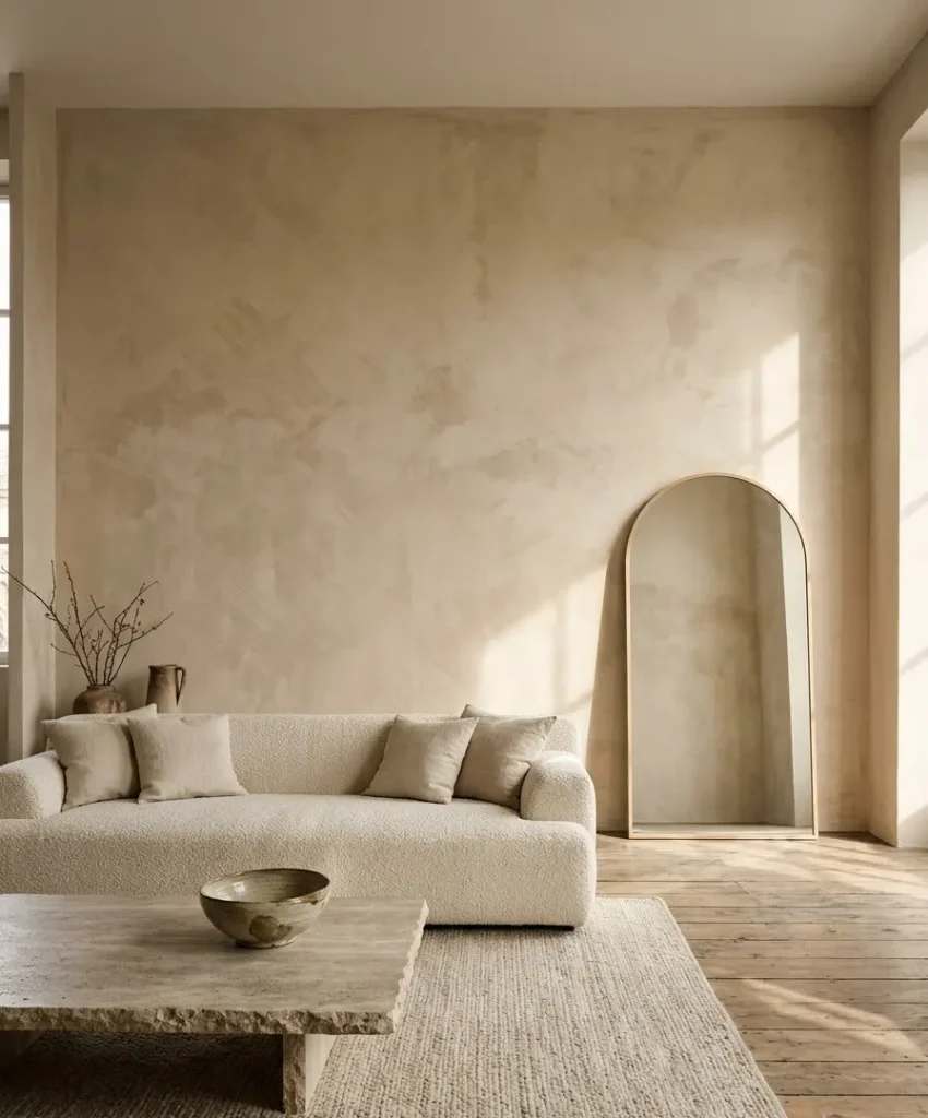
Limewash gives walls a cloudy, soft-edged look, a bit like an old Italian villa. It costs more than standard paint, and the application takes practice.
You brush it on in crisscross strokes, and the uneven finish is the whole point.
My first attempt looked patchy for about ten minutes. Then it dried, and the patchiness turned into depth.
Limewash forgives mistakes better than almost any other finish.
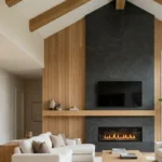
Wood slat panels
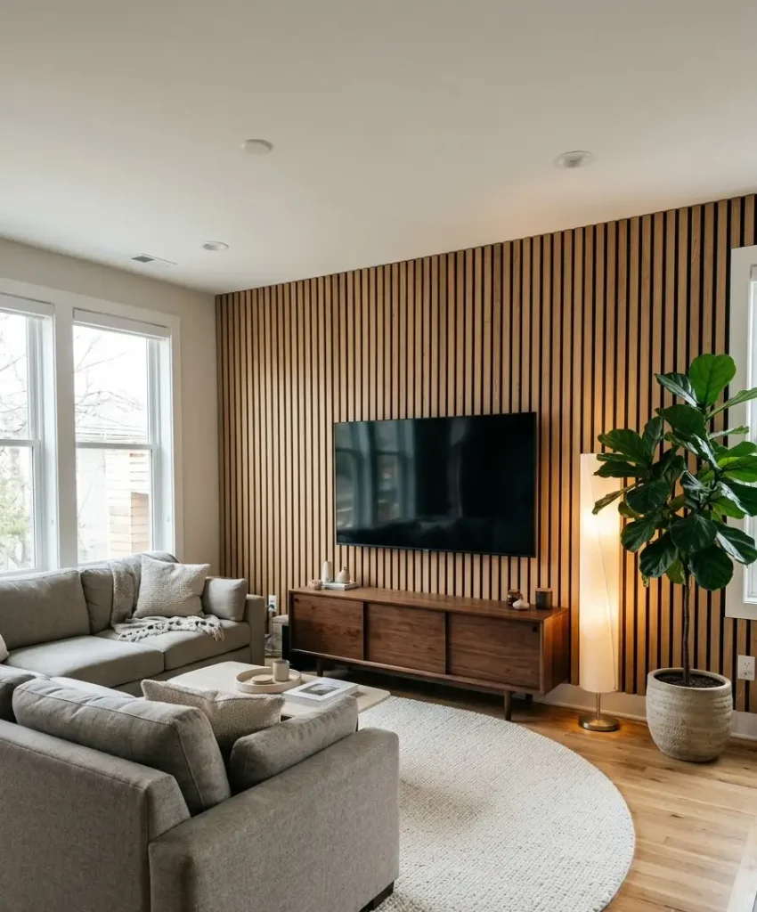
Vertical wood slats bring warmth and a modern edge at the same time.
Oak and walnut veneers dominate Pinterest, and I understand why. They look great behind a TV or a sofa.
Slat panels cost more than paint, but many come as ready-made sheets on felt backing, so you can install them in a weekend.
Keep the wood tone close to your floor or your coffee table for harmony. Mixing three wood tones usually turns messy, so I stick to two.
Venetian plaster and microcement
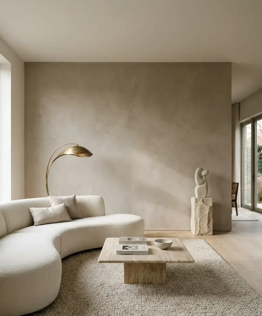
These finishes create a smooth, slightly glossy surface with soft movement. They look refined, and they photograph beautifully.
They also demand skill, so I’d hire a pro unless you enjoy risky weekend projects.
If your budget is tight, plaster-effect paint mimics the look for a fraction of the price. It won’t fool a design nerd up close, but from the sofa it looks great.
Textured wallpaper and grasscloth
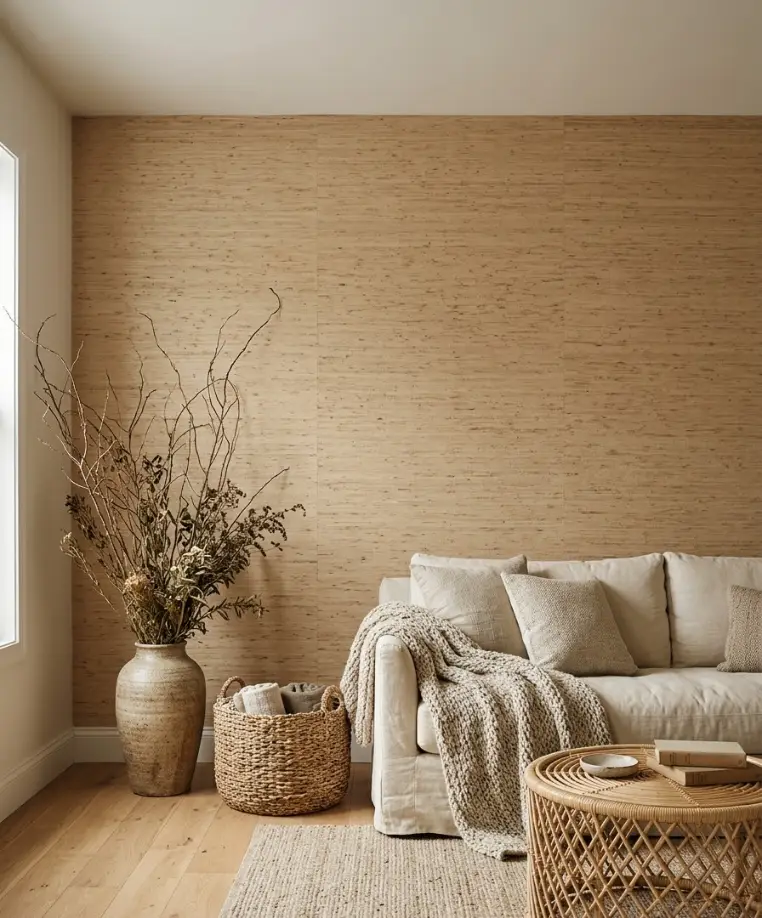
Grasscloth is woven from natural fibers, and it adds a quiet, tactile pattern with no print at all.
Seams show a little, and some people love that. I do, but my sister thinks it looks like a mistake.
Peel-and-stick versions give renters a way in. Real grasscloth stains easily, so skip it near a spot where kids toss juice boxes.
Exposed brick or stone
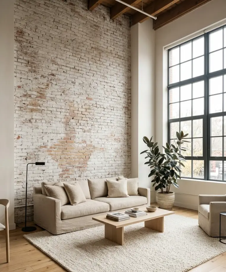
If you already have brick, whitewash it or leave it raw. A thin stone veneer gives a similar look when you don’t have the real thing.
Both bring heavy texture, so keep the rest of the room soft and simple.
Board and batten, or shallow paneling
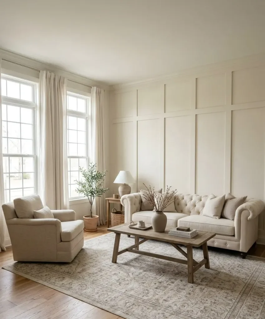
Paneling gives you texture through shape, not material. Paint it the same neutral as the wall, and shadows do the rest.
This option suits traditional homes and fits the “quiet luxury” mood that Pinterest keeps pushing.
A quick, slightly off-topic thought
My neighbor repaints her front door every spring, and I always wonder how she finds the time.
I can barely remember to water my pothos. Anyway, that habit taught me something useful: small, repeatable changes beat big, dramatic ones.
A subtle accent wall works the same way, because you can refresh it in an afternoon.
Choosing the right wall
Picking the wrong wall ruins the effect faster than picking the wrong color.
You want the wall your eye hits first when you walk into the room, usually the one behind the sofa or the one with the fireplace.
The wall behind your sofa
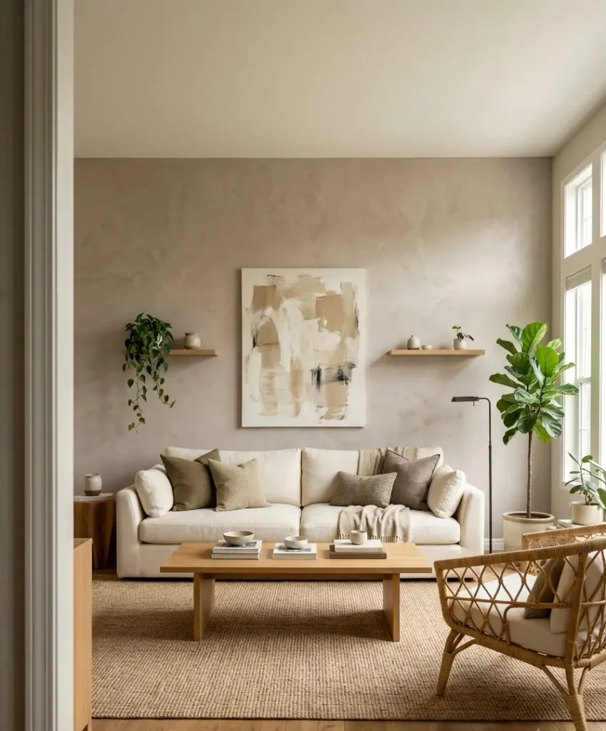
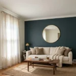
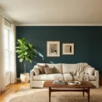
This is the safe pick. It frames the main seating area, and you look at it from the entry, the dining table, and the kitchen. It also gives you a big surface for art, shelves, or a mirror.
The fireplace wall
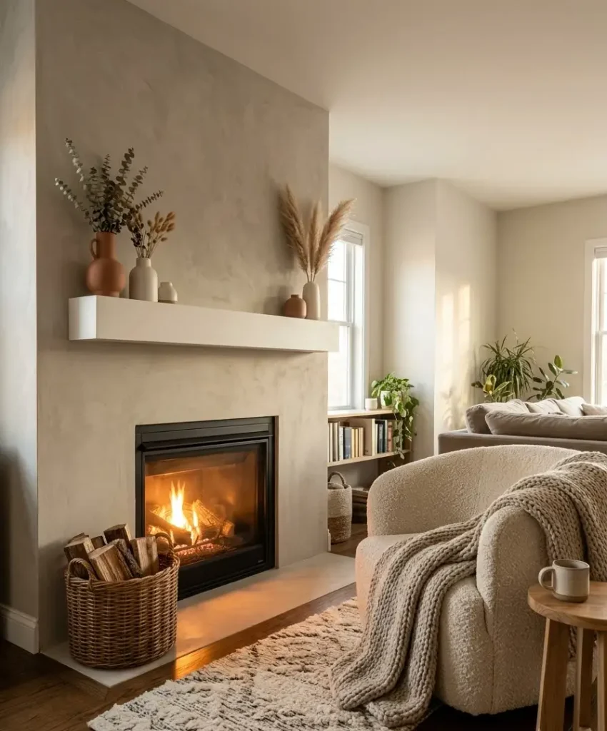
A fireplace already acts as a focal point, so a textured finish around it feels natural.
Limewash and plaster look especially good here, since they give the hearth a soft, aged look.
The TV wall
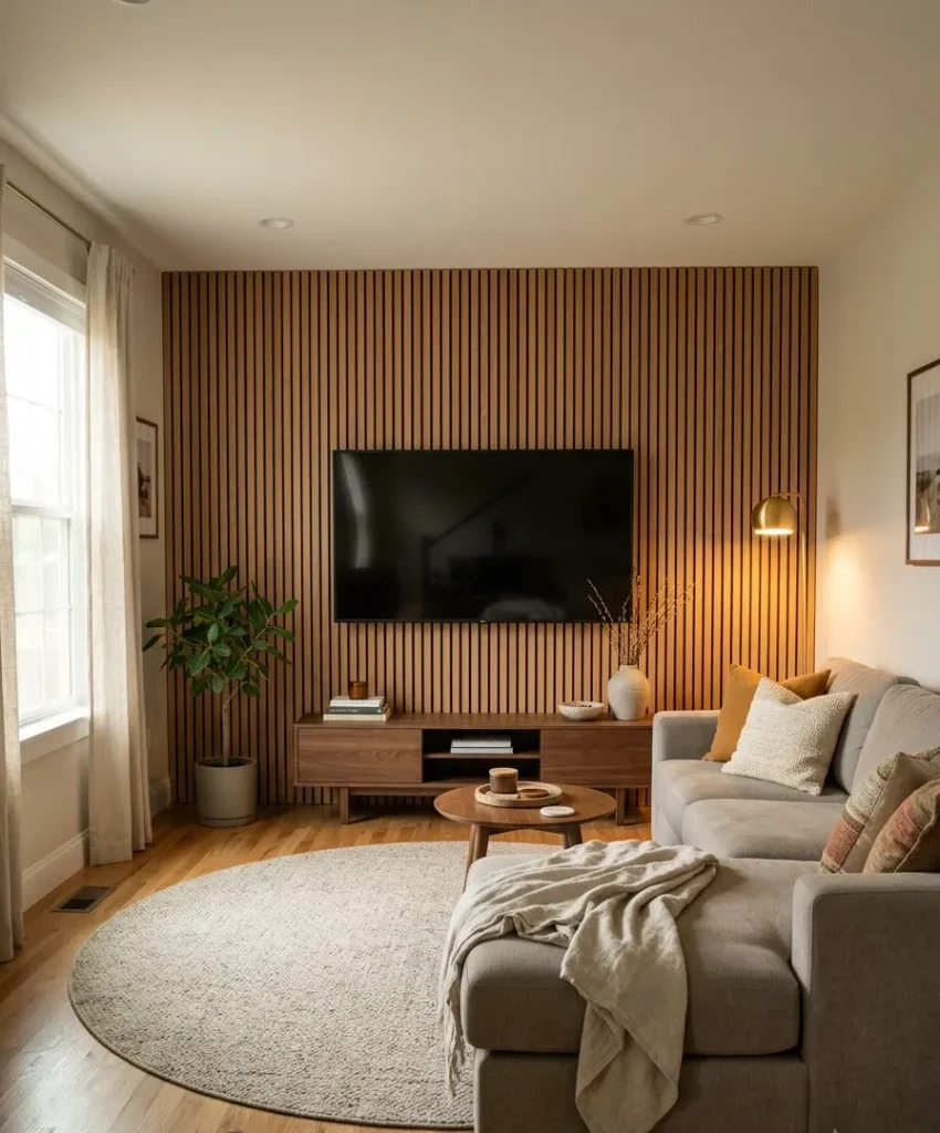
I have mixed feelings about this one. Slat panels hide wires and soften a black screen, which I love. But a heavily textured wall behind a TV can feel busy, so I keep the texture quiet.
Walls to avoid
- Walls broken up by several doors or windows, because the texture gets chopped into small pieces
- The wall you rarely see, since you waste effort and budget
- A wall with a radiator or awkward vents, unless you plan around it
Layering the rest of the room
A subtle accent wall needs supporting players. Without them, the wall looks like a single decision in a room that forgot to finish the sentence.
I follow a simple approach: repeat one texture from the accent wall elsewhere in the room, and add one contrast.
If the wall is limewash, I bring in a linen sofa and a rattan chair. The repeat ties everything together, and the contrast keeps it from going bland.
Fabrics that play well with natural walls
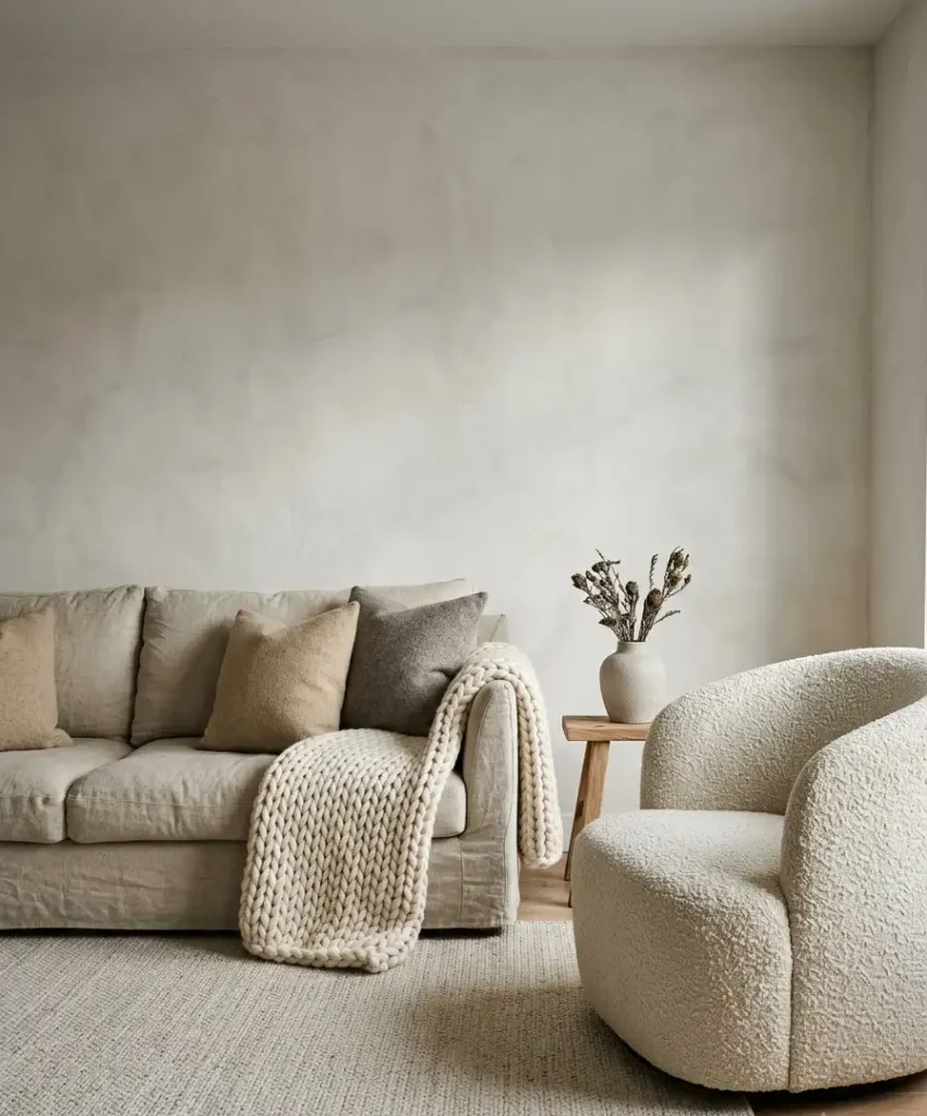
Linen, wool, bouclé, and cotton all suit this style. Chunky knit throws add comfort, and they photograph well too.
I skip shiny polyester in this setup because it fights the matte, natural mood.
Furniture and shapes
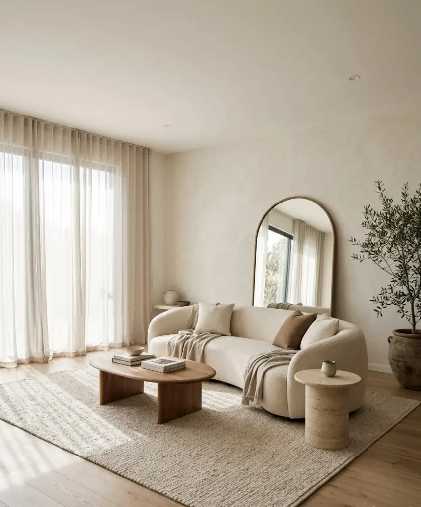
Rounded shapes soften a room full of straight lines. A curved sofa, an oval coffee table, or an arched mirror breaks up the grid.
In my own living room, a round travertine side table did more for the vibe than any paint.
Plants and greenery
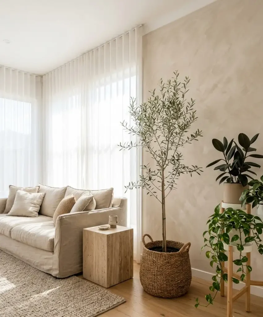
Plants add a living color that neutrals need. One tall plant, like an olive tree or a rubber plant, stands in front of the accent wall and gives it scale.
Dried pampas or eucalyptus stems work when your light is bad (mine is, hence my fake olive branch, and I stand by it).
Art and decor
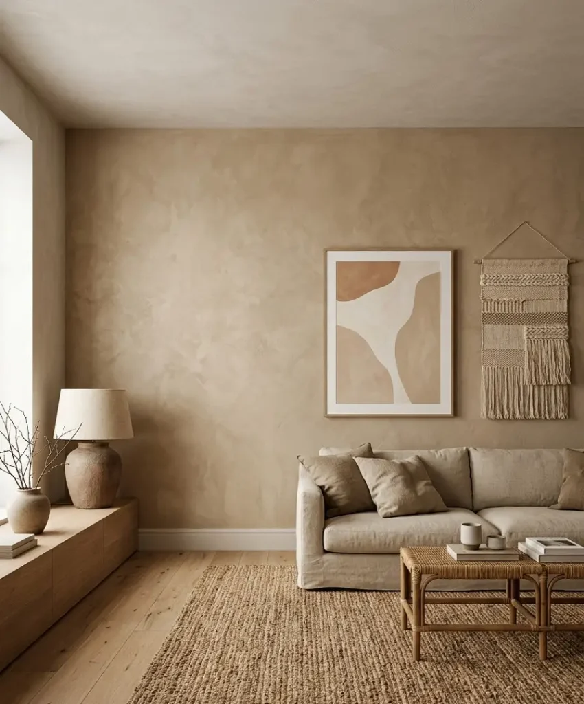
Pick art with soft edges and earthy tones. Large abstract prints, black-and-white photography, and woven wall hangings all sit comfortably on textured walls.
Leave some blank space, because a crowded gallery wall fights the subtle look you’re building.
Lighting makes or breaks the texture
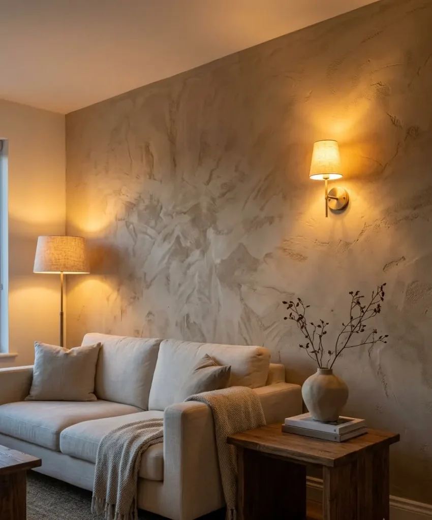
Texture needs side light to show up. If you shine a flat overhead bulb straight at a textured wall, you wash the depth out.
If you angle light across it, every ripple and slat throws a shadow.
I learned this after installing slats and thinking they looked boring. Then I moved a floor lamp to the side, and wow, the whole wall came alive.
Practical lighting tips
- Use warm bulbs around 2700K for a cozy, natural glow
- Place a floor lamp or sconce a few feet from the wall so light rakes across the surface
- Try a picture light or LED strip to graze the wall from above
- Avoid harsh spotlights that flatten the finish
Ever notice how your favorite cafe looks perfect at 4 PM? Low, warm, side light does that. Copy it.
Comparing the main options: cost, effort, and look
People always ask me which finish to pick. I can’t give one answer, because it depends on your budget, your skills, and how long you’ll stay in the space.
Here’s how I’d rank the common options from my own experience and from friends who tried them.
Paint-based finishes
Limewash and plaster-effect paint cost the least, and you can do them yourself. They suit renters who have permission to paint, and they look good in photos. Expect a weekend of work and some sore shoulders.
Panel-based finishes
Wood slats and paneling cost more and take planning, but they last for years. They also hide uneven walls, which helps in older homes. I’d pick slats if I planned to stay five years or more.
Wallpaper-based finishes
Grasscloth and textured wallpaper sit in the middle on price. Installation needs patience, and I’d hire a pro for real grasscloth. Peel-and-stick versions give renters a low-risk way to test the look.
My honest ranking
- Limewash, for the best look per dollar
- Wood slats, for the best texture and function
- Textured wallpaper, for the easiest swap
- Venetian plaster, which I love but can’t recommend to beginners
Your list might look different, and that’s fine. Opinions on textures get weirdly personal.
Styling and photographing for Pinterest
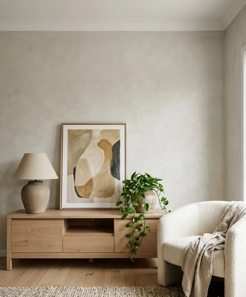
Pinterest rewards images that feel calm, bright, and tall. If you plan to pin your own room, or if you just want your space to look good on your phone, a few small habits help a lot.
Shoot in the right light
Natural daylight gives the softest, most flattering result. I shoot in the late morning, with the curtains open and the lamps off. Overhead lights add yellow cast and harsh shadows.
Pick vertical angles
Pinterest favors vertical images, around a 2:3 ratio. Stand in a corner, hold your phone upright, and include the floor and a bit of ceiling.
This shows the accent wall in context, and it fits the feed format.
Style the vignette
Keep the setup simple: a sofa or console, one plant, one lamp, and one piece of art. Odd numbers of objects look natural. Tidy up the cables, the remote, and the random mail pile (we all have one).
Use descriptive titles and alt text
When you pin, write a clear description with natural keywords, such as “neutral living room accent wall with limewash texture.
” Pinterest’s own business guidelines explain how descriptions and board names help people find your pins. Short, plain language works better than clever puns.
Mistakes I made so you don’t have to
I’ve made most of the classic errors. Some cost money, and some just cost pride.
Skipping the sample
I once bought a full gallon of a “warm gray” without testing it. It looked purple in my room. I repainted. Don’t repeat that.
Overdoing the texture
My first plan included slats, grasscloth, and a plaster fireplace in one room. It looked like a showroom with an identity crisis. Pick one hero texture and let the others stay quiet.
Ignoring the floor
A beautiful wall sits awkwardly above a floor with the wrong undertone. Check your flooring color before you pick the wall. If your floor leans orange, choose warmer neutrals, and if it leans gray, lean cooler.
Forgetting about maintenance
Textured walls collect dust, and grasscloth resists scrubbing. I now use a soft brush attachment on my vacuum for the slats. Easy, but I ignored it for months, and it showed.
Matching everything too perfectly
When every item matches exactly, the room feels flat. Vary the shades a little, like cream with oatmeal and a touch of stone.
Subtle variety makes a neutral room feel alive.
A simple step-by-step plan
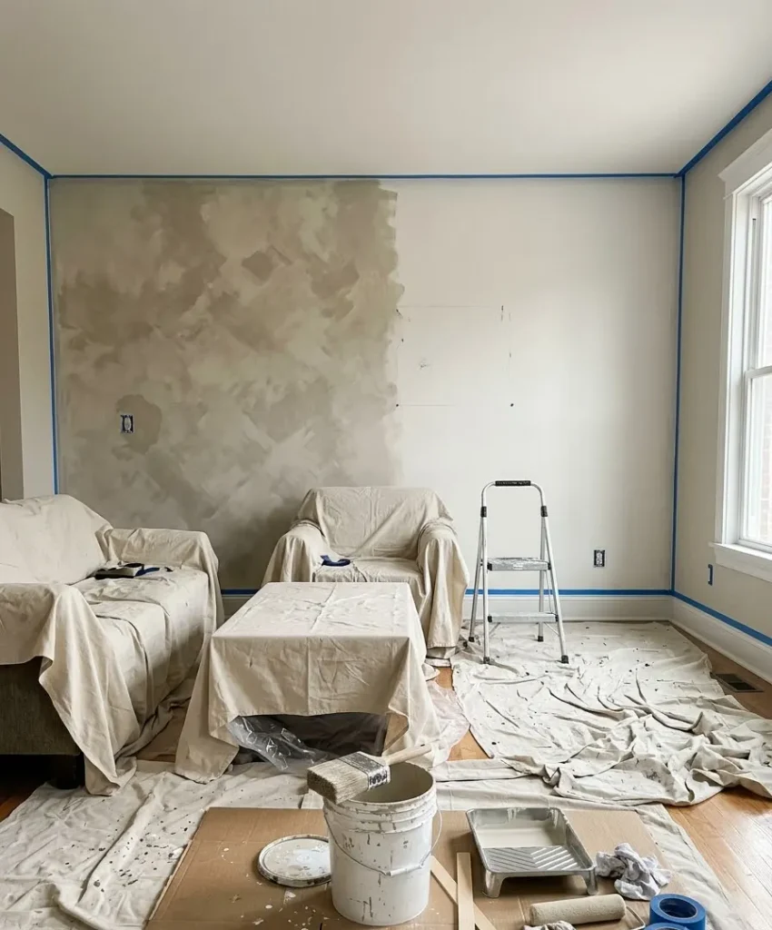
If you want to start this weekend, here’s the order I’d follow.
- Pick your wall by finding the spot your eye lands on first.
- Test three samples on two walls, and check them morning and evening.
- Choose one texture that fits your budget and skill level.
- Prep the wall with cleaning, patching, and priming, since skipping this ruins the finish.
- Apply the finish in thin layers, and let each one dry.
- Adjust the lighting so it grazes the surface.
- Style the space with one plant, one piece of art, and a couple of natural fabrics.
Take your time with step 2. It saves the most money and regret.
Frequently asked questions
Can a subtle accent wall work in a small living room?
Yes, and it often works better than in a large one. Light neutrals keep the room open, and a soft texture adds depth without adding clutter. I’d stay in the same color family as the other walls and let texture do the work.
What neutral colors look best with natural wood furniture?
Warm whites, soft greige, and sandy beige all pair well with oak, walnut, and pine. Match the undertone of the wood to the wall, so a yellow-toned oak sits better with cream than with cool gray. Always test the sample next to your actual furniture.
Is a textured accent wall suitable for renters?
It can be. Peel-and-stick textured wallpaper and removable wood slat panels let you try the look without permanent changes. Check your lease first, and ask your landlord if you want to paint.
Final thoughts
A subtle accent wall proves that you don’t need a loud color to make a room feel special.
A quiet neutral, one natural texture, good side lighting, and a few thoughtful pieces give you a living room that looks calm in photos and feels better in person.
Start small, test your samples, and trust your eye. And if your first attempt looks a bit patchy, give it ten minutes to dry before you panic (I speak from experience).
So which wall in your living room keeps catching your eye? Tell me which texture you’re leaning toward, and save this guide to your Pinterest board so you can come back to it when the paint cans come out.
1 thought on “Subtle Accent Wall Living Room Ideas With Neutral Colors and Natural Textures”