I redecorate for fall every single year, and every single year I make the same mistake. I buy too many pumpkins.
Actual pumpkins, ceramic pumpkins, velvet pumpkins shaped like pumpkins pretending to be pillows.
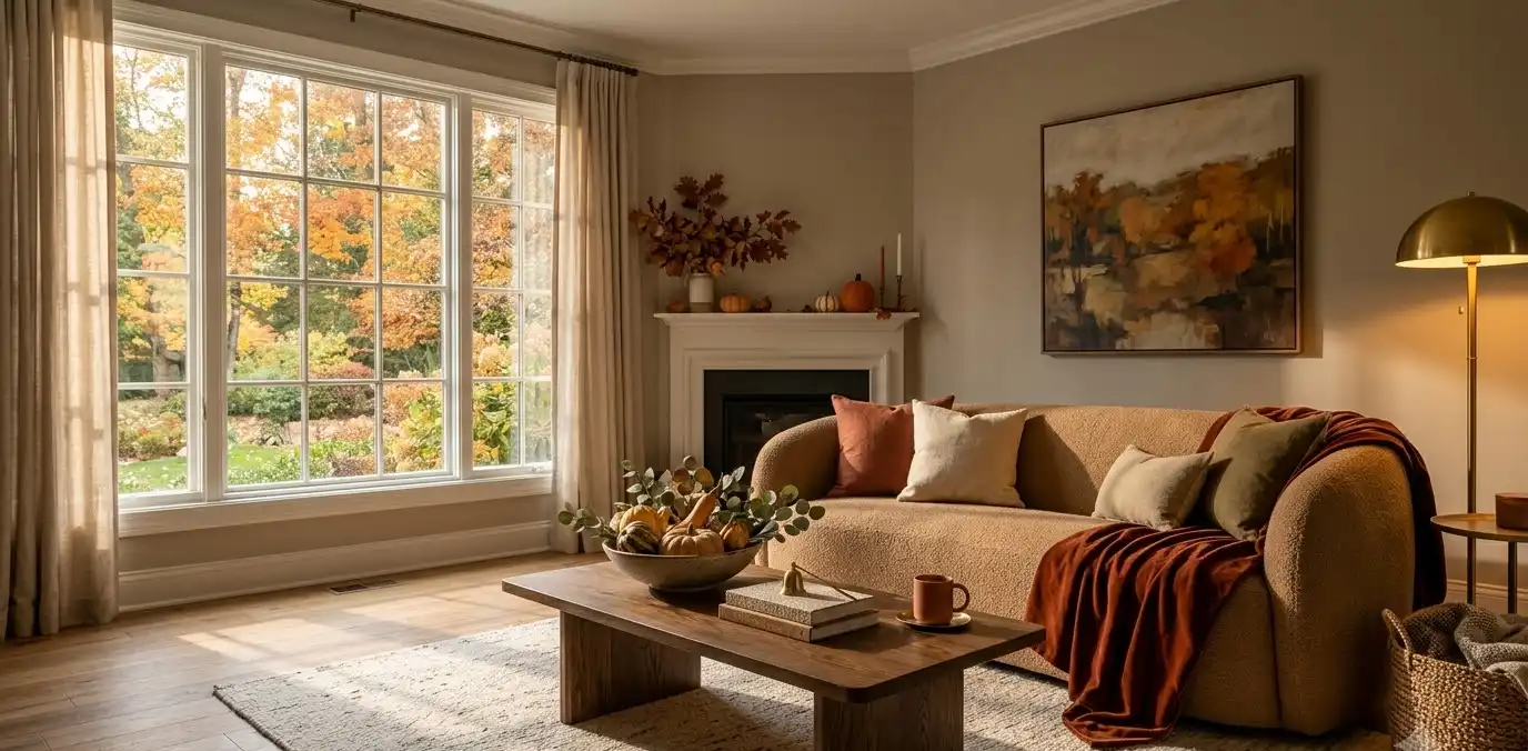
My living room turns into a patch. So this year I stripped it back and went for something that actually looks expensive instead of seasonal-aisle-at-Target expensive.
That’s what this whole guide is about: fall decor that reads elegant first, cozy second, and “I bought everything on sale” never.
If you’re pinning ideas for a living room refresh, a cozy bedroom corner, or just want your entryway to stop looking sad every October, stick around.
I’m sharing what actually works, what I regret buying, and a few pieces worth the splurge.
Start with a palette, not a theme
Most fall decor fails because people decorate around a season instead of a color story.
Orange and brown everywhere doesn’t say “luxury.” It says “craft fair.”
Here’s what actually works for an elevated fall look:
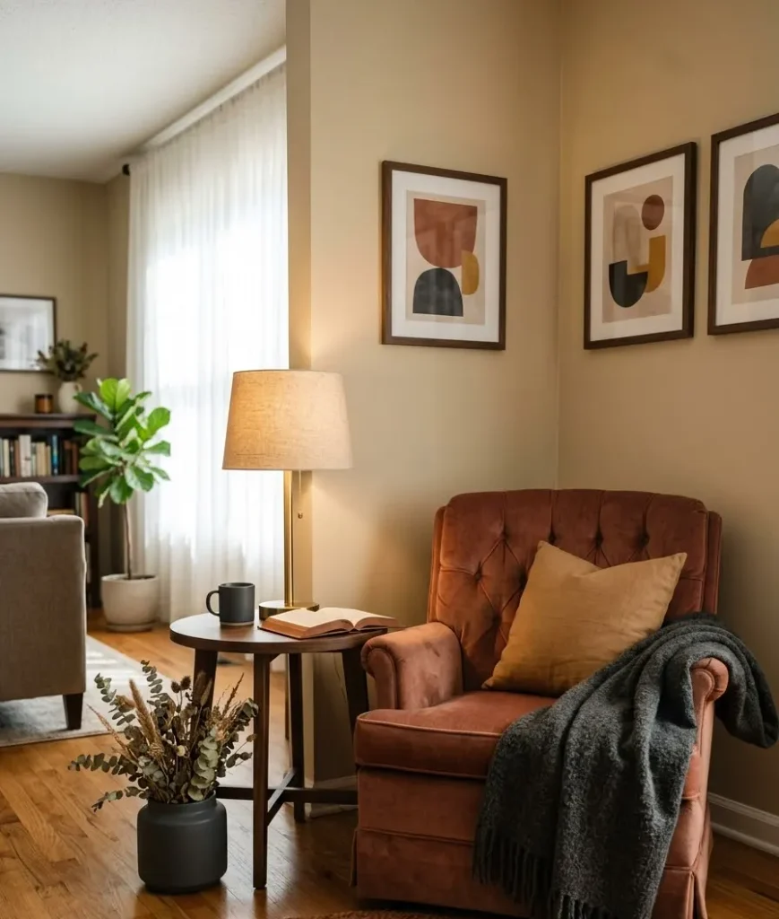
- Deep terracotta and rust instead of bright pumpkin orange
- Warm camel and caramel tones on textiles and furniture
- Charcoal or espresso brown as an anchor, not just an accent
- Muted gold or brass metallics for a warm glow without going full glam
I learned this the hard way after a Pinterest binge left me with a mantel that looked like a candy corn display.
IMO, the fix is simple: pick 3 colors max and repeat them across the room instead of scattering 8 different shades everywhere.
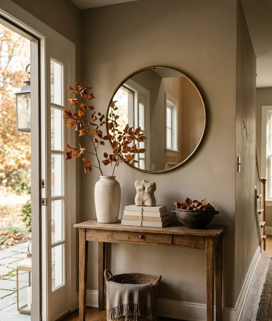
A quick palette cheat sheet
| Room feel | Base color | Accent color | Metal finish |
|---|---|---|---|
| Cozy living room | Camel | Deep rust | Brushed brass |
| Elegant dining room | Espresso brown | Burgundy | Antique gold |
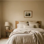
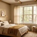
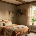
| Warm bedroom | Warm ivory | Terracotta | Matte black |
| Entryway | Charcoal | Mustard | Aged bronze |
Keep that table pinned to your phone while you shop. It saves you from buying a rug that clashes with everything else in the room.
Texture is the real luxury signal
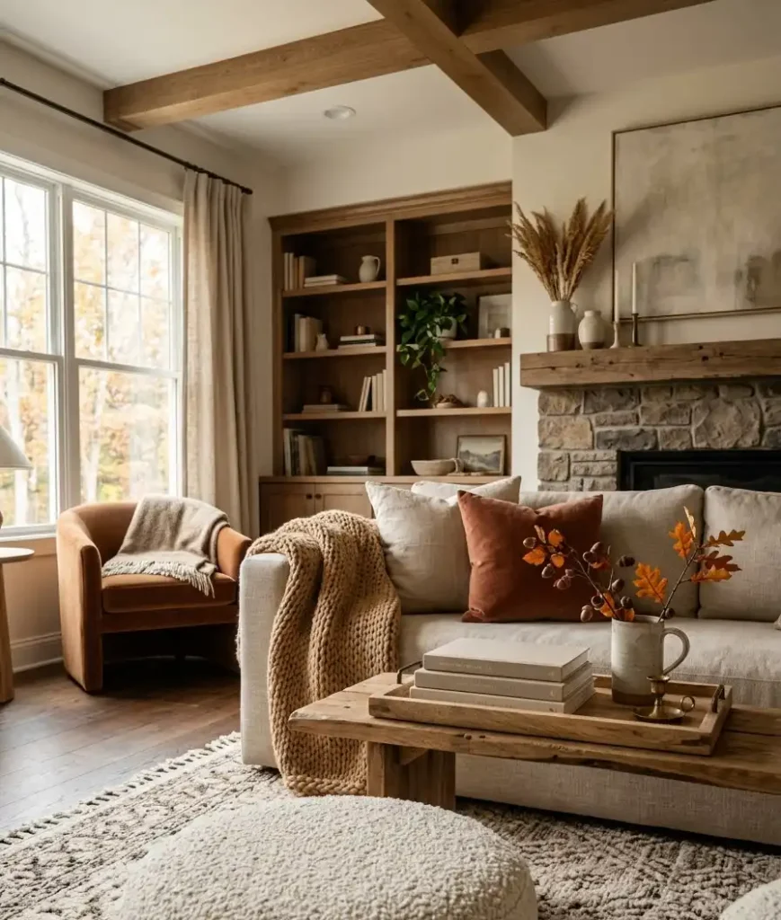
Ever wondered why some rooms look expensive even with basic furniture? It’s almost never about price. It’s texture.
A room with flat, matching finishes looks like a hotel lobby from 2009.
A room with mixed textures, boucle, velvet, raw wood, wool, looks curated even if half of it came from a discount bin.
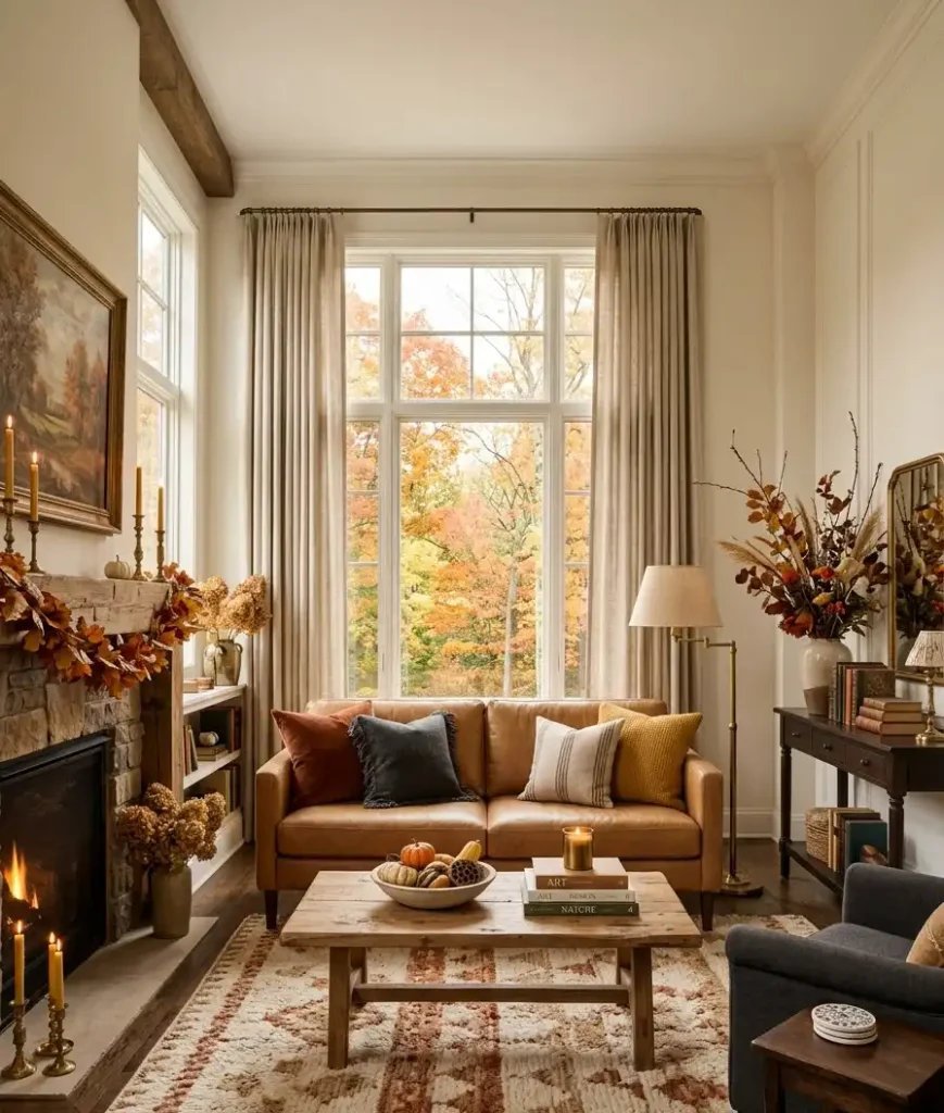
For fall specifically, layer in:
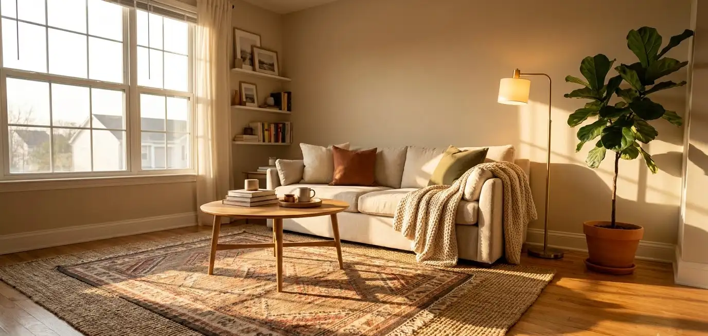
- Chunky knit throws draped over the arm of a sofa, not folded flat
- Velvet or boucle accent pillows in your base tone
- Raw wood bowls or trays on coffee tables for organic contrast
- Wool area rugs with visible texture, not flat weave
I bought a boucle ottoman two years ago thinking it would look trendy for a season and then get boring.
It’s still my favorite piece in the house. Sometimes the “trendy” purchase is actually the good one.
Lighting changes everything, and it’s the cheapest luxury upgrade
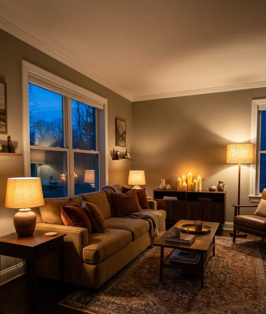
If you only do one thing from this article, do this one.
Swap your bulbs to warm white (2700K, not the cold 5000K office lighting most people have without realizing it) and add at least one layer of ambient lighting beyond your ceiling fixture.
Think table lamps, a floor lamp in the corner, maybe a few flameless candles grouped on a tray.
This is genuinely the fastest way to make a room feel expensive without spending real money.
According to Architectural Digest, layered lighting is one of the most consistent traits across professionally designed interiors, and honestly, once you see it, you can’t unsee bad lighting in other people’s homes.
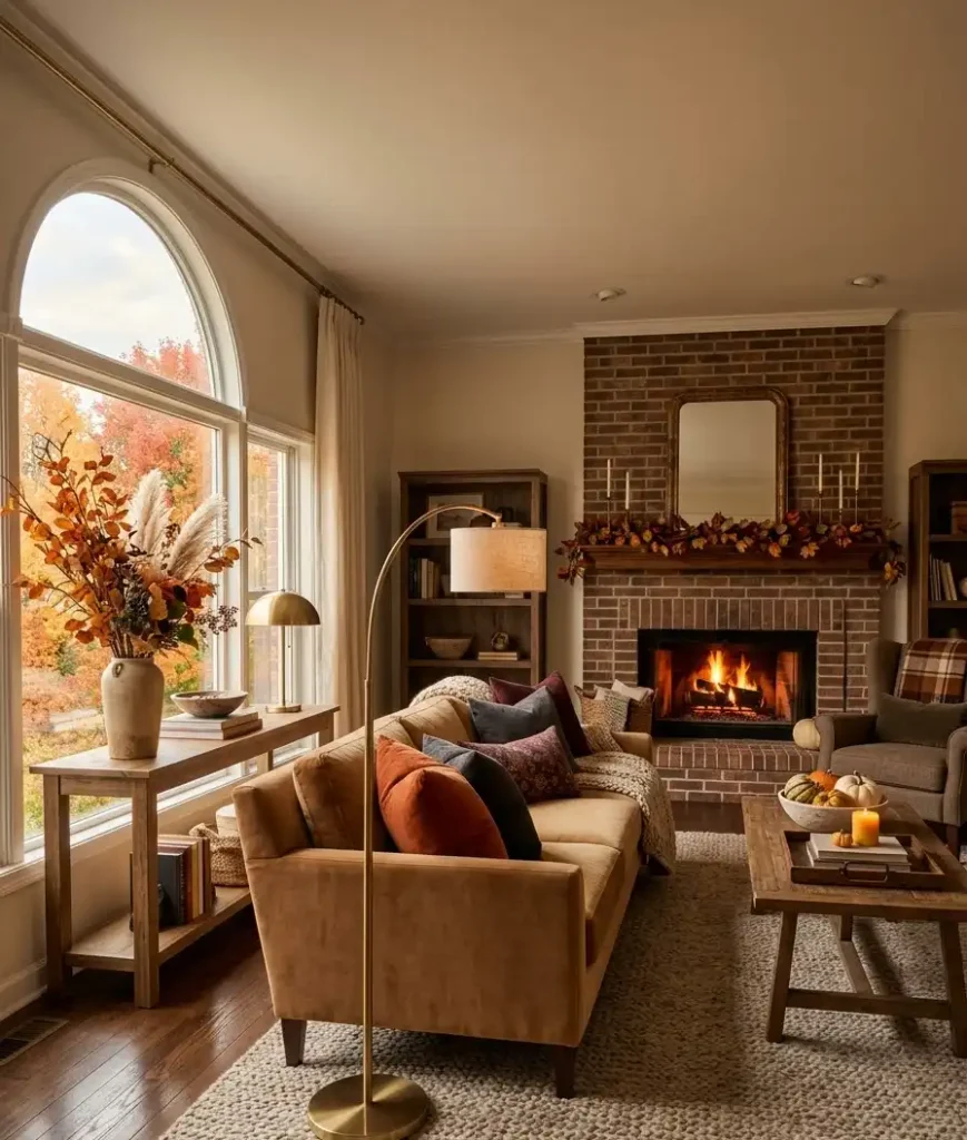
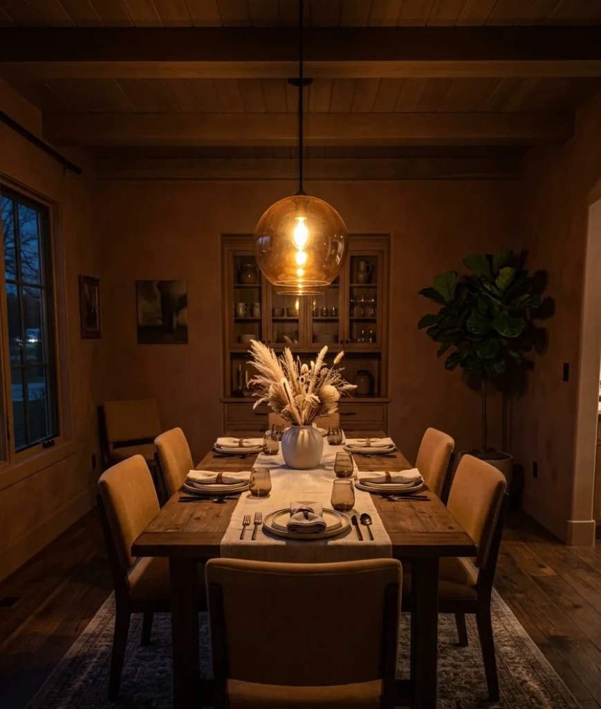
A few specific swaps I’d recommend:
- Amber or smoked glass pendant lights over dining tables
- Brass or bronze table lamps with linen shades
- A few pillar candles in varying heights on your mantel or console
Wow, the difference this makes is almost unfair for how little effort it takes.
The mantel and tablescape: less is genuinely more
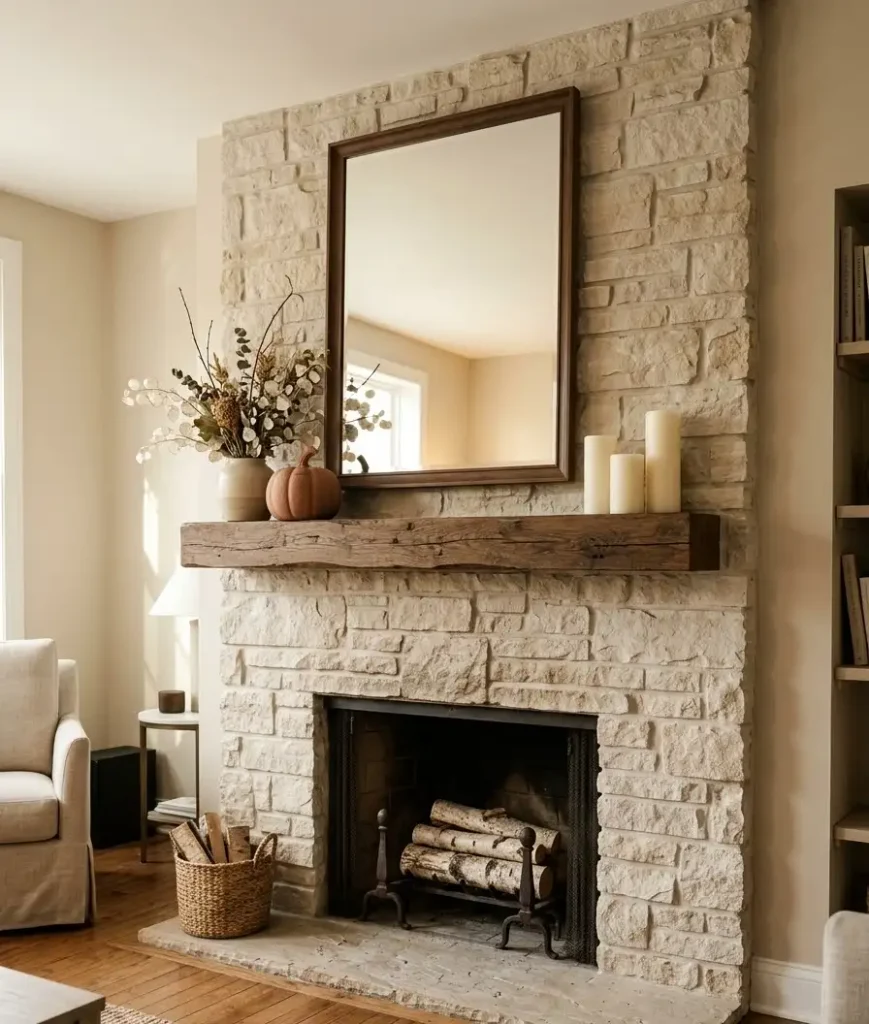
Here’s where I see people overdo it the most. A mantel packed edge to edge with dried florals, mini pumpkins, candles, and a garland looks busy, not luxurious.
Try this instead: pick one focal piece (a large vase, a piece of art, a mirror), then build outward in odd numbers.
Three candles of varying height. One low arrangement of dried pampas grass or eucalyptus.
Maybe a single ceramic pumpkin in a matte finish, not the glossy orange kind.
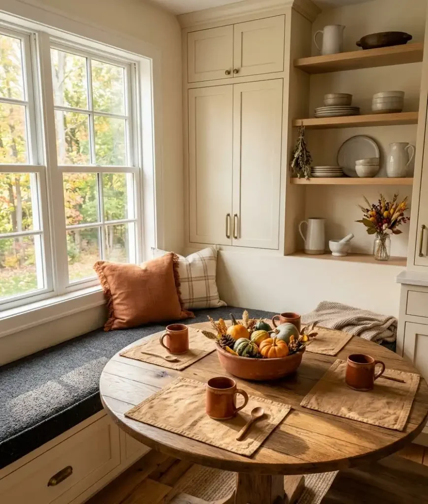
For your dining table, a runner in a warm neutral with a low, wide centerpiece works better than a tall arrangement that blocks conversation across the table.
The Spruce has some solid seasonal styling breakdowns if you want more specific measurements for proportion, which honestly I still reference sometimes because I forget the ratios.
Random thought, but I’ve noticed people who thrift their vases and vessels usually end up with more interesting shapes than people who buy new.
Something about mass production flattening out all the character. Anyway, back to the mantel.
Where to splurge and where to save
Not every item deserves the same budget. This is where a lot of “luxury decor” guides get it wrong, they tell you to spend big everywhere, which isn’t realistic for most of us.
Splurge on:
- One statement piece per room (a mirror, a lamp, an art piece)
- Bedding, since you touch it every single day
- Your sofa’s throw pillow inserts, cheap ones go flat within months
Save on:
- Seasonal florals and greenery (swap these out every year anyway)
- Small decorative trays and bowls
- Candles, unless scent throw really matters to you
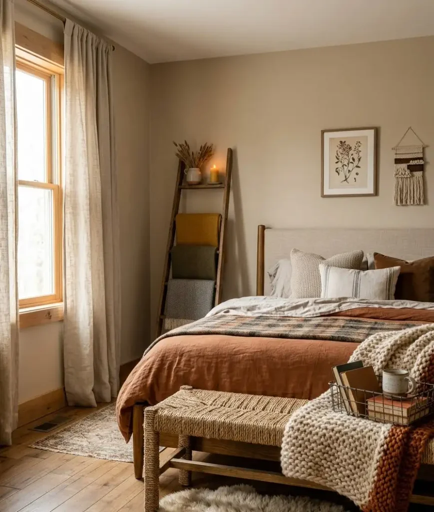
I’ve bought a $12 ceramic pumpkin from a discount store that looked more expensive than the $40 one from a boutique shop.
Price doesn’t always track with how something photographs. That’s genuinely one of the more freeing things to learn as you get into home styling.
Small-space fall styling that doesn’t look cluttered
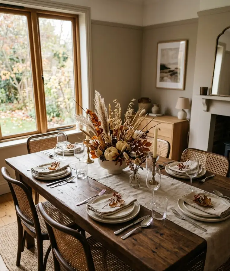
If you’re working with a smaller apartment or a single accent wall instead of a full living room, scale everything down proportionally rather than skipping decor altogether.
A few things that work well in tight spaces:
- Wall-mounted sconces instead of floor lamps to save surface space
- A single oversized item (one big vase, one bold art piece) instead of five small ones
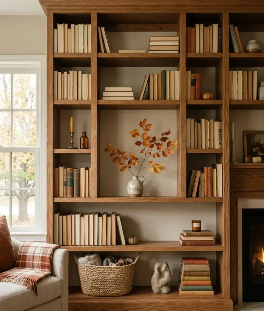
- Layered rugs only if your entryway or room is large enough to support it visually
- Mirrors to bounce light and make the space feel less cramped during darker fall evenings
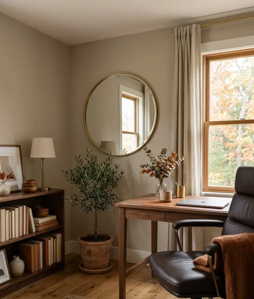
Apartment Therapy runs small-space features fairly often, and their approach of “edit, don’t add” is basically the golden rule for anyone decorating under 700 square feet.
Building a Pinterest-worthy vignette
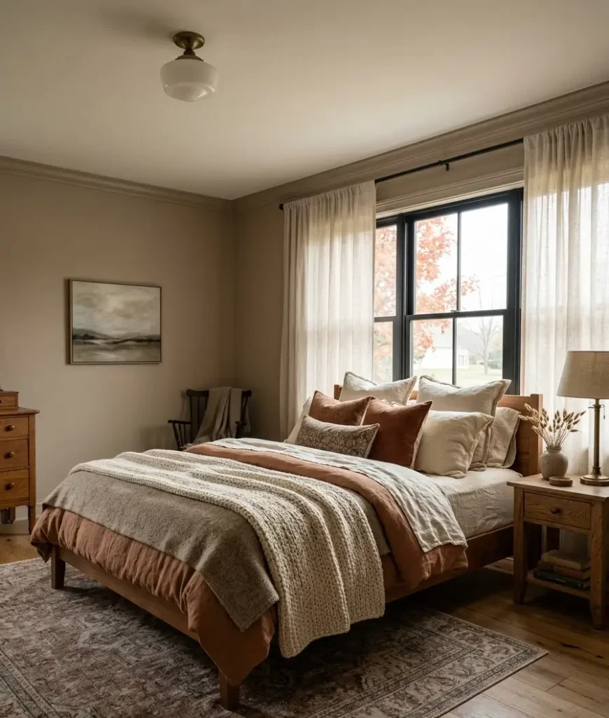
If you’re styling specifically for photos, whether that’s for your own Pinterest board or an actual listing, vignettes matter more than full-room shots.
A vignette is just a small styled corner: a console table, a nightstand, a windowsill.
The formula that photographs well almost every time:
- One tall item (vase, lamp, plant)
- One medium item (books stacked, a small sculpture)
- One low, textured item (a bowl, a candle, folded fabric)
- A small organic touch (a stem of dried grass, a branch, a single leaf)
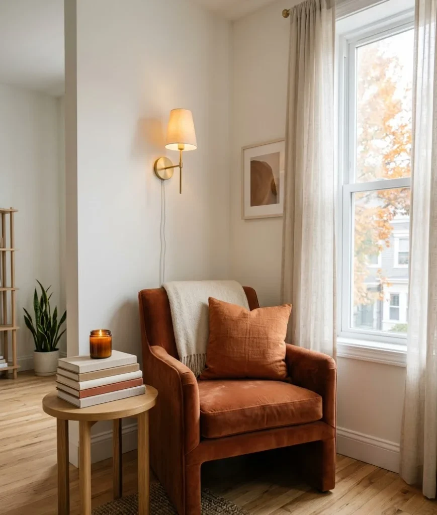
Group them close together rather than spreading them out. Tight clusters read as intentional. Spread-out items read as forgotten.
A quick recap before you start shopping
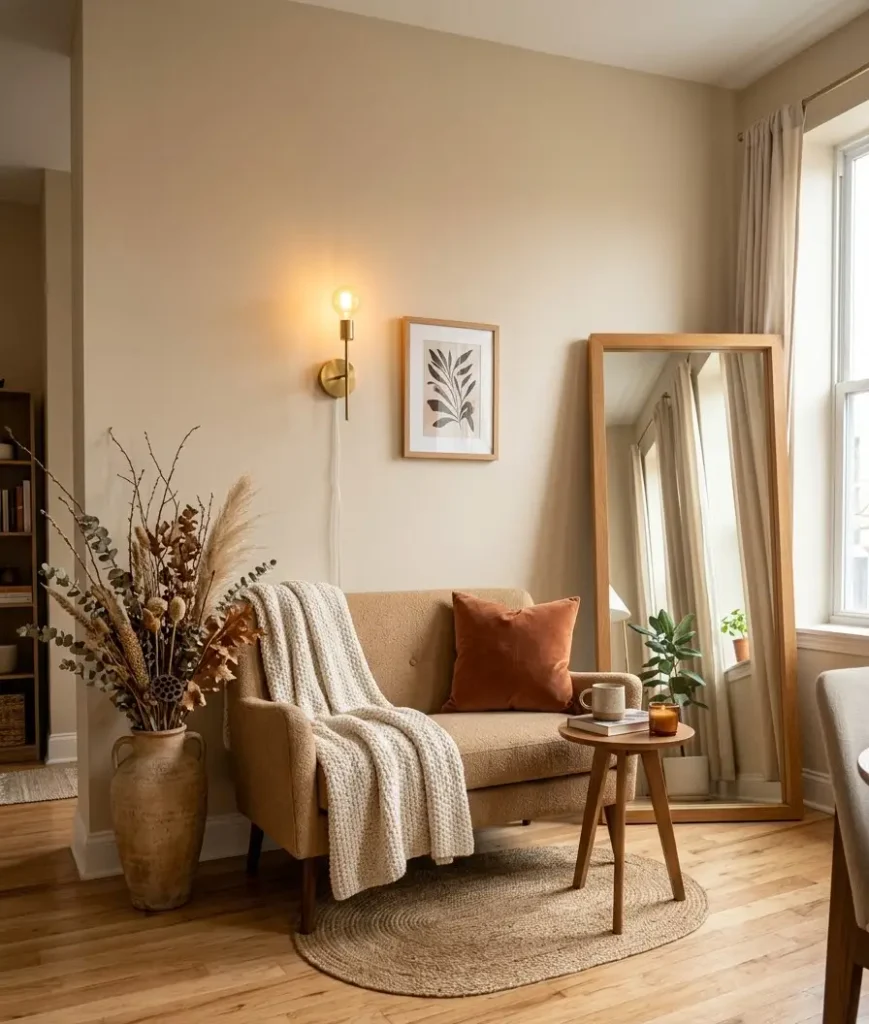
Fall decor doesn’t need to mean pumpkins on every surface.
Pick a tight color palette, layer in real texture, fix your lighting before anything else, and edit your tablescapes down to the essentials.
Splurge where you touch things daily, save on what rotates yearly, and keep vignettes tight and clustered if you want that photogenic look.
FAQs
Do I need to redecorate my whole house for fall? No, and honestly you shouldn’t. Focus on 2 to 3 high-visibility spots, your entryway, living room, and dining table, and let the rest of the house stay neutral year-round.
What’s the biggest mistake people make with fall decor? Overloading on orange. A warm, muted palette with rust and camel tones looks far more elegant than bright pumpkin orange spread across every surface.
How much should I budget for a luxury-looking fall refresh? You can do a convincing refresh for under $150 if you focus on lighting and one statement piece, then fill in with thrifted or seasonal items you already own.
So, which room are you tackling first, the entryway, the living room, or that one shelf that’s been empty since summer?
Save this guide, pull up your palette, and start with lighting. That single swap alone will tell you if the rest of the room actually needs work.