Your living room has a blank wall, and it stares at you every time you sit down. Mine did for three years before I finally bought a miter saw.
Molding fixes that wall. A few thin strips of wood or MDF, a gallon of paint, and one weekend turn flat drywall into something that looks like an architect planned it.
I’ve scrolled through enough Pinterest boards to know what you want: pictures you can steal, with honest notes on cost and difficulty.
So this list covers 25 modern molding accent wall ideas for the living room, plus the mistakes I made so you can skip them. Grab a coffee and pin as you go.
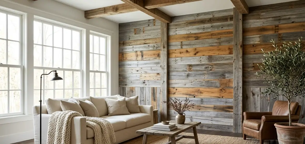
What modern molding actually looks like
Traditional molding comes with curves, deep grooves, and enough ornament to make a Victorian blush.
Modern molding keeps profiles flat and slim, lines straight, and spacing deliberate. You get the architectural depth without the fuss.
I think of it as drawing on your wall with wood. The lines do the talking, so the shapes and the paint color matter far more than the trim itself.
Profiles I use most
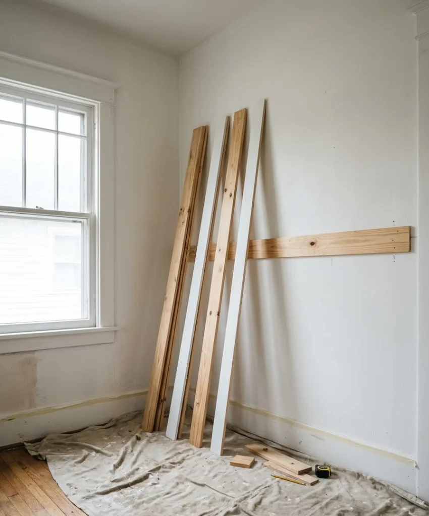
You don’t need a lumberyard catalog.
Here is what I reach for, and what I skip.
- Flat or square-edge strips (about 3/4 inch to 2 inches wide) are my default. They cut clean, cost little, and give crisp shadow lines.
- Half round works for reeded or fluted looks. I love it on a narrow wall and hate sanding it.
- Simple stepped profile adds one small shadow ledge. IMO it looks best under warm lamplight.
- Fancy ogee or ornate profiles go back on the shelf. They fight with a modern room every time.
Tools and materials
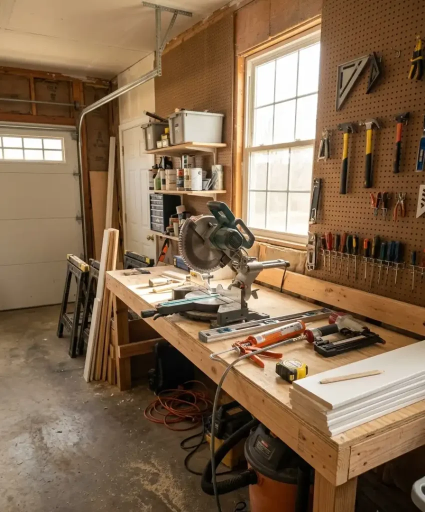
A basic setup handles almost every idea below. If you want a step-by-step technique guide, the team at Family Handyman has solid walkthroughs for trim and panel work.
- Miter saw or a hand miter box
- 18-gauge brad nailer (I rent mine, and honestly I’d buy one if I did this twice a year)
- 4-foot level and a laser line if you own one
- Construction adhesive and paintable caulk
- Wood filler, sandpaper, and a good angled brush
Measure twice. Then sketch the layout on paper, because chalk lines on a wall look confident right up until they’re wrong.
Box and frame molding ideas
These are the layouts that pop up on Pinterest again and again. They work because the repetition feels calm, and a beginner can pull most of them off.
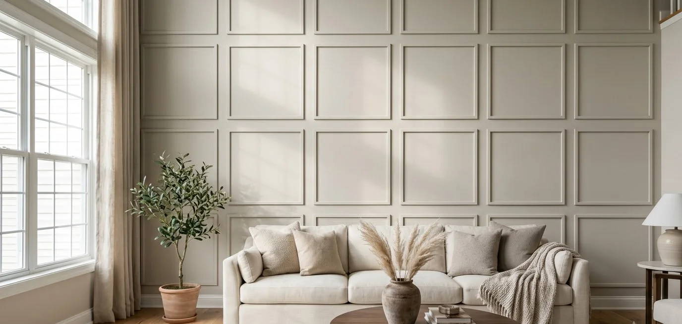
1. Classic square box grid
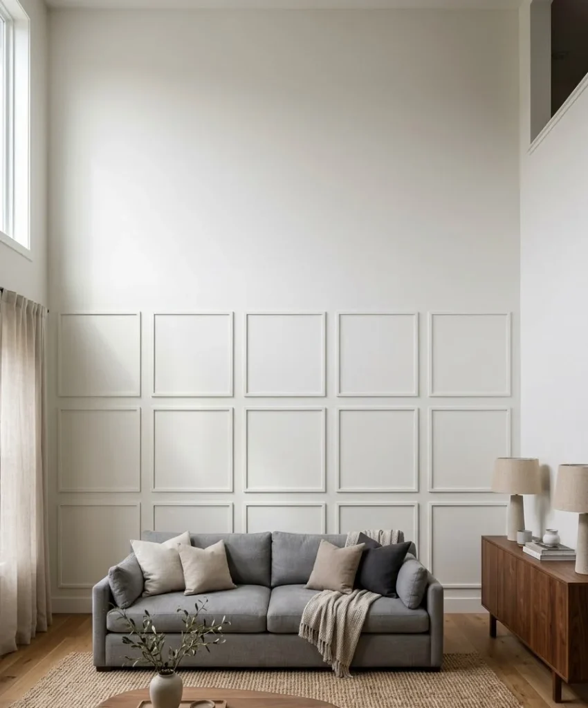
Rows of equal squares climb from about chair-rail height toward the ceiling.
Use thin flat strips, and paint everything one color so the shadows carry the pattern.
This was my first project. Six boxes took me a full Saturday and a lot of muttering at corners that refused to close. It looked great anyway.
2. Oversized rectangle panels
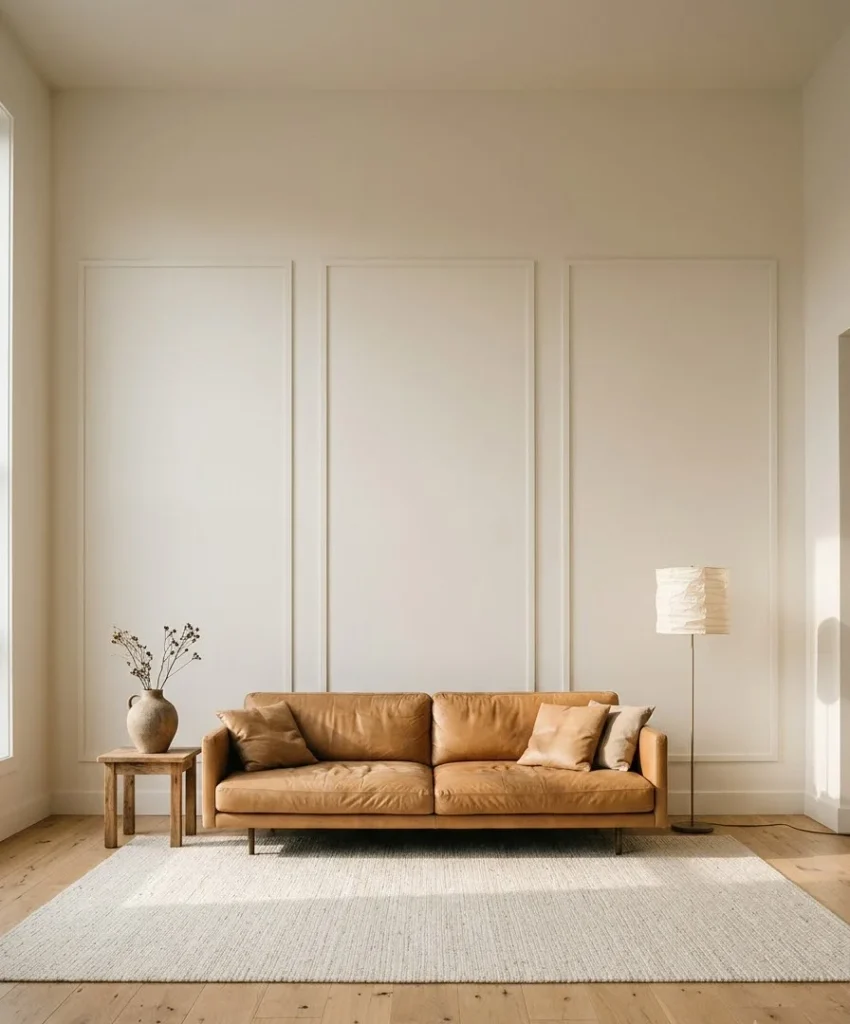
Swap the many small boxes for two or three tall rectangles behind the sofa.
The look is bolder and less busy, which suits a minimalist room.
Leave about 3 inches of bare wall at each end so the panels don’t crowd the corners.
Ever notice how a layout feels off when the margins disagree? That’s why.
3. Picture frame molding with art inside
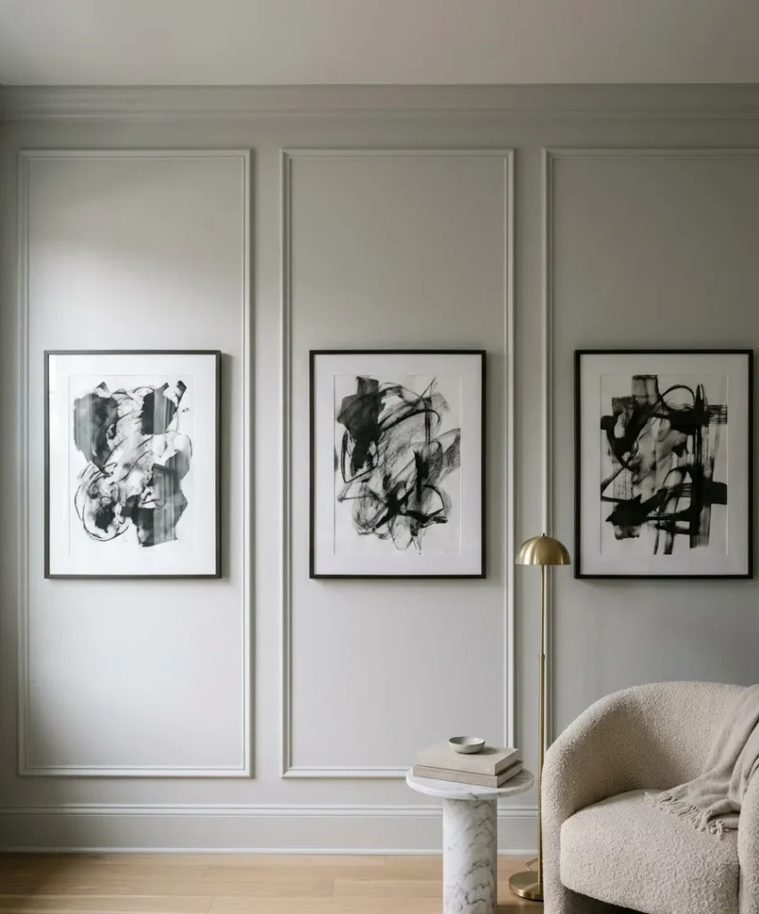
Build frames sized for real prints, then hang a piece in the center of each one. The molding acts like a mat, and the art looks intentional instead of random.
I did this with three black-and-white photos. Guests asked if the frames came with the house. Free compliment.
4. Floor-to-ceiling single frames
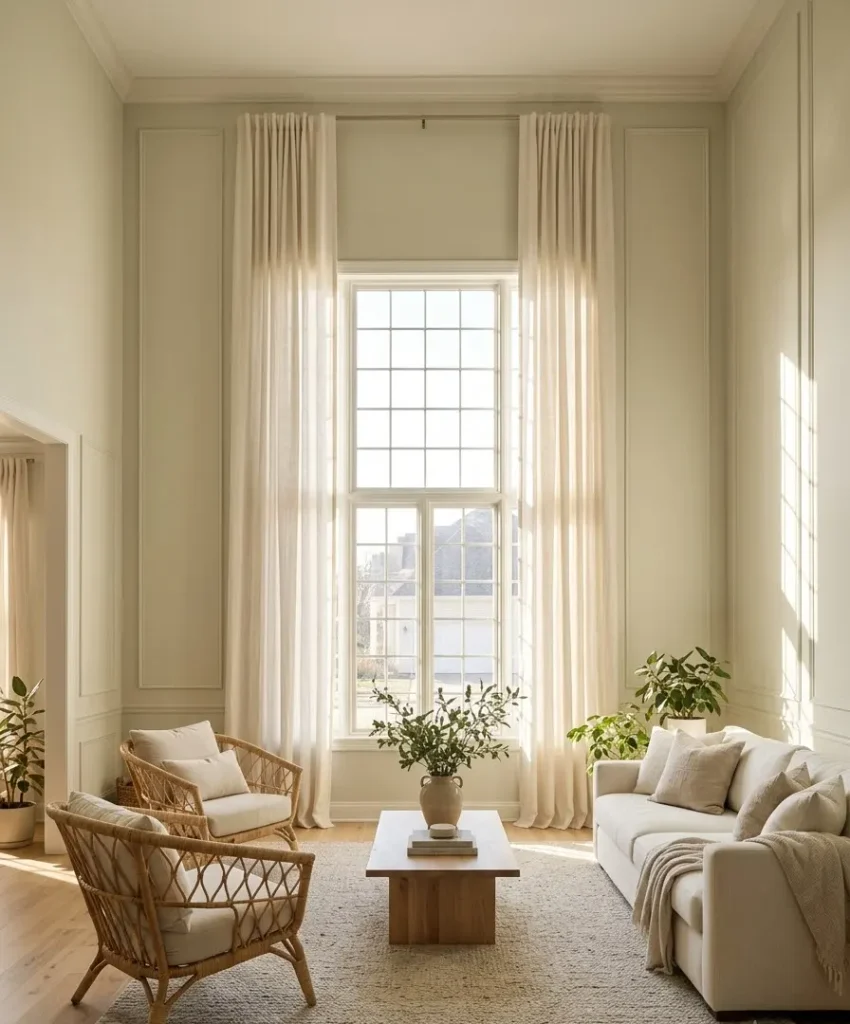
One tall frame, or a pair, stretches a wall upward and makes an 8-foot ceiling feel taller. It works especially well flanking a window.
Keep the border slim, about 1.5 inches. A thick border on a tall frame looks heavy fast.
5. Double-line nested frames
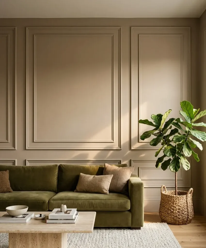
Two rectangles, one inside the other, with roughly 2 inches between them. The gap catches light and makes a quiet, layered shadow.
It takes double the cuts, so I only recommend it if you enjoy the process. I did, and my wrists disagreed.
6. Offset staggered boxes
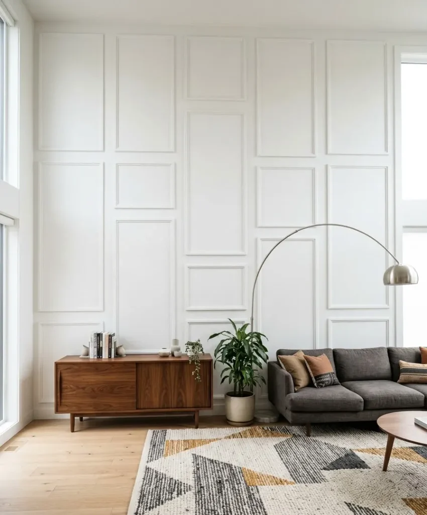
Mix box sizes and stagger them so no two rows line up. The result feels modern and a little playful, like a wall designed by someone who owns a good bookshelf.
Sketch it on graph paper first. Random layouts need more planning than symmetrical ones, which surprised me.
Color and finish ideas
The trim gets the credit, but paint does the heavy lifting. A single color decision can change the whole mood of the room.
For color inspiration, I browse the collections at Benjamin Moore and Sherwin-Williams, then test big samples on the actual wall.
7. Tone-on-tone paint with mixed sheens
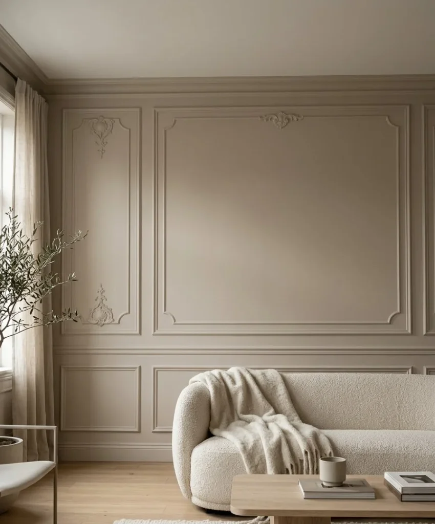
Paint the wall in matte and the molding in satin, both in the same color.
The pattern appears and disappears as you walk around the room, which I find weirdly satisfying.
This is the easiest way to look expensive. One can of paint, two sheens, done.
8. Moody charcoal or deep navy
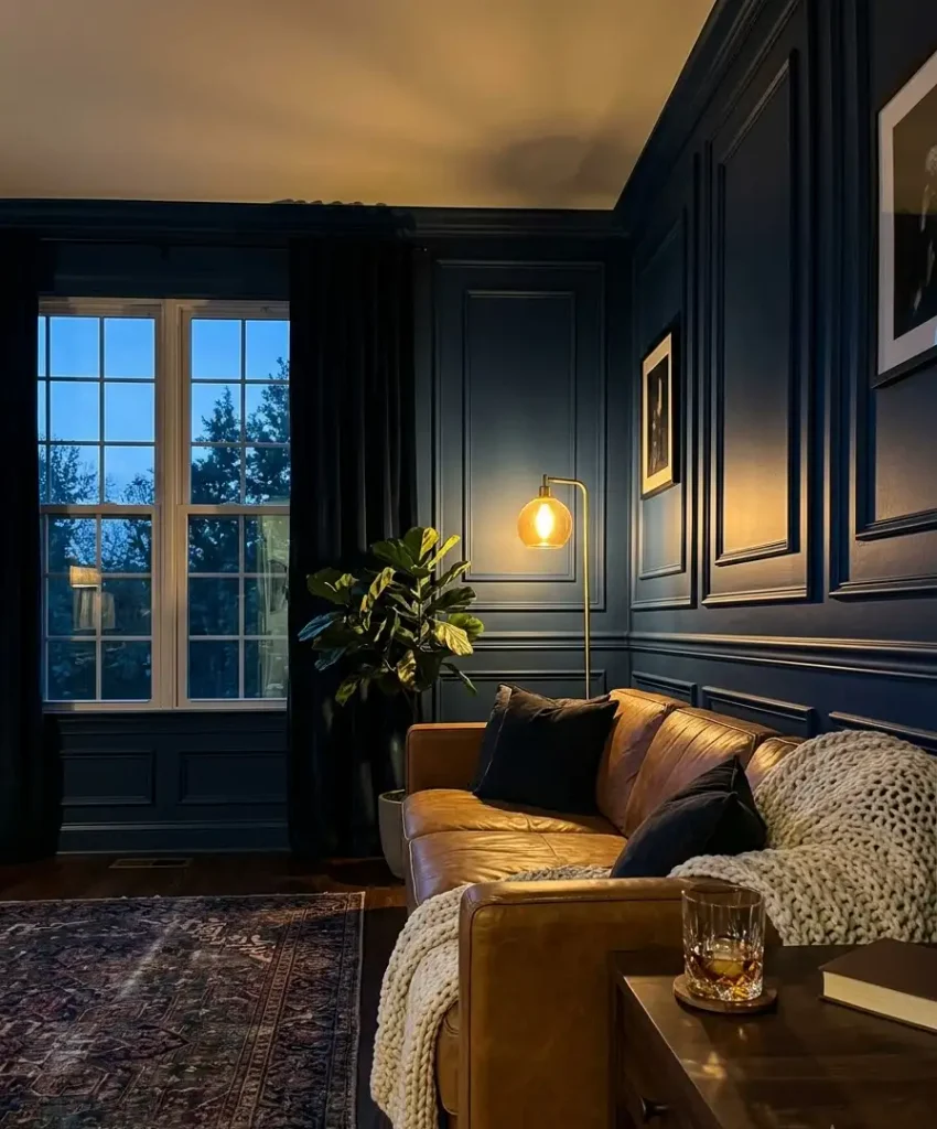
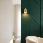
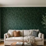
Dark paint makes molding look like carved shadow. Add one floor lamp and the wall glows at night.
Wow, the difference between this and a plain gray wall is huge. Just test the color in daylight first, because a deep navy can turn black in a north-facing room.
9. White on white
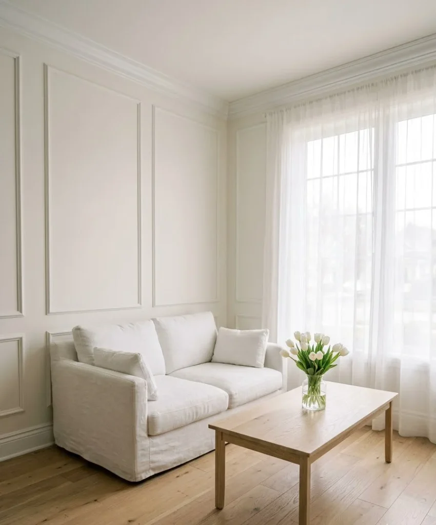
Warm white walls with slightly brighter white molding keep a small room airy. The texture adds interest while the color stays calm.
Pick one undertone and stick with it. Mixing a cool white with a creamy one makes the wall look dirty, even when it’s clean.
10. Two-tone panels
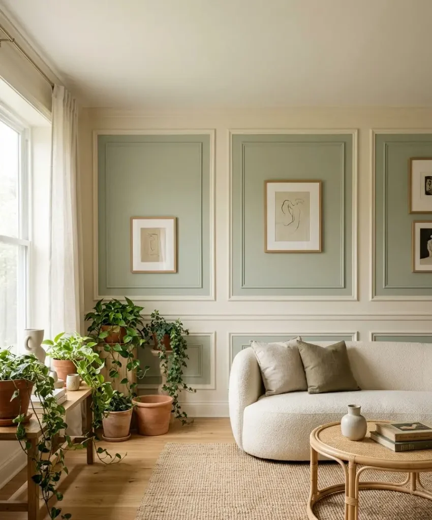
Paint the inside of each frame a different shade than the surrounding wall.
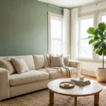
A soft sage inside, with a lighter cream outside, gives the wall a gentle, gallery feel.
Cut in the edges with painter’s tape and a steady hand. I use a small angled brush, and I take my time.
11. Black molding on a light wall
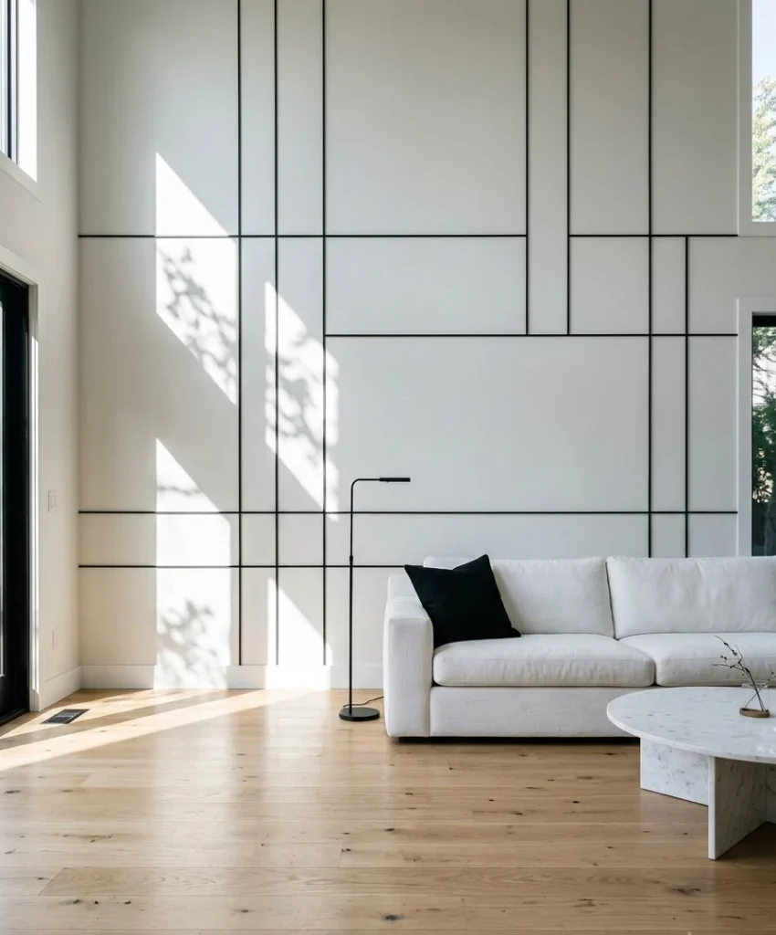
Thin black strips on a white or pale gray wall read like line art. It’s graphic, crisp, and very Pinterest.
It shows every flaw, though, so caulk your joints carefully. IMO the extra prep is worth it for a look this sharp.
12. Natural wood molding on a painted wall
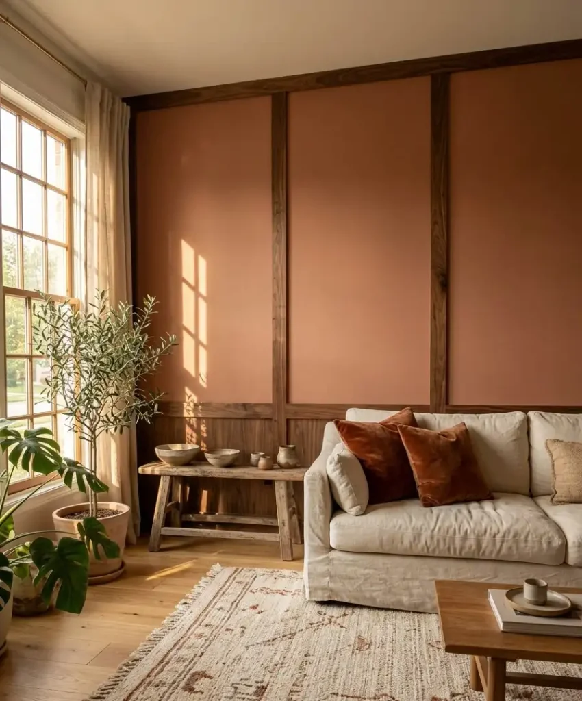
Stained oak or walnut strips over a muted green or terracotta wall bring warmth. The grain adds texture that paint alone can’t copy.
I’m a sucker for this one. It looks handmade in the best way.
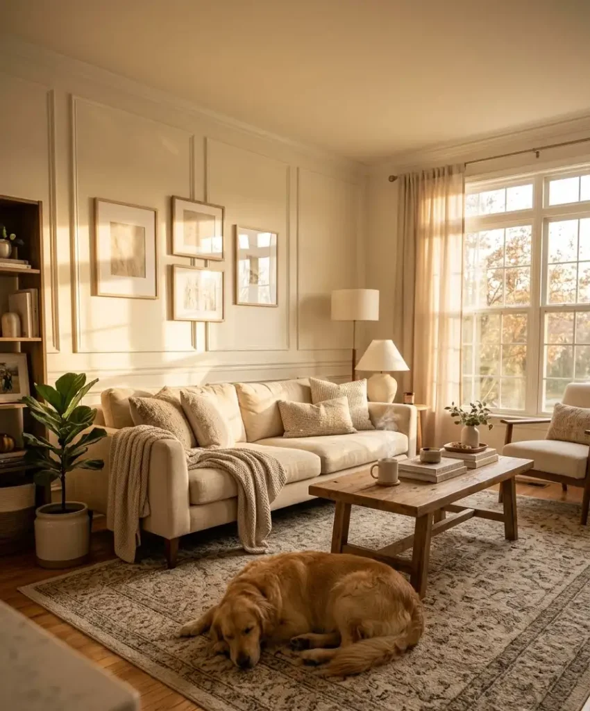
Small tangent: my dog Biscuit sat on every single oak offcut while I worked on mine.
He wasn’t helping, and he knew it, but I never had the heart to move him. Back to the walls.
Wainscoting and half-wall ideas
These ideas wrap the lower part of a wall, which protects it from scuffs and gives a room a grounded feel. Families with kids and dogs, take note.
13. Classic wainscoting at 36 inches
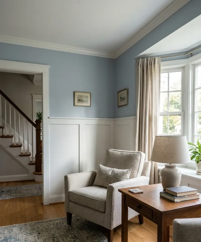
Flat panels below a thin cap rail, usually around 32 to 36 inches high. It’s a timeless look, and it hides the marks from backs of chairs.
Paint the cap rail the same color as the panels. A contrast cap rail gets busy quickly.
14. Tall two-thirds wainscot
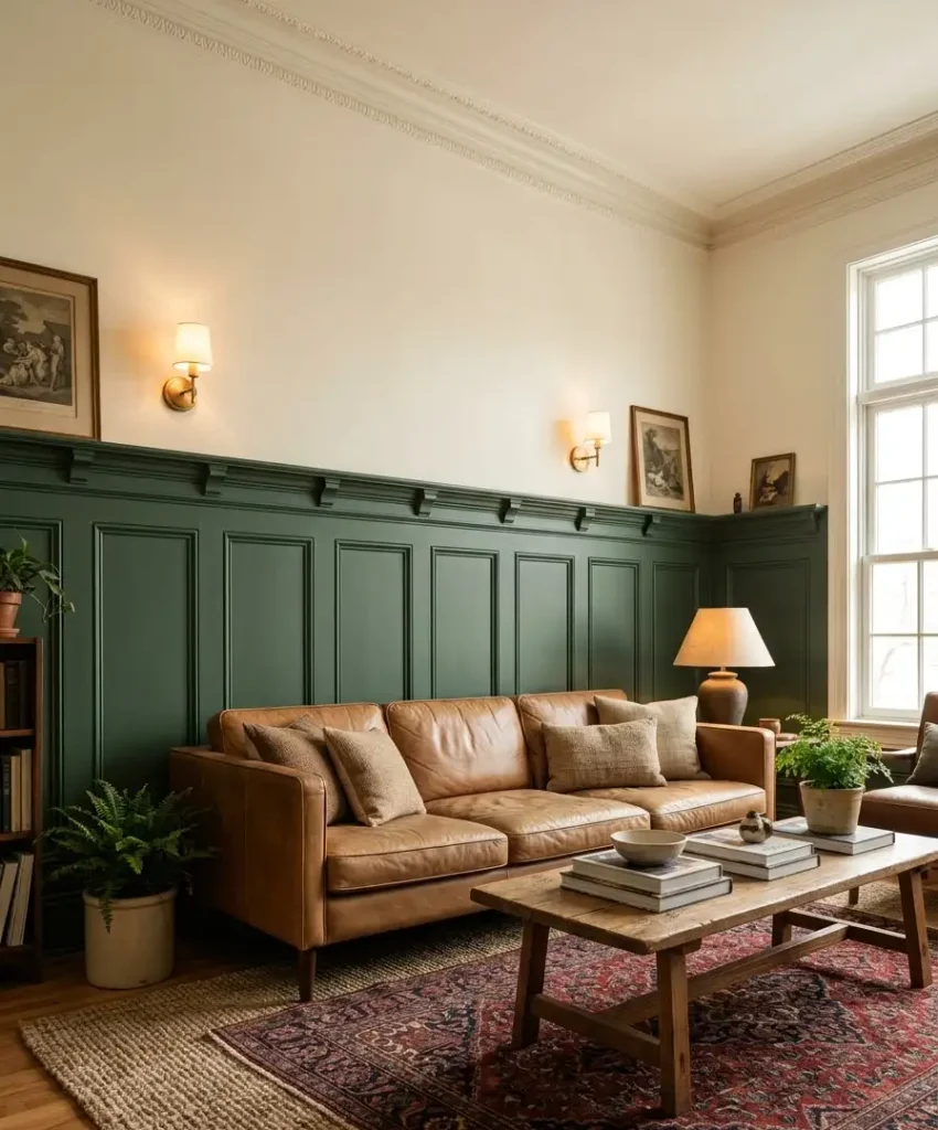
Raise the panels to about two-thirds of the wall height, roughly 60 inches in an 8-foot room.
Your eye reads the wall as more architectural and less cottage.
Set the cap rail just above the top of your sofa back. That detail makes the furniture and the wall feel designed together.
15. Shaker-style half wall
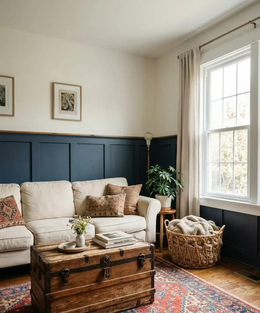
Simple rectangular recessed panels with clean edges. Shaker keeps the lines modern, since the profile has no curves to date it.
I like pairing this with a bold paint color below and a soft white above.
Do you commit to a wild color on the whole wall, or just the bottom half? Just the bottom half is cheaper and kinder to resale.
16. Board and batten with wide spacing
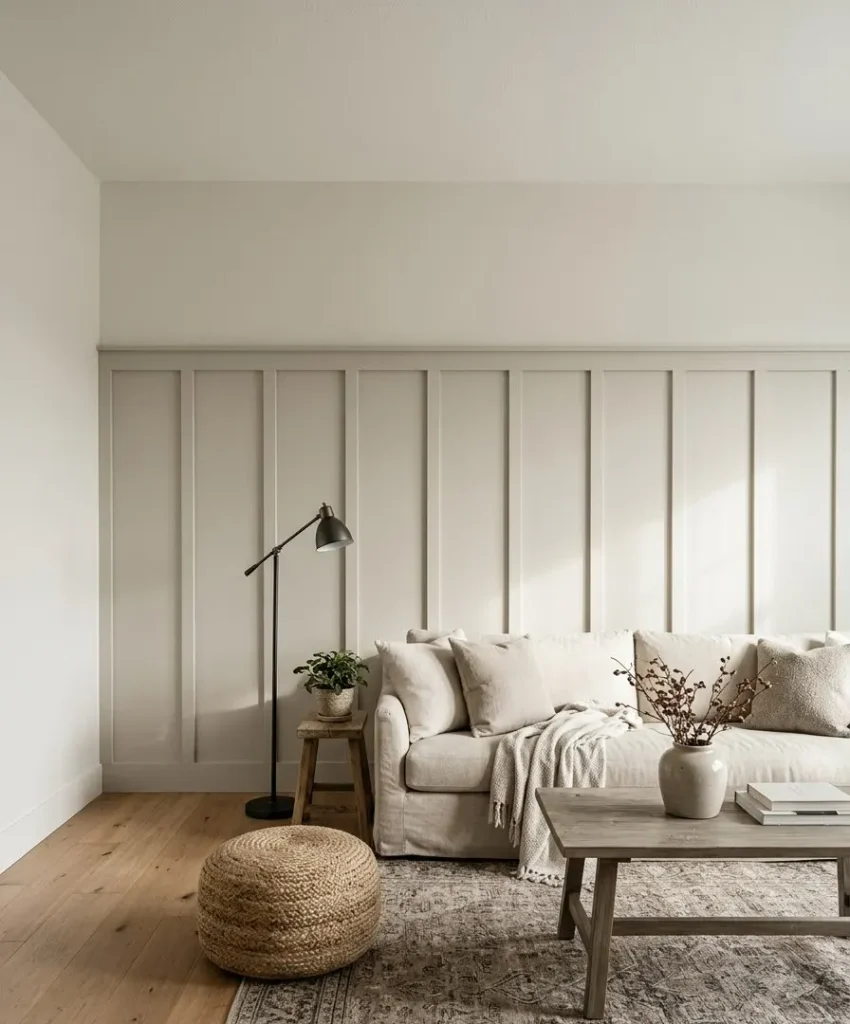
Vertical battens spaced 8 to 10 inches apart, topped with a horizontal rail.
It’s the most forgiving style for uneven walls, because a slightly crooked line blends into the pattern.
For a deeper look at how professionals handle wall paneling, Houzz has a huge photo library of finished rooms to study.
Geometric and statement ideas
Here is where the accent wall earns its name. These layouts take more planning, and they reward you with a wall people photograph.
17. Vertical slat or reeded wall
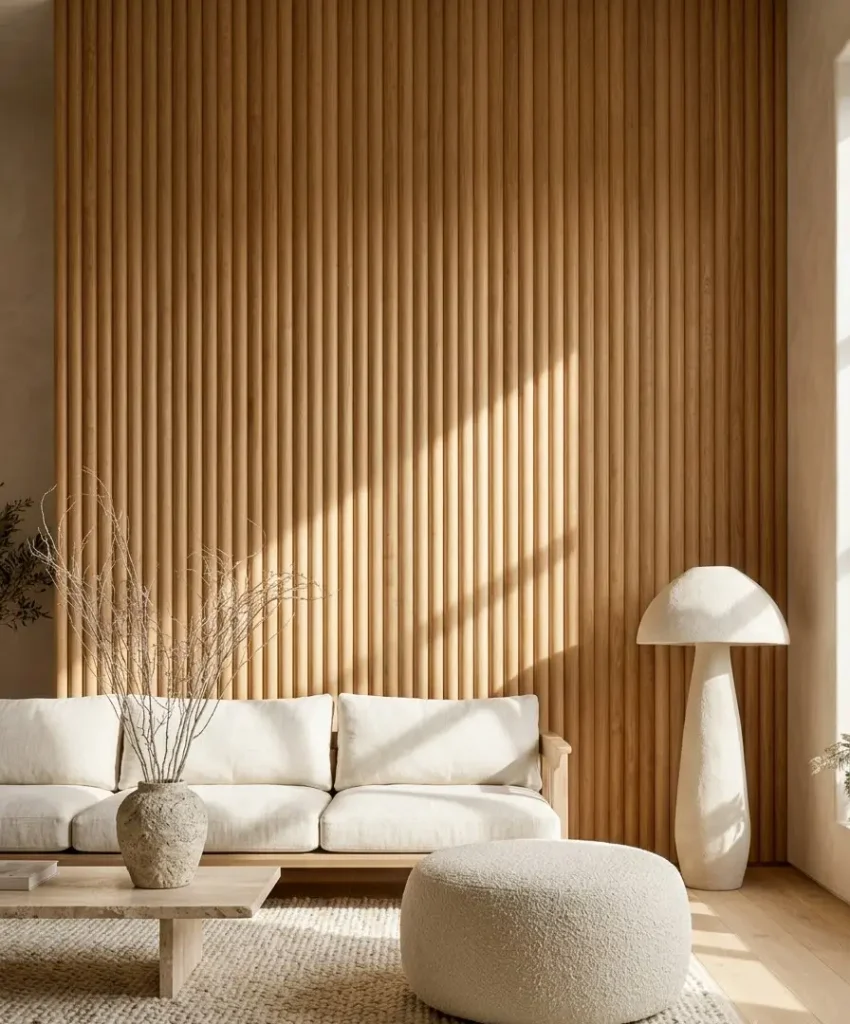
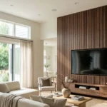
Narrow vertical strips, or half-round dowels, set close together. The shadows create rhythm, and the wall looks sculpted.
Light changes it all day long. Mine looks soft in the morning and dramatic by 6 p.m.
18. Diamond lattice
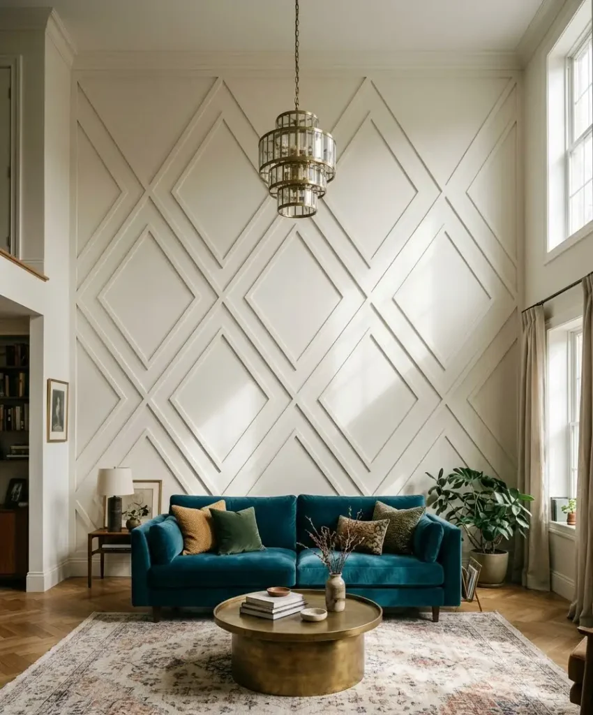
Diagonal strips that cross to form diamonds. It’s a bit heavier than other options, so I only recommend it on a single focal wall.
Miter cuts need to be exact here. If your saw drifts a half degree, the diamonds drift with it. :/
19. Horizontal linear stripes
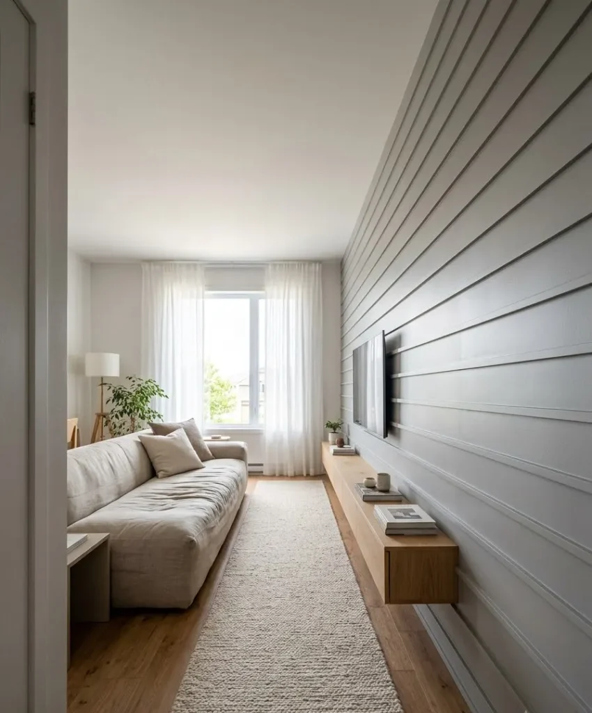
Thin horizontal strips set 6 to 8 inches apart, running the full width of the wall. They make a narrow room feel wider.
This was my second project, and it took half the time of the box grid. Straight lines forgive a lot.
20. Arched molding panels
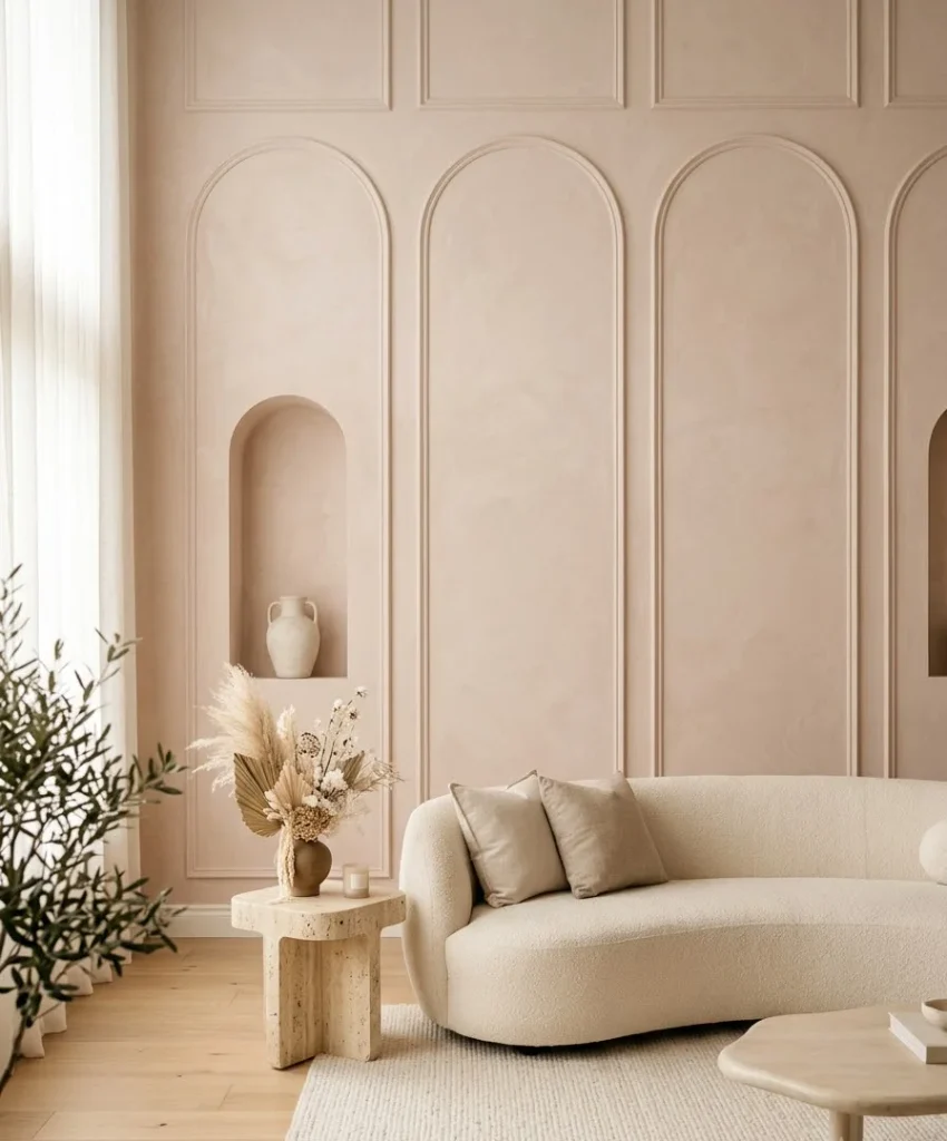
Curved arches built from flexible molding or cut MDF, either as framed niches or as repeating arcs. They soften a room full of hard corners.
This one is advanced. I bought pre-bent flexible trim instead of curving my own, and I don’t regret the extra $40.
21. Asymmetric architectural lines
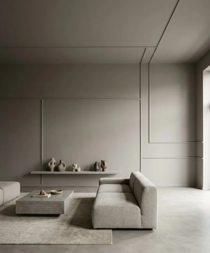
A few long horizontal and vertical lines that cross at different points, like a modern floor plan.
It looks artistic, and it breaks the rules of symmetry on purpose.
Look at the wall for a week before you commit. Impulse layouts tend to look like mistakes by Wednesday.
Feature-wall ideas for living rooms
Some walls already have a job. These ideas dress up the fireplace, the TV, and other focal points so the molding supports what your eye already wants to see.
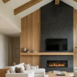
22. Fireplace wall with a molding frame
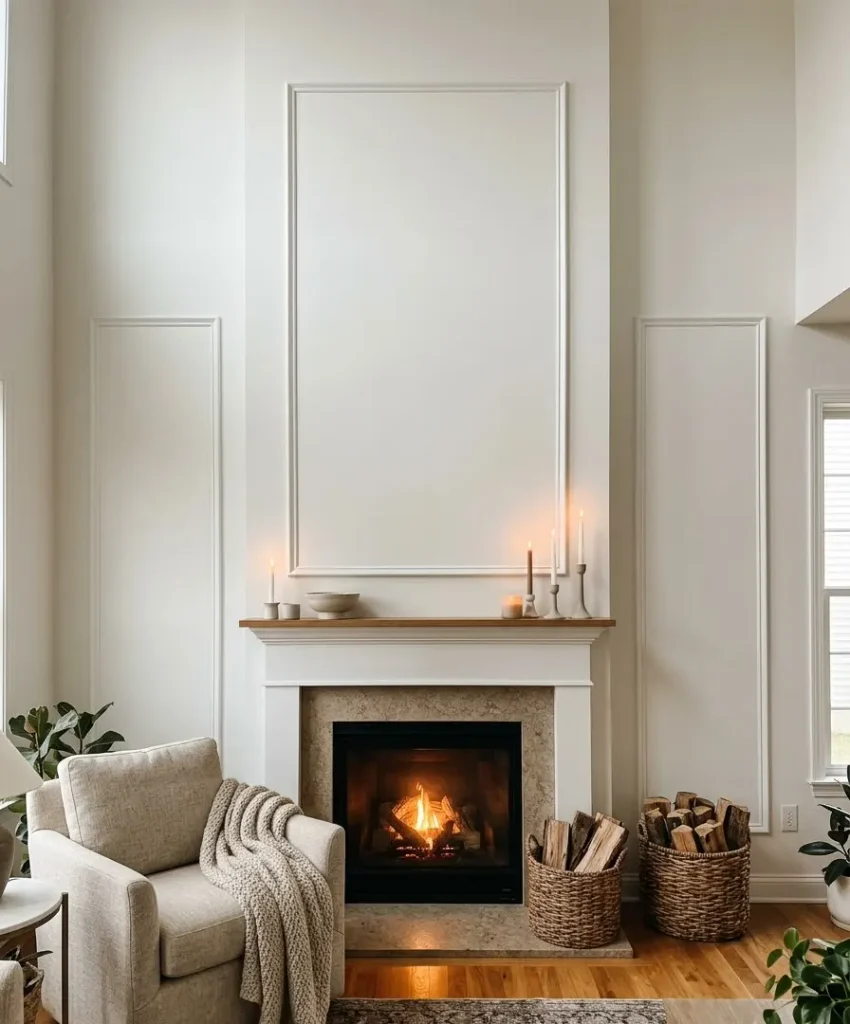
A tall rectangle surrounding the fireplace, running up to the ceiling, turns the hearth into the room’s anchor. Add smaller panels on each side to balance it.
This is one of my favorites. It makes a plain brick or tile surround feel intentional.
23. TV wall frame
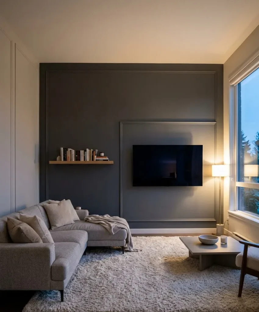
Build a large frame around a wall-mounted TV, so the screen sits inside the molding like a piece of art. When the TV is off, the wall still looks finished.
Mount the TV and run the cables before you start. I did it backward once, and fishing wires through finished panels was a lesson in humility.
24. Molding behind floating shelves
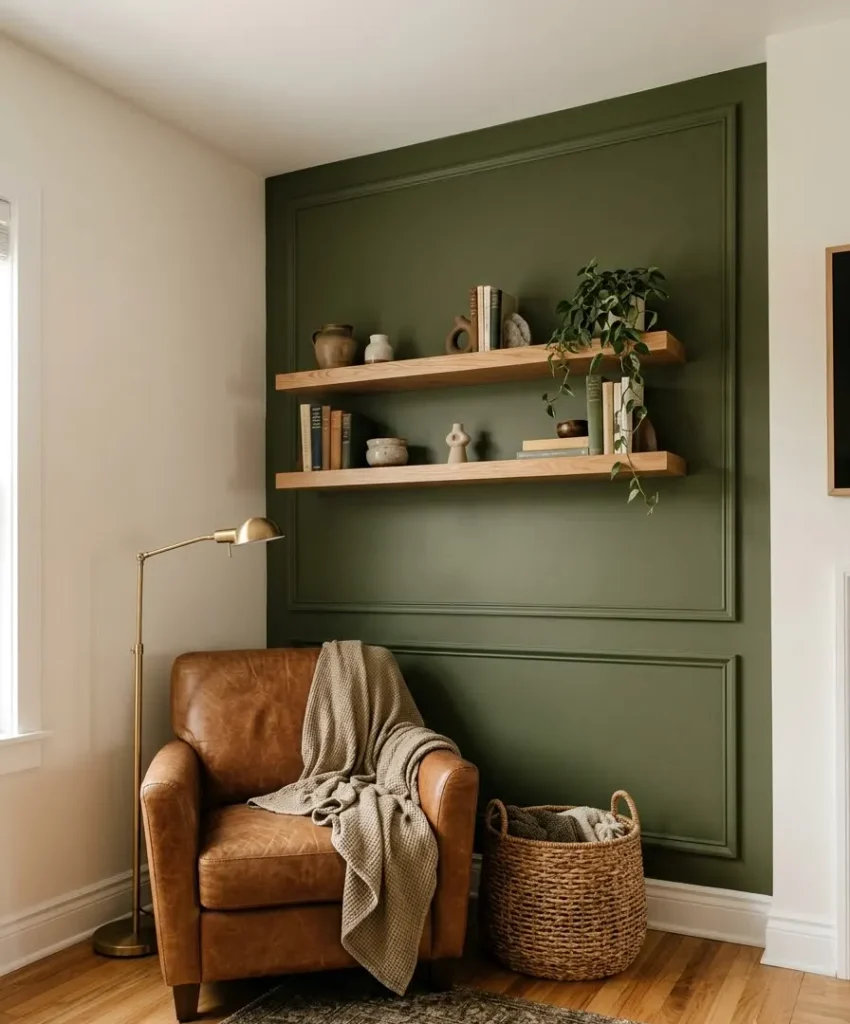
Place thin box or frame molding behind a pair of floating shelves, and the shelves feel built-in. Paint the whole section a deeper tone for extra depth.
Keep the shelf brackets hidden. The illusion needs clean lines to work.
25. Molding that wraps onto the ceiling
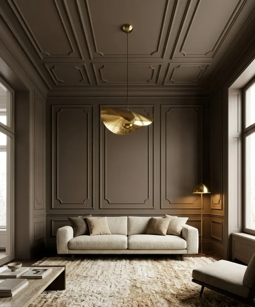
Continue the pattern up and over the edge onto the ceiling, so the wall and ceiling read as one box.
It’s dramatic, and it works best in rooms with a lower ceiling.
This is the hardest idea on the list, and IMO the most impressive. Hire a finish carpenter if corners make you nervous.
Quick comparison table
Here is a short snapshot of what each style costs and how hard it is.
My numbers come from my own projects and local prices, so your total may shift.
| Style | Cost (approx.) | Skill level | Time |
|---|---|---|---|
| Box or frame grid | $100 to $250 | Beginner | 1 weekend |
| Wainscoting | $150 to $400 | Beginner to intermediate | 1 to 2 weekends |
| Slats or lattice | $200 to $500 | Intermediate | 2 weekends |
| Arches or ceiling wrap | $300 to $700 | Advanced | 2 to 3 weekends |
Mistakes I made so you don’t have to
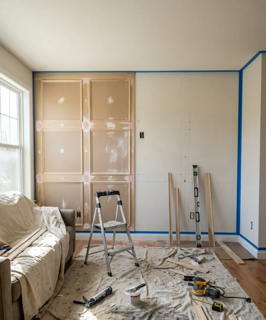
I’ve wrecked a few walls learning this.
Here is the short list of things I’d tell a friend.
- Skipping caulk. Gaps look tiny in daylight and enormous after painting. Caulk every seam. I learned this one the hard way.
- Trusting a level on one wall only. Walls and ceilings lean. Measure from a fixed line, and adjust the layout when the room disagrees with your plan.
- Buying cheap, warped trim. Sight down every board at the store. A bowed strip never lies flat, no matter how many nails you use.
- Painting before filling nail holes. Ten minutes with wood filler saves a full repaint.
This is insane how much a good caulk gun changes the result. Spend the $12.
FAQs
How much does a molding accent wall cost?
A DIY wall usually runs $100 to $400 in trim, adhesive, caulk, and paint. A pro install costs more, often $800 to $2,000 depending on your area and the complexity of the layout.
Can I install molding on textured walls?
Yes, with a small adjustment. Use construction adhesive along with nails, and caulk the edges well to cover gaps.
A heavy knockdown texture works best with slightly thicker strips, and you may want to skim-coat the wall first.
Does molding work in a small living room?
Yes, and it often looks better there. Stick with slim profiles, light or tone-on-tone paint, and fewer panels so the wall doesn’t feel crowded.
Final thoughts
A plain wall can become the best part of your living room with some wood strips, caulk, and a free weekend.
Start with one of the simpler layouts, like a box grid or horizontal lines, and save the arches for round two.
Pin your three favorites from this list and look at them again tomorrow. Which one still makes you smile? That’s your wall.
And if you build it, tell me how it turned out in the comments. Biscuit and I want to see 🙂