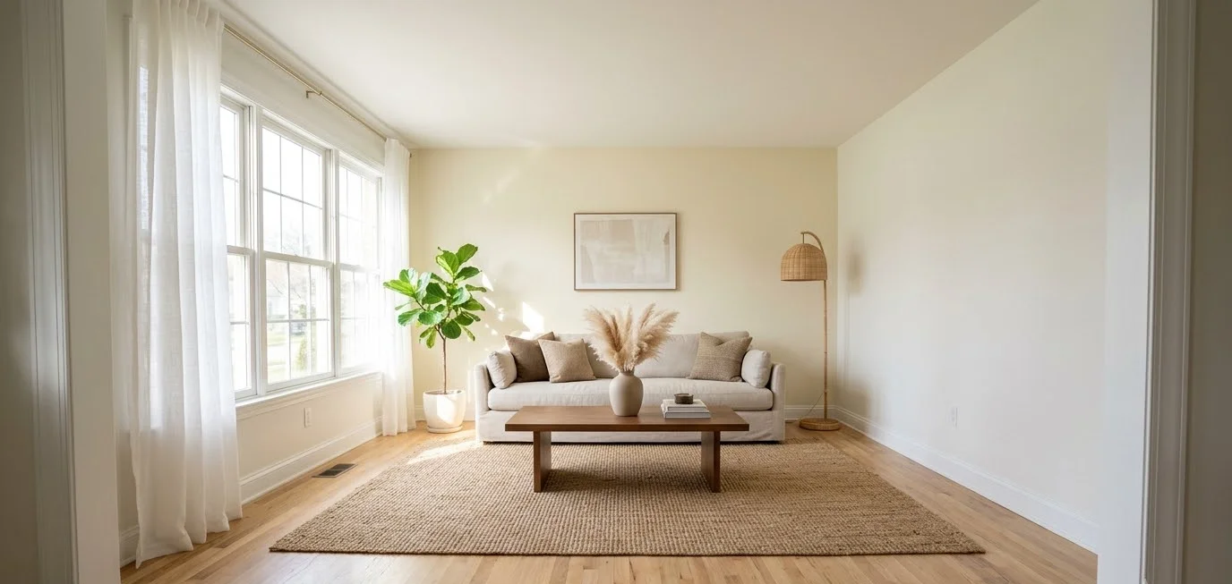
Your living room has one wall that looks bored. You know the one. You stare at it during every movie, and it stares back with nothing to say.
I’ve spent a lot of late nights scrolling Pinterest for fixes, and I keep landing on the same answer: a light accent wall.
It gives you a focal point without the commitment of a navy or forest green that swallows your lamp light at 6 p.m.
This guide covers the paint colors I trust, the textures worth the effort, and the layouts that work in real rooms (including the awkward ones).
What a light accent wall actually is
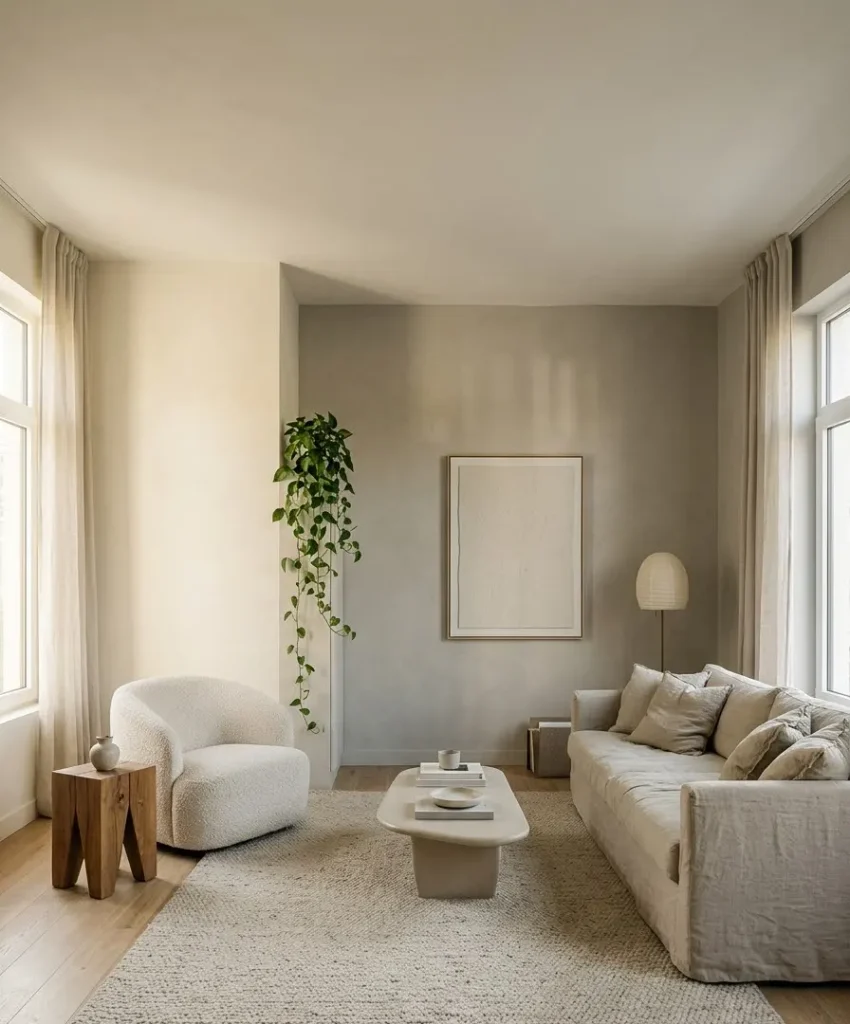
A light accent wall is one wall, painted or finished in a softer shade than the others, or in a lighter tone of the same family.
Think cream against warm white, or sage against a soft greige. The contrast is gentle, and that’s the point.
Most people hear “accent wall” and picture a bold, dark slab of color behind the sofa. Light versions behave differently.
They add depth and shape to a room while keeping the space airy, which matters if your living room is small, north-facing, or both.
I’d also count texture as part of the definition. A white wall with limewash, wood slats, or plaster still counts, because the finish does the accent work and the color stays quiet.
Why light accent walls work so well
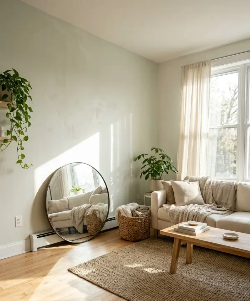
Light colors reflect more of the room’s natural and artificial light. That makes a space feel wider and calmer, and it gives your furniture room to breathe.
A dark wall asks your eyes to stop. A light one lets them travel.
They also forgive you. If you pick a pale sage and your sofa turns out slightly more gray than you expected, the room still looks intentional.
Try that with a saturated terracotta and you’ll know within an hour.
Here’s what I like most about them:
- They photograph well. Pale walls bounce light into pictures, which matters if you post your room or save ideas to Pinterest boards.
- They change with the day. A soft green looks cooler at noon and warmer at sunset, so the wall keeps your attention for years.
- They suit rentals. Peel-and-stick wallpaper and removable slats in light tones look polished and come off clean.
- They age slowly. I repainted a bright teal wall after 14 months once. Pale shades have never made me reach for the roller that early.
The best light paint colors for an accent wall
Paint choice is where most guides get vague, so I’ll name actual colors. Swatches vary by brand and screen,
and undertones shift in your light, so treat these as a shortlist to test and skip the “buy a gallon today” approach.
Warm whites and creams
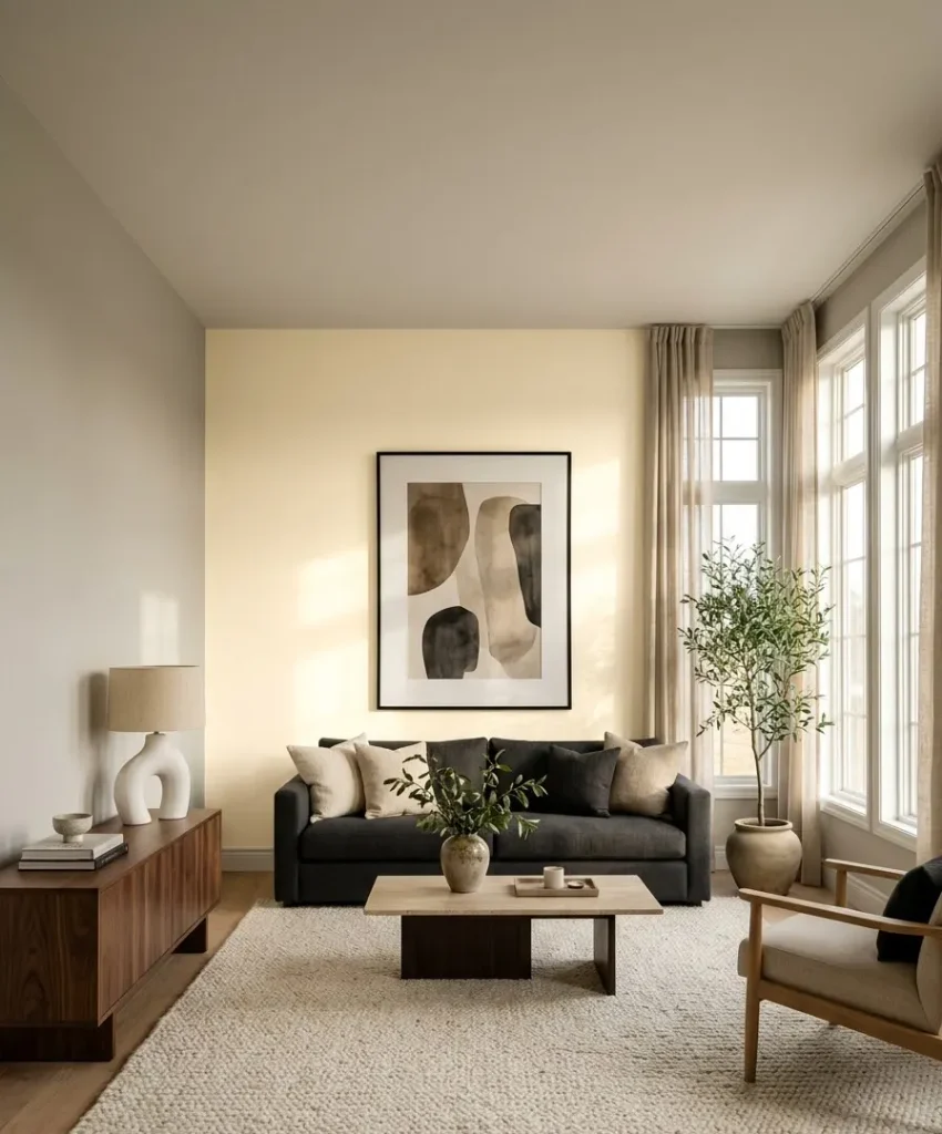
If you want the wall to read as an accent while keeping the room bright, warm white is the safest bet.
Benjamin Moore Simply White and Sherwin-Williams Alabaster both sit on the creamy side without turning yellow.
Put one of these behind a sofa with darker walls elsewhere (a greige, say), and the white wall looks like a light source.
I think this combo is underrated. It looks expensive, and it costs the same as any other quart.
Soft sage and muted green
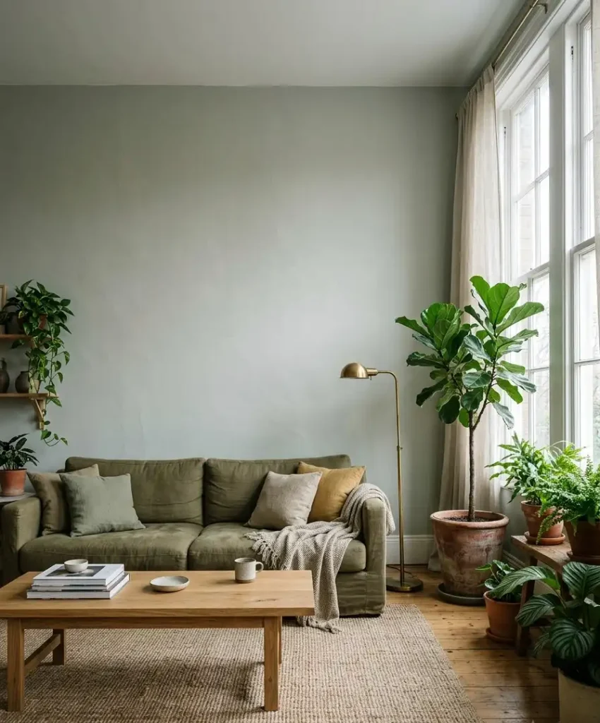
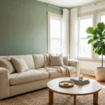
Pale green is the color I see most on saved living room pins, and I get why. Sherwin-Williams Sea Salt leans gray-green and shifts with the light, and Benjamin Moore October Mist goes slightly deeper and earthier.
Sage pairs well with natural wood, linen, and brass. It also hides in a room full of plants instead of competing with them.
Just watch your cool-toned lighting, because LED bulbs above 4000K can push sage toward a hospital hallway look.
Blush, clay, and soft peach
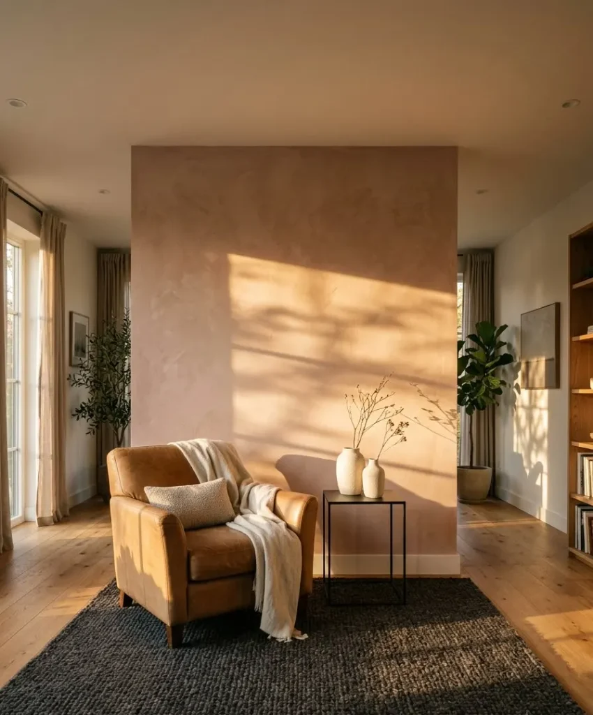
Pale pink gets dismissed as nursery territory, and I don’t buy that. Farrow & Ball Setting Plaster and Sherwin-Williams Intimate White are muted and warm, closer to skin tone than bubblegum.
They glow in rooms with afternoon sun. Pair them with a camel leather chair and a charcoal rug, and you get a room that looks edited instead of sweet.
Powder blue and gray-blue
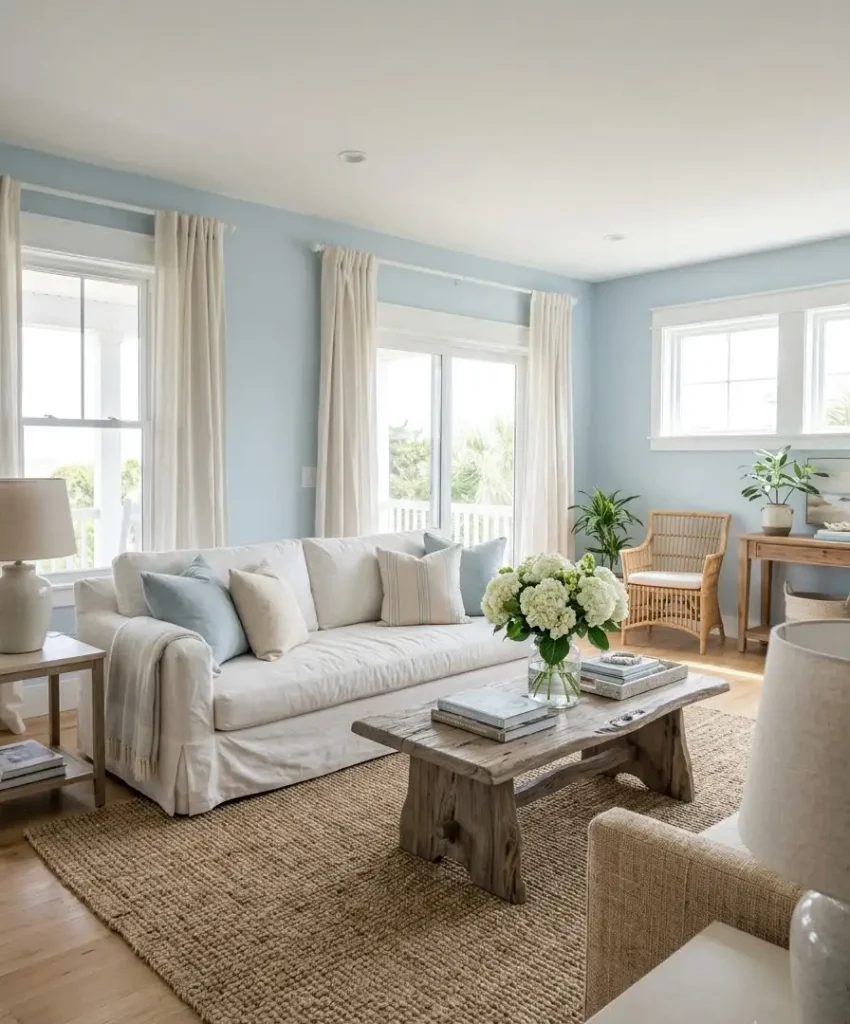
Sherwin-Williams Rainwashed and Benjamin Moore Palladian Blue both read as calm and airy.
They suit coastal rooms, but they also work in city apartments that need a little visual cooling.
One warning: pale blues turn icy in north light. If your living room faces north, pick the version with a bit of green or gray in it, or lean toward the warmer neighbors above.
Greige and mushroom neutrals
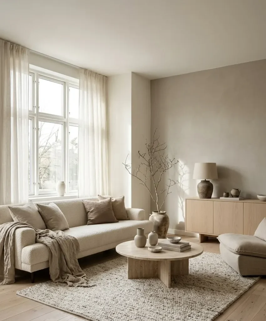
For people who say they hate color, Sherwin-Williams Accessible Beige and Benjamin Moore Pale Oak deliver a soft shift without a statement.
They make the wall feel a touch heavier than white, which grounds the sofa area.
I put greige on an accent wall in a rental once and it quietly made the whole room look more finished. Nobody commented, which I now count as a win.
Quick comparison table
| Color family | Example shade | Best light | Pairs well with |
|---|---|---|---|
| Warm white | Simply White | Any | Walnut, black accents |
| Soft sage | Sea Salt | South or west | Brass, linen, plants |
| Blush clay | Setting Plaster | West, afternoon sun | Camel leather, charcoal |
| Greige | Pale Oak | North or east | Oak, cream bouclé |
How to pick the right wall
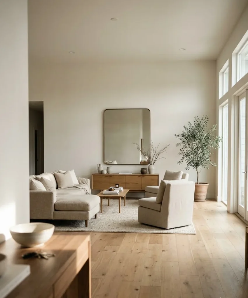
Not every wall deserves the spotlight. The right one is usually the wall you see first when you walk in or the one your seating faces.
Ever walked into a room and felt your eyes land on a spot with nothing there? That’s your wall.
Skip walls with a lot of doors, vents, or windows. They break up the color, and you end up paying for a statement the room can’t deliver.
The sofa wall
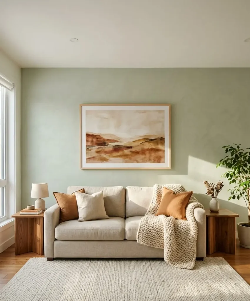
This is the most common choice, and it works. The color frames your sofa and art, and it anchors the seating area.
The downside is you sit with your back to it, so you rarely see it while you’re relaxing.
The TV or media wall
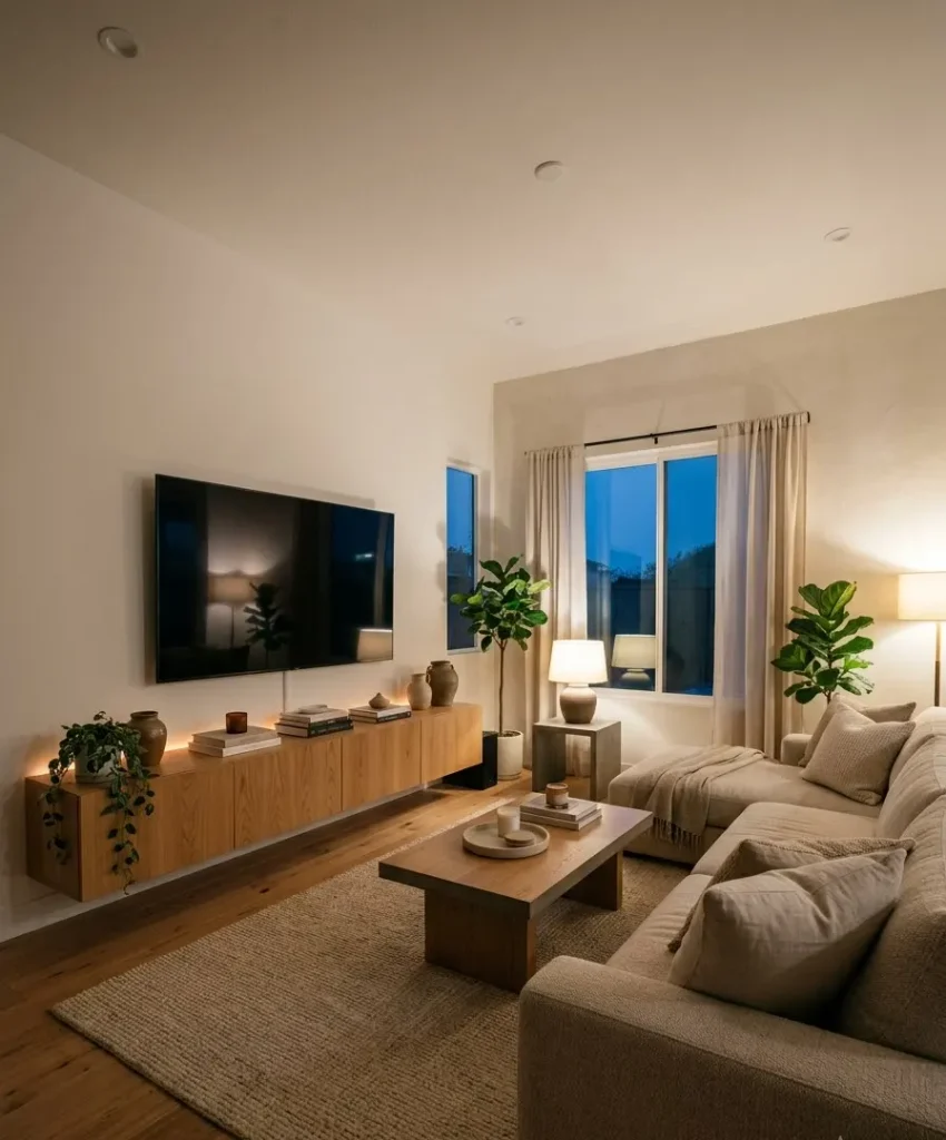
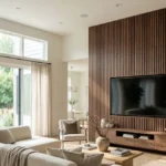
I lean toward this wall in smaller rooms. You face it daily, and a pale color keeps the dark screen from looking like a hole in the room.
Painting it slightly lighter than your other walls reduces the contrast that makes TVs feel huge.
The fireplace wall
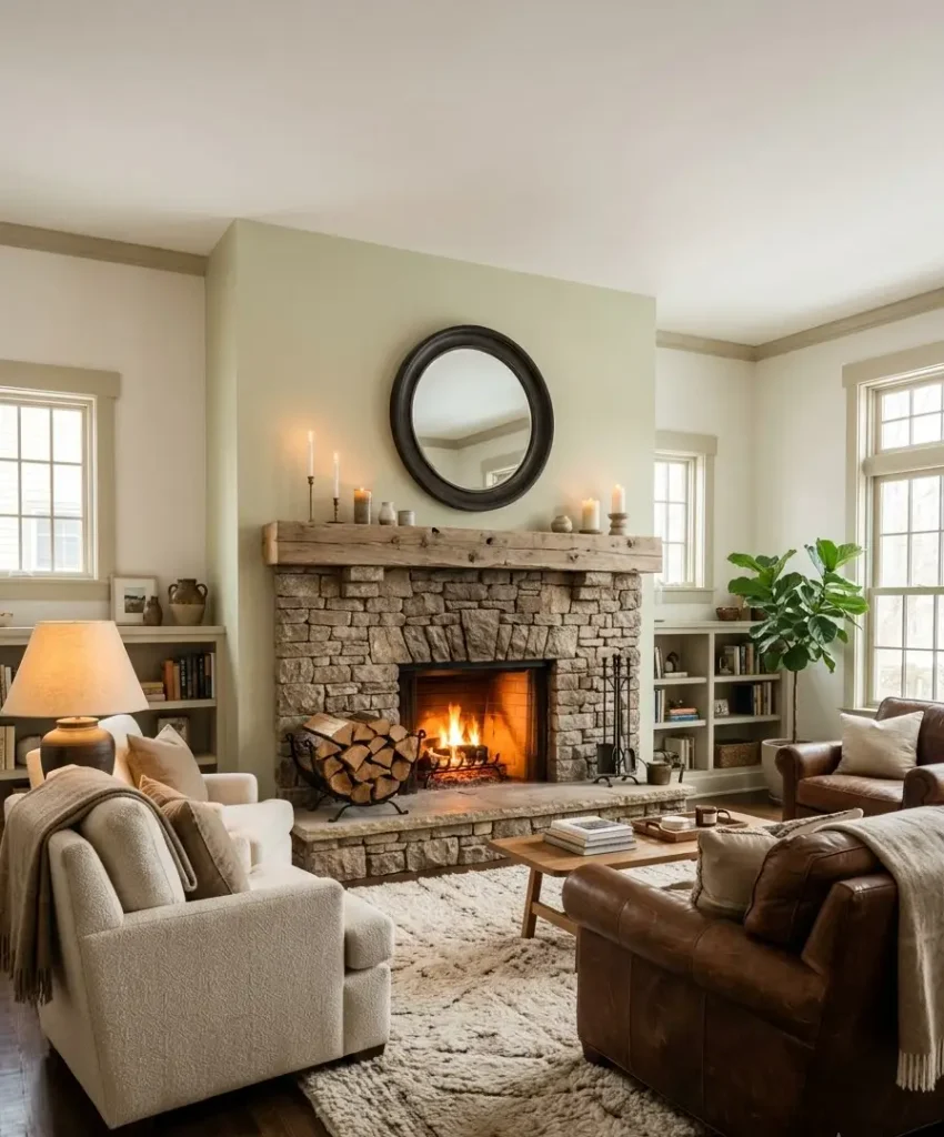
If you have a fireplace, you already have a focal point. A light accent color here makes the surround and mantle look deliberate.
Warm whites and pale greens both work well, especially with a stone or brick hearth.
How light changes everything
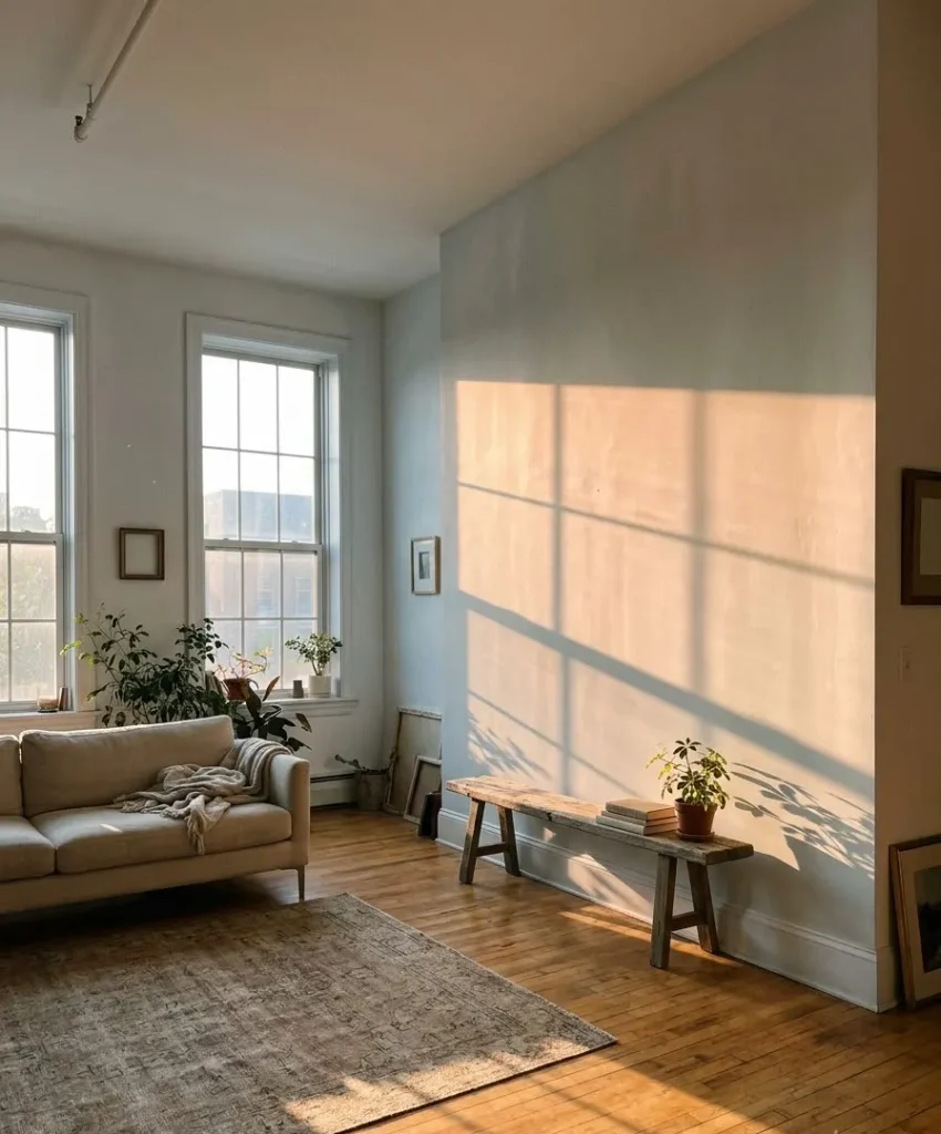
Color behaves differently in every room. A paint chip under store lighting tells you very little about what happens in your living room at 4 p.m. in October.
Here’s what I check before I commit:
- Window direction. North light is cool and flat, so choose warmer undertones. South light is warm and strong, so almost anything works.
- Bulb temperature. Warm bulbs (2700K) add yellow, and cool ones (4000K and up) pull colors blue or gray.
- Surrounding colors. A pale green next to a green-gray carpet looks cleaner than next to a beige one.
- Time of day. Look at your sample at 9 a.m., noon, and evening before deciding.
I buy sample pots (or peel-and-stick sample sheets from the brand) and put them on two different walls.
Never judge a color on a single patch in a single spot. I learned that after painting a “soft gray” that turned lavender once the sun hit it.
For color systems and undertone help, Benjamin Moore’s color tools and Sherwin-Williams’ ColorSnap are good starting points, and Farrow & Ball publishes useful notes on how its shades react to light.
Textures that make a light wall pop
Light colors can look flat in photos and in person. Texture fixes that by adding shadow and movement, so the wall earns its title without any loud color.
Limewash
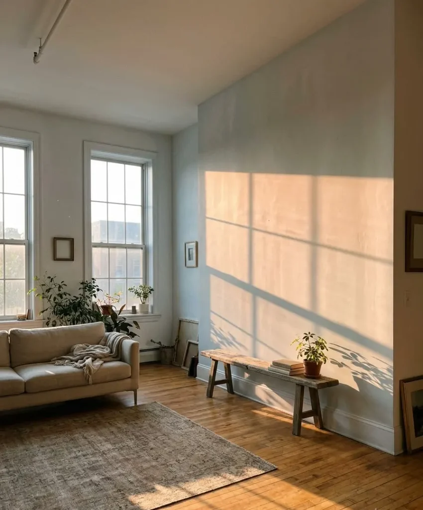
Limewash gives you a cloudy, chalky finish that looks like an old European plaster wall.
It dries in soft, uneven patches, which sounds messy until you see it in a sunny room. IMO it’s the most flattering finish for pale greens and creams.
You can brush it on yourself, but it takes practice. I’d do a practice board first, because limewash dries lighter than it looks wet, and that surprise has ruined a few Saturdays for me.
Wood slats and fluted panels
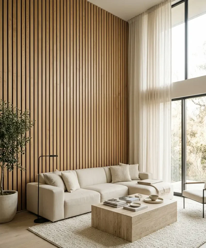
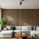
Slat walls trended hard on Pinterest for a reason. Vertical wood lines add height and rhythm, and light oak or ash keeps the effect airy.
The surprise cost is your cleaning routine. Slats collect dust in the gaps, so I’d skip them behind a TV unless you enjoy running a brush attachment every two weeks.
Venetian plaster and microcement
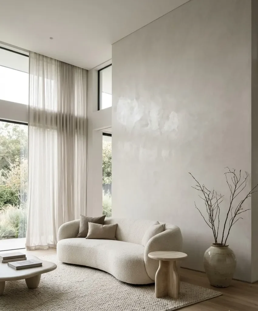
These finishes give a smooth, polished look with subtle movement. They cost more and need a skilled hand, so most people hire a pro.
If your budget allows one splurge wall, this one is worth the call.
Board and batten or picture-frame molding
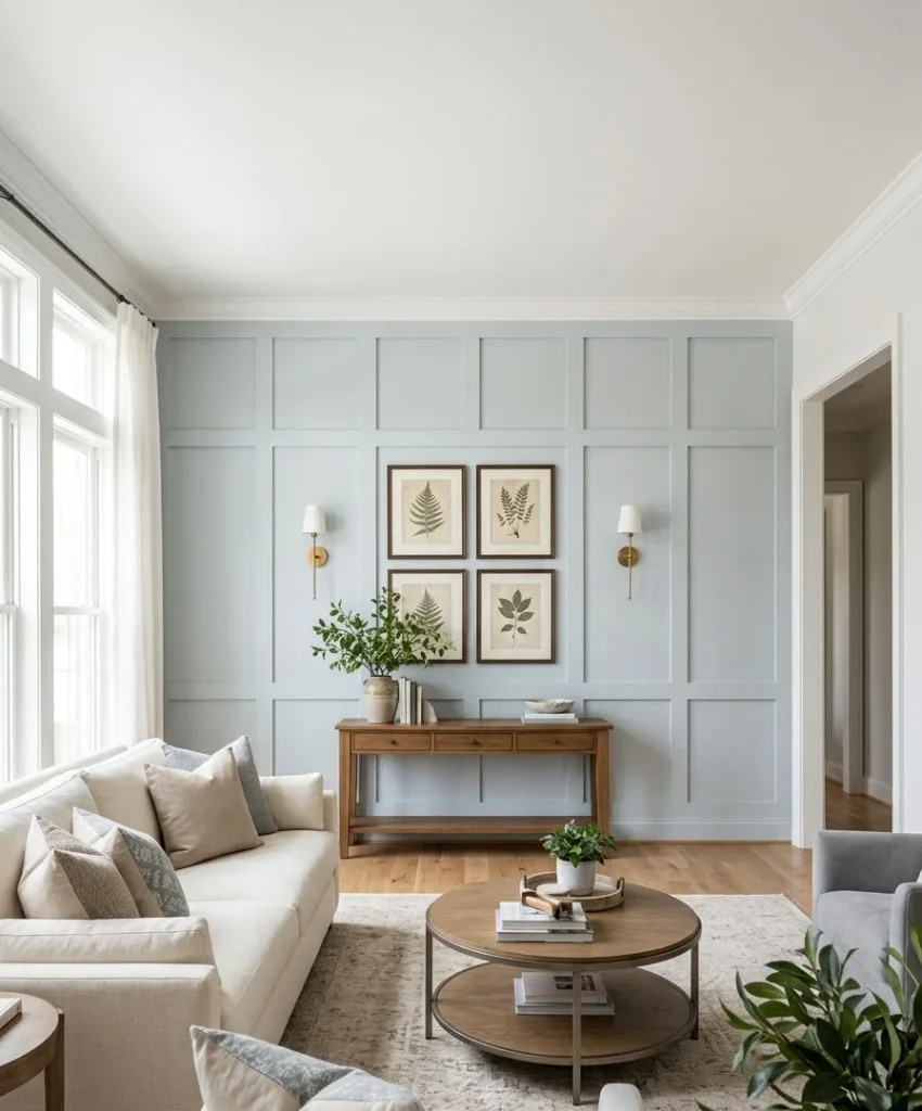
Painted trim in a single light color creates a wall of shapes and shadows. It suits traditional and transitional rooms, and it works well in a pale blue or soft gray.
The DIY version costs less than people think. A few sheets of MDF, a nail gun, and caulk will get you a wall that looks custom.
Textured wallpaper
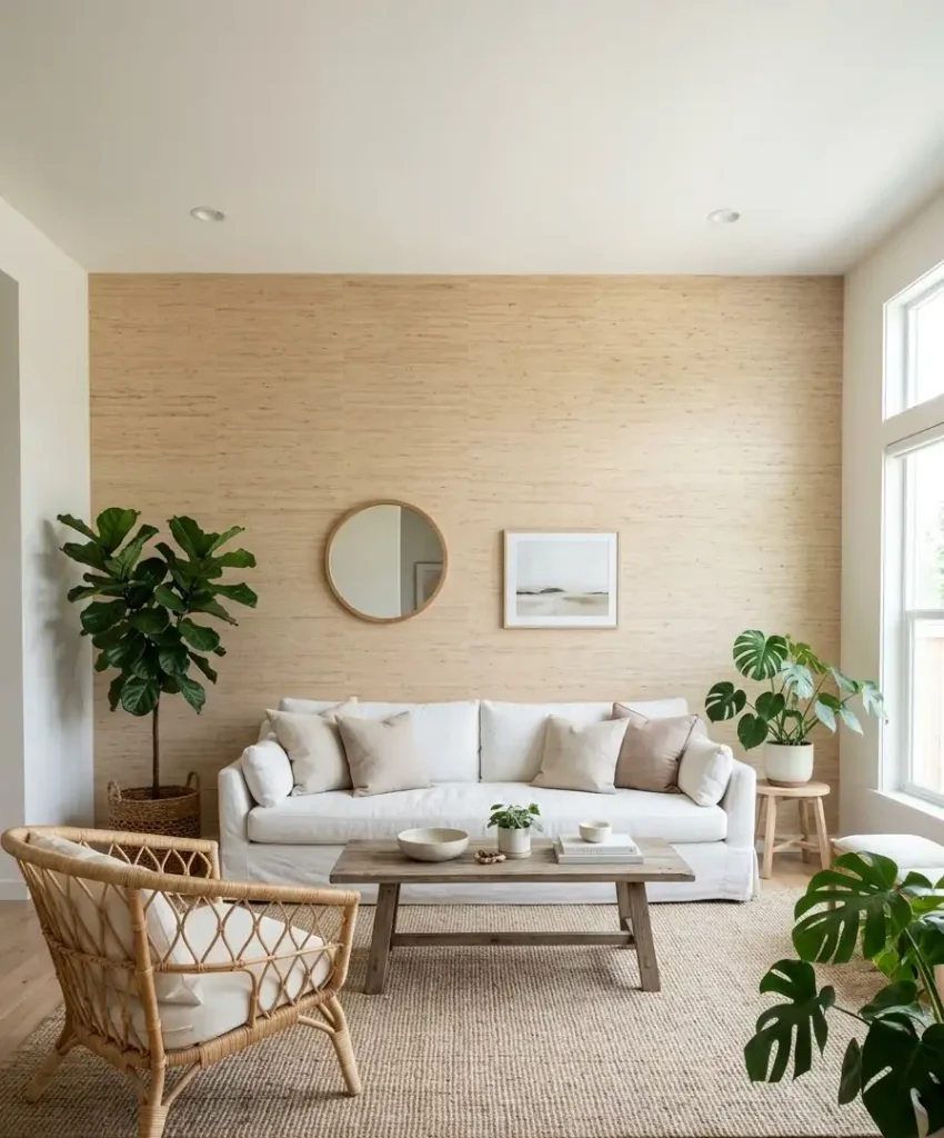
Grasscloth and linen-look papers add warmth through weave rather than color.
They work well in rooms that lean boho or coastal. Peel-and-stick versions suit renters, though the seams show more on busy walls.
Layout ideas that actually work
A great color on a poorly chosen wall wastes your effort. Layout means where you put the wall, what sits against it, and how the rest of the room supports it.
Small living rooms
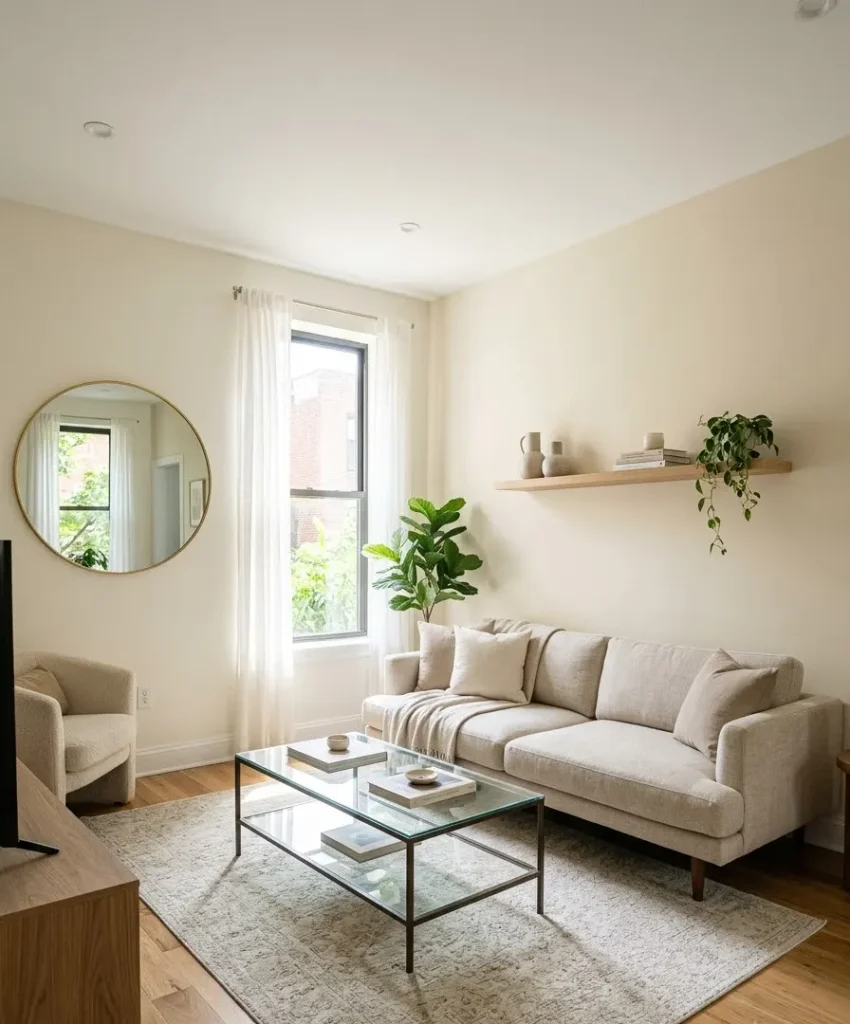
Pick the wall furthest from the door, and paint it a shade deeper than the other three while keeping it light overall.
This pulls the eye outward and makes the room feel longer. Keep furniture low, because tall pieces cut the wall in half.
Open-plan spaces
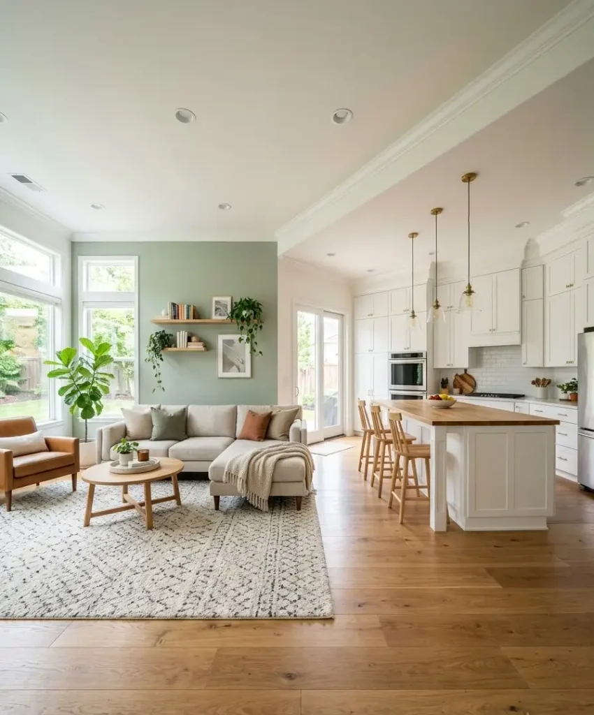
In open layouts, the accent wall marks the living zone. Choose a wall that backs your sofa or TV,
and avoid painting the one that borders the kitchen, since it fights with cabinets and backsplashes.
I think this is the biggest mistake in open-plan rooms. People paint the first wall they see, and the color ends up marking nothing.
Rooms with high ceilings
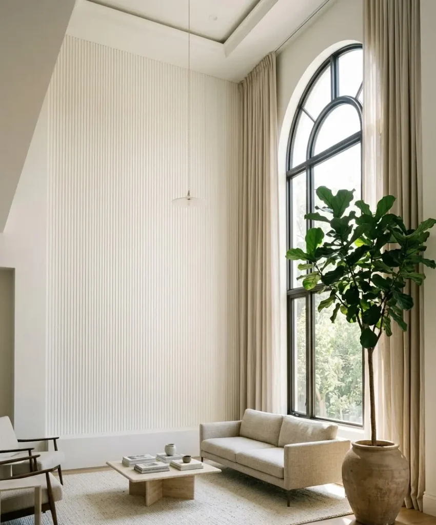
If your ceilings run 10 feet or higher, a light accent wall with vertical texture (slats, fluting,
tall paneling) makes the room feel intentional instead of cavernous. Stay away from horizontal stripes of any kind here.
Narrow rooms
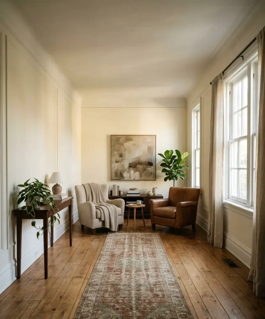
Paint the short end wall, not a long one. This shortens the tunnel feeling and brings the far end of the room closer. A pale warm color works better than a cool one for this trick.
A random thought about swatches
Off-topic, but I need to say it. Paint chip names are some of the funniest writing in the world.
Someone gets paid to decide that a beige is called “Elephant’s Breath” and another beige is “Mouse’s Back.” I could read them for an hour.
Anyway, back to walls.
Pairing your accent wall with furniture and decor
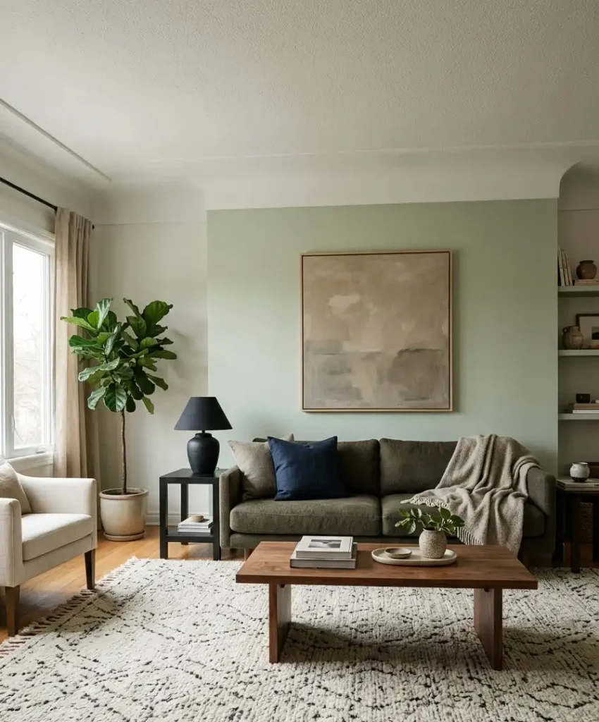
A light wall gives you freedom, but the furniture still has to behave. Here’s how I think about it, and a few of these are personal preferences you can ignore:
- Choose a sofa one or two shades darker than the wall. A cream sofa against a cream wall disappears. I’d rather see charcoal or olive against pale sage.
- Use wood to add warmth. Walnut and oak both suit light walls. IMO oak looks better against greens, and walnut looks better against blush.
- Keep art simple. Large single pieces look better than a busy gallery wall on a textured accent wall. Wow, a crowded grid on limewash looks chaotic.
- Add one deep color nearby. A navy pillow or a black lamp stops the room from feeling washed out.
- Match your trim to the wall family. I like trim in a slightly lighter version of the wall color, because stark white trim cuts the wall off from the room.
Mistakes I see (and made) all the time
Every accent wall has a story behind it, and plenty of those stories end in repainting. Here are the usual culprits:
- Choosing paint from a screen. Pinterest photos have filters, and your phone adds more. Always test in your room.
- Skipping primer on dark walls. Covering a deep color with pale paint takes three or four coats without it.
- Painting the wrong wall. If your eye goes to the window or a door first, that’s where the room’s focus already sits.
- Ignoring the ceiling and floor. A warm wall over a cool gray floor can clash. Look at both before you buy paint.
- Picking sheen carelessly. Flat and matte hide wall flaws and suit living rooms. Satin shows every dent and roller mark.
I made number 5 last spring. I picked satin because the label said “easy to clean,” and my living room looked like a freshly waxed car. Don’t repeat my error.
Budget, DIY, and how I’d paint it
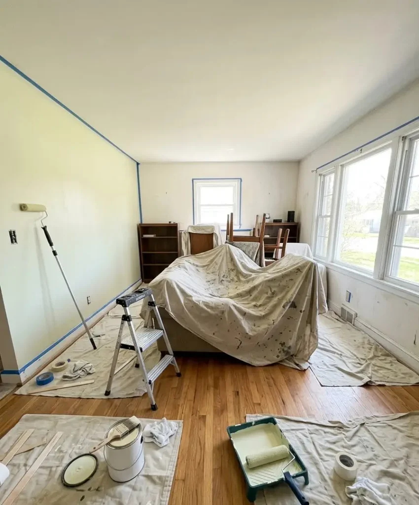
A paint-only accent wall costs roughly $40 to $80 for a gallon plus supplies. Limewash or plaster finishes can run $150 to $400 DIY,
or well beyond that with a pro. Slat walls and paneling fall in the middle, depending on wood choice.
If you’re painting it yourself, here’s the order I follow:
- Clean the wall and fill any holes with spackle.
- Sand the patches smooth and wipe away dust.
- Tape the trim and ceiling edge with painter’s tape.
- Prime if you’re covering a darker color.
- Cut in the edges with a brush, then roll two coats, letting each dry fully.
- Remove the tape while the paint is slightly tacky.
Ventilation matters. Choose low-VOC or zero-VOC paint, and open windows while you work. The EPA’s page on volatile organic compounds explains why those fumes matter indoors and how to reduce exposure.
Finding ideas on Pinterest without losing a weekend
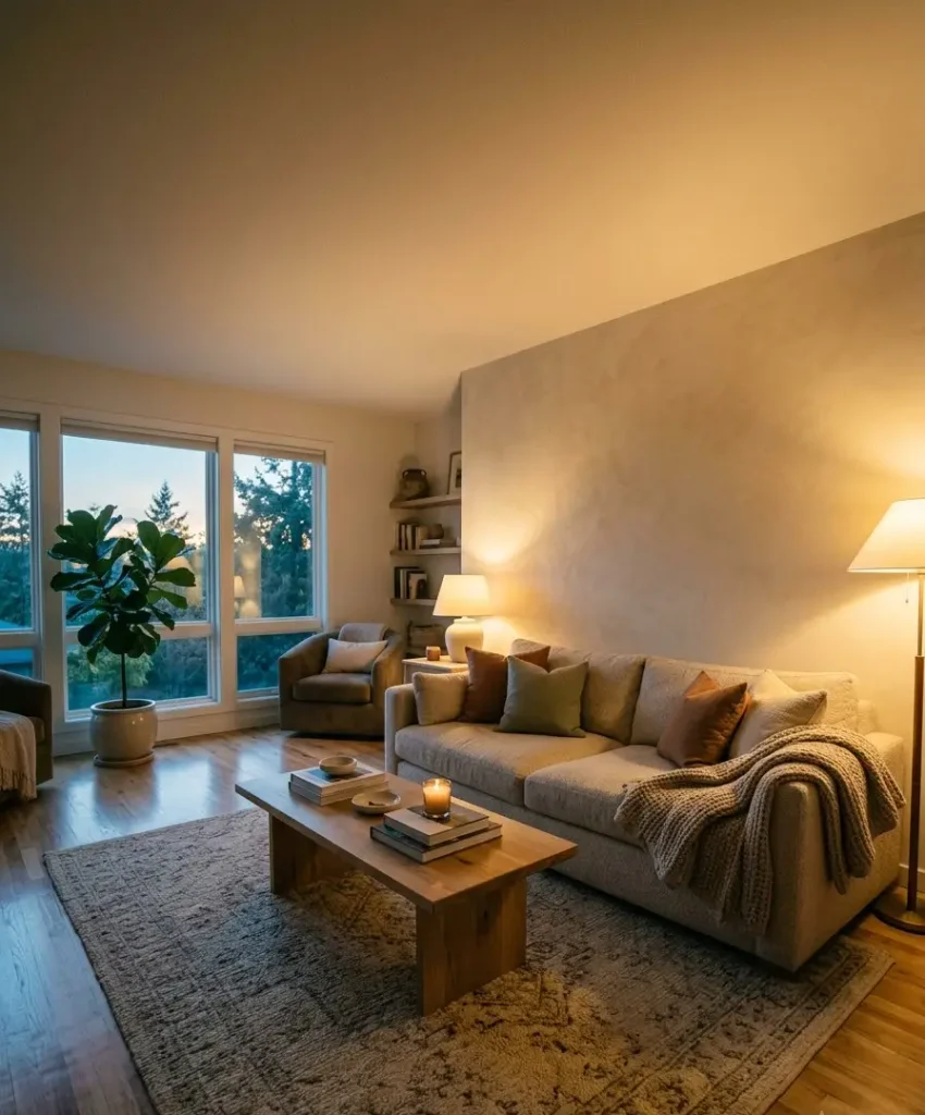
Pinterest is the best place to hunt for accent wall ideas, and the worst place to lose track of time. I use a few habits to keep it useful.
Search specific phrases such as “sage green accent wall living room” or “limewash living room wall” rather than generic ones.
Save pins to a single board per room, and look at the photos in the comments, where people post real-life versions of the idea.
Pinterest’s own search and board tools let you narrow by color, which helps when you’ve decided on a family but not a shade.
I also screenshot the lighting in each photo, because a pin shot in golden hour tells me little about my gray Tuesday afternoons.
One more tip: when you see a pin you love, check whether the room has lots of natural light. If it does and yours doesn’t, you probably need a warmer version of the same color.
FAQ
Can I do a light accent wall in a dark living room?
Yes, and I’d argue it helps more than in a bright room. Choose a warm white or a pale cream, and avoid cool blues and gray-greens. Add warm bulbs and a mirror opposite the wall to bounce light around.
Should the accent wall be lighter or darker than the other walls?
Both work, but for a light accent wall, aim for one to two shades different, whether lighter or slightly deeper.
A huge jump in value makes the wall read as dark paint on a white room, which defeats the airy goal.
What finish is best for a living room accent wall?
Matte or flat works for most living rooms because it hides imperfections. Eggshell suits rooms with kids or pets, since it wipes clean better. Avoid satin and gloss unless you have flawless walls.
Final thoughts
A light accent wall asks for one wall, a few samples, and a weekend. You get a focal point, a brighter room, and a space that photographs well without shouting at you.
Start with your light, pick two or three shades to test, and add texture if the wall still feels flat. Then step back and see how it handles a whole day.
So which wall in your living room has been staring at you the longest, and what color would you test on it first?