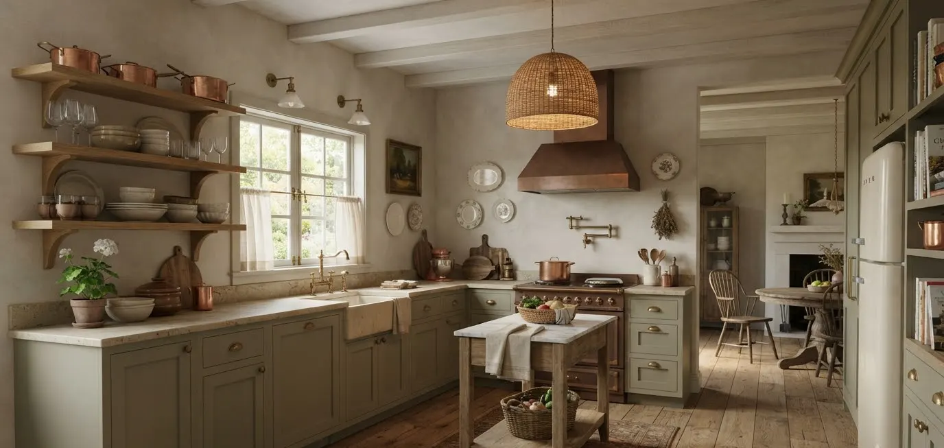
I fell for European cottage kitchens the hard way. I spent three weekends ripping out a 1990s oak cabinet system in my own kitchen, convinced I could “just wing it” with a Pinterest board and a can of chalk paint.
I got about 60% of the way to the look I wanted before I understood what actually makes this style work.
It’s not the paint color. It’s not one hero pendant light. It’s a stack of small, deliberate choices that add up to something that feels old even when it’s brand new.
This guide walks through the 25 elements I now consider non-negotiable if you want a genuine European cottage kitchen, not a farmhouse kitchen wearing a beret.
Some of these I learned from renovators and designers who’ve done this for decades.
A few I learned by getting it wrong myself, at real cost, in my own house.
I’m writing this specifically with Pinterest boards in mind. If you’re the type who saves 200 kitchen photos and still can’t articulate what you actually want, this list should help.
Pin the sections that hit hardest and skip the ones that don’t fit your space.
Not every kitchen can support exposed beams. Almost every kitchen can support better hardware.
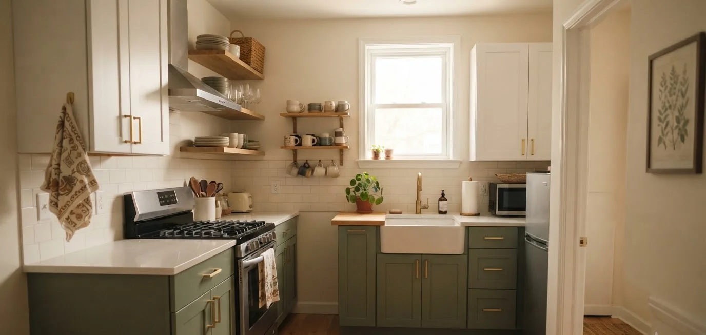
Small Kitchen Design Inspiration On A Budget 20 High End Looks For Less
Discover More →What separates cottage from farmhouse (and why it matters for your Pinterest board)
People use “farmhouse” and “European cottage” like they’re interchangeable. They’re related, but they’re not twins.
American farmhouse leans toward shiplap, black metal accents, and a slightly industrial edge.
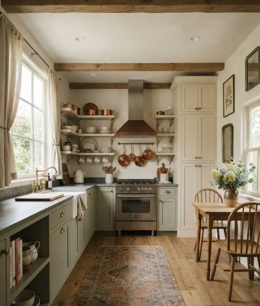
European cottage pulls from English, French, and Belgian country homes: think plaster, aged brass, linen, and a color palette borrowed from the outdoors rather than a paint swatch called “Farmhouse White.”
The easiest way to tell them apart on a Pinterest board? Farmhouse photographs crisp.
Cottage photographs a little soft, a little worn, like the room has been lived in for a hundred years even if the renovation finished last Tuesday.
There’s also a regional split worth knowing before you start pinning. English cottage style leans toward deep, gar
den-inspired colors and slightly heavier furniture. French provincial cottage style softens that with pale blues, curved lines, and a touch more formality.
Belgian style, which has quietly taken over a huge share of the design world’s attention the last few years, strips things back even further into warm neutrals and raw texture.
You don’t have to pick just one. Most of the kitchens people actually fall in love with borrow from all three.
The materials that carry the whole look
Get the materials right and the rest of the room practically decorates itself.
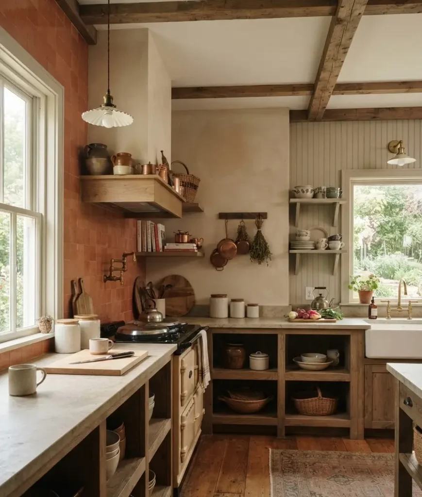
1. Limewash or plaster walls. Flat paint reads modern. Limewash and plaster have texture and depth that catch light differently throughout the day. That’s the whole trick.
I painted one wall of my own kitchen with a limewash kit before committing to the full room, and the way it shifted from chalky pink to warm gray depending on the hour genuinely surprised me.
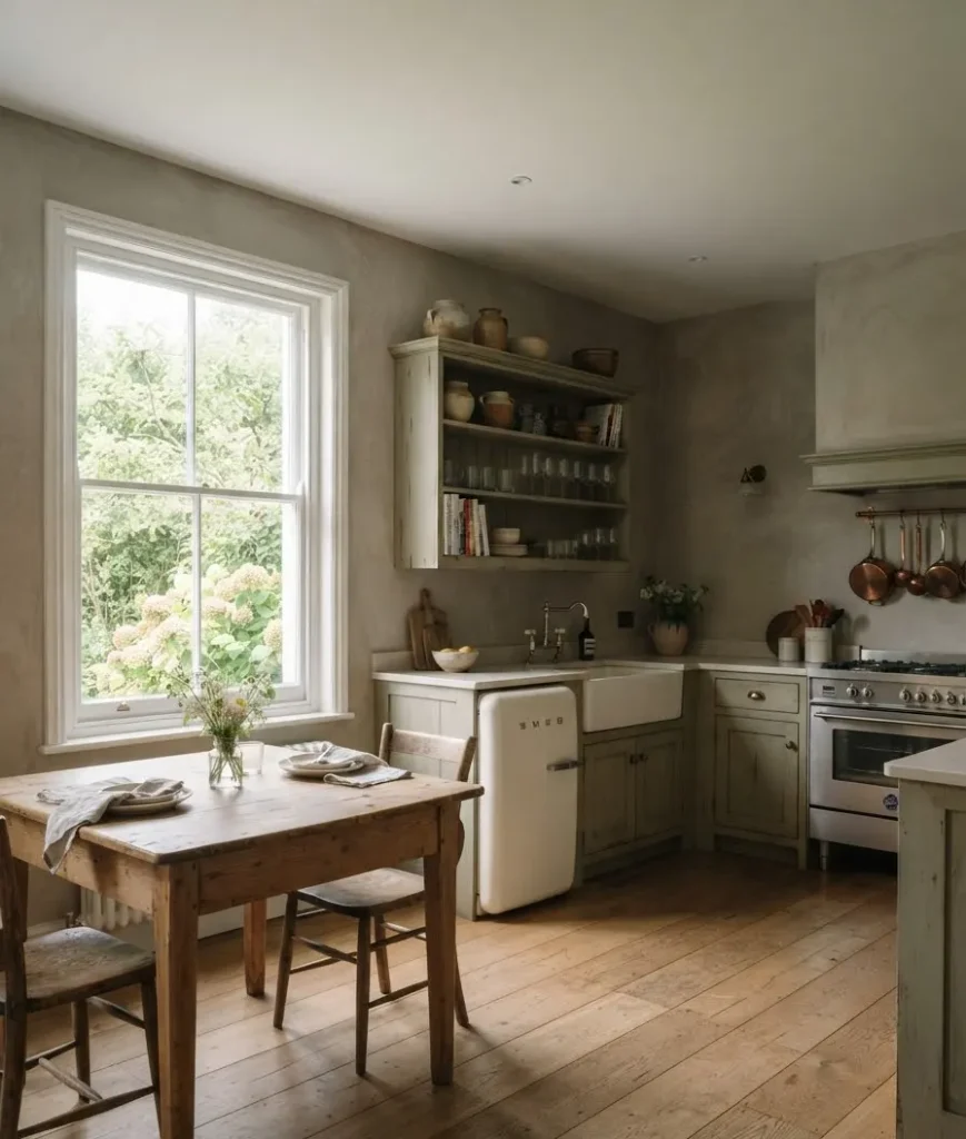
2. Reclaimed or wide-plank wood floors. New floors sanded to a mirror finish fight the aesthetic.
Look for wide planks, visible grain, and a bit of natural variation in tone.
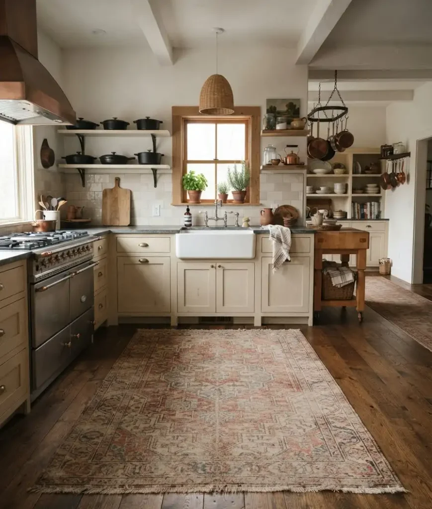
If a full floor replacement isn’t in the budget, even a runner rug in the right tone can fake this from across the room.
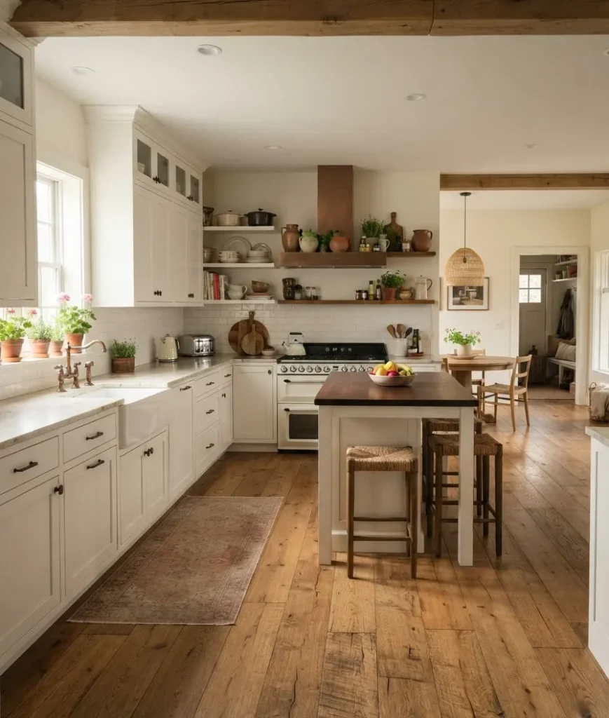
3. Natural stone countertops. Honed marble, limestone, or soapstone. Skip the glossy polished finish.
Cottage kitchens want stone that looks like it’s been wiped down with a rag for 50 years, not laminated in a showroom.
Yes, honed marble stains easier than polished. I still think it’s worth it for this particular look, and most stains fade or blend into the natural veining anyway.
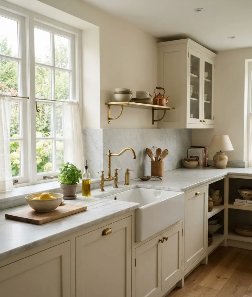
4. Terracotta or handmade tile. Uneven edges and slight color shifts from tile to tile are a feature, not a defect.
Perfectly uniform subway tile belongs in a different mood board entirely.
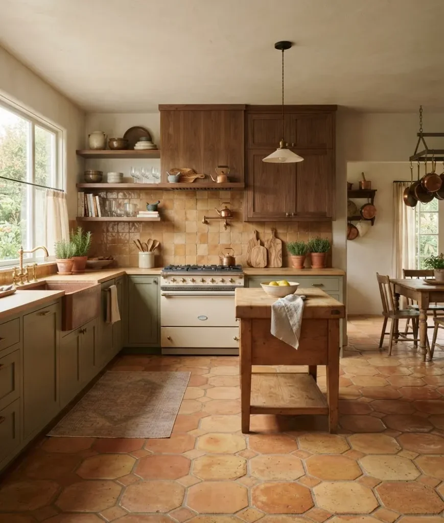
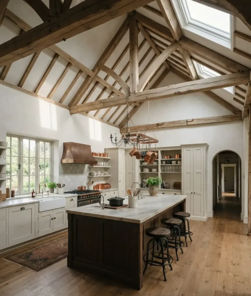
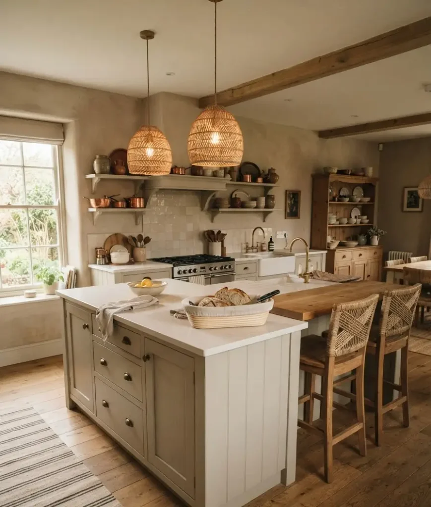
5. Exposed timber beams. Not every kitchen can add these structurally, but if yours has them, or can fake them convincingly with lightweight faux beams, they anchor the whole ceiling and give the room an instant sense of age.
A friend of mine added faux beams to a builder-grade rental kitchen and it was the single change that made guests ask if she’d just moved into a converted barn.
6. Woven and rattan textures. Bread baskets, pendant shades, seat backs.
This is one of those details people skip because it feels minor. It isn’t.
Rattan softens a kitchen full of hard surfaces almost instantly, and it’s one of the cheapest fixes on this entire list.
Cabinetry and hardware that give it away
Cabinets do more heavy lifting in this style than in almost any other kitchen aesthetic, which is exactly why I obsessed over them for weeks before landing on inset doors.
7. Inset cabinet doors. This is my honest opinion after years of staring at kitchen photos: inset cabinetry is the single fastest way to make a kitchen look European instead of generic.
The doors sit flush inside the frame rather than overlapping it, which is how older, custom-built cabinetry was made before mass production took over.
CliqStudios has a solid gallery of inset cabinet kitchens if you want to see the difference next to standard overlay doors.
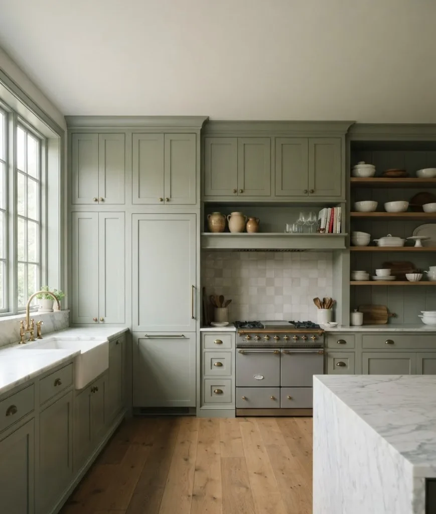
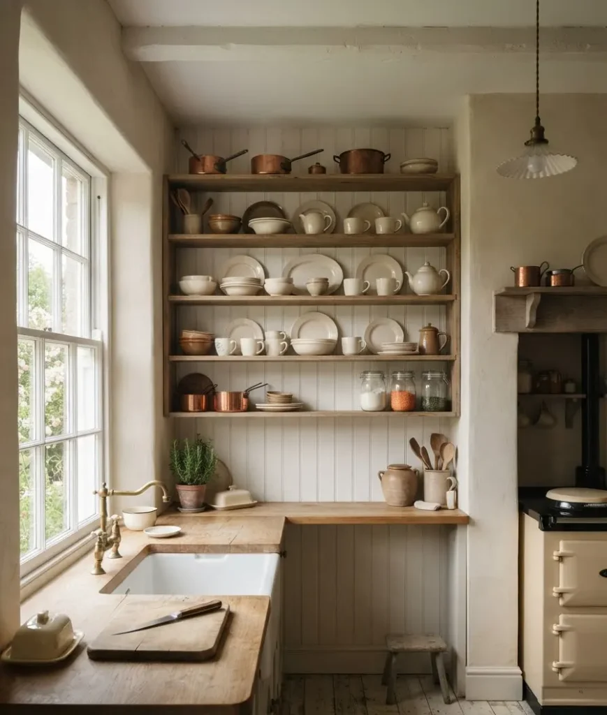
8. Beadboard or paneled cabinet backs. Open shelving with a plain painted back looks unfinished in this style.
Add beadboard or shiplap behind it and the same shelf suddenly reads intentional, even if it took you an afternoon and a nail gun to install.
9. Unlacquered or aged brass hardware. Chrome and brushed nickel are too clean for this look. Unlacquered brass tarnishes naturally over time, which honestly is the point.
IMO it’s one of the best low-cost upgrades you can make to an existing kitchen: a full set of pulls and knobs usually costs less than a single new appliance, and the visual impact is disproportionate to the price.
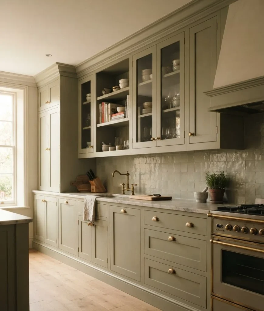
10. A plaster or copper range hood. This is the item that tends to eat the biggest chunk of a renovation budget, and it’s usually worth it.
A hand-troweled plaster hood or an aged copper one becomes the visual center of the room.
If your budget can’t stretch that far this year, a simple stucco-effect paint treatment over an existing hood gets you maybe 70% of the way there for a fraction of the cost.
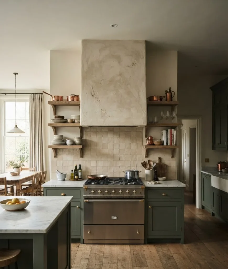
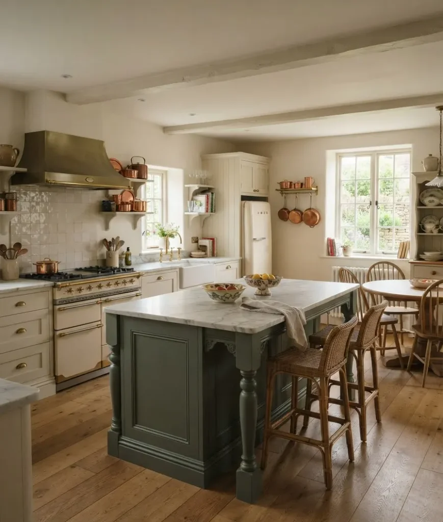
11. Furniture-style island, not a slab box. Legs, molding, maybe a contrasting paint color.
Islands that look like a piece of furniture rather than a built-in cabinet block are everywhere in genuine cottage kitchens across France and England.
Some designers even use an actual antique table as the island base, plumbing worked in around it.
That’s a bigger project, but it’s the most authentic version of this idea I’ve seen.
Color palettes that feel lived-in
Here’s a small table comparing three common palette directions if you’re trying to narrow things down.
| Palette style | Best cabinet colors | Overall mood |
|---|---|---|
| English country | Sage, olive, muted terracotta | Warm, garden-inspired |
| French provincial | Soft blue, cream, dusty lavender | Romantic, a little formal |
| Belgian minimal | Warm white, greige, oatmeal | Calm, restrained, textural |
12. Muted, earthy paint on lower cabinets. Sage, olive, and dusty terracotta show up again and again for a reason: they sit closer to natural pigments than a bright factory paint color would.
I tested five sage swatches on my own cabinets before landing on one, and honestly, the lighting in your specific kitchen matters more than the paint chip ever will.
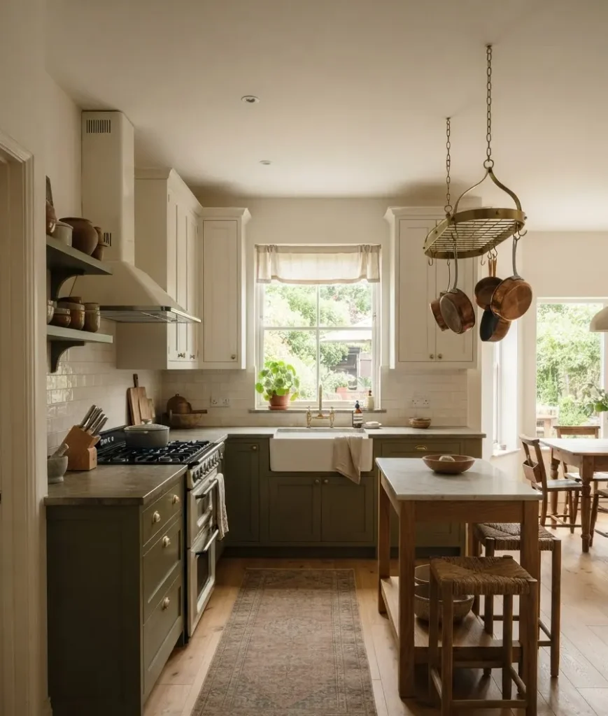
13. Warm white on upper cabinets or walls. Stark white feels clinical.
Warm whites with a hint of cream keep the room soft, and they photograph noticeably better in the golden-hour light most people shoot their kitchen in for Pinterest anyway.
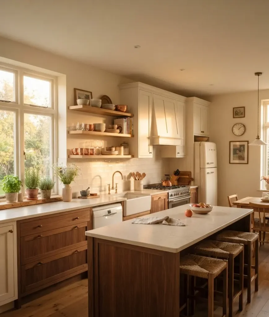
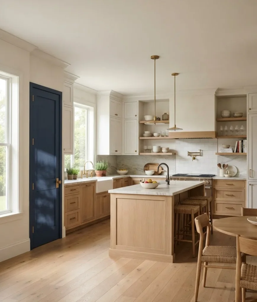
14. A single unexpected accent, used sparingly. One deep color, maybe on an island or a pantry door, stops the palette from going flat.
Overdo it and you lose the calm the whole style depends on.
This is a case where less really does more, no matter how tempting it is to paint every surface.
15. Patina over perfection. This one isn’t really a color choice so much as a mindset.
If a surface looks brand new, it hasn’t earned its place in a cottage kitchen yet.
That’s a hard pill to swallow after spending real money on a renovation, but it’s also the detail that separates a convincing cottage kitchen from one that just looks expensive.
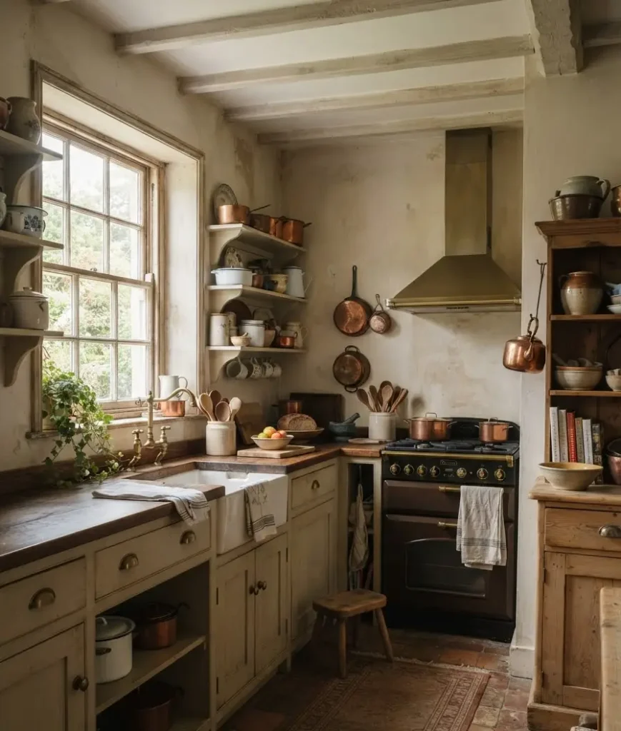
Quick aside, and I promise this connects: my grandmother’s kitchen in rural Yorkshire had a stove that was older than my dad, and I used to think it just looked “old” in a bad way.
Now I realize that stove had exactly the patina designers spend thousands trying to fake. Funny how taste catches up to what you grew up dismissing.
Lighting and fixtures worth splurging on
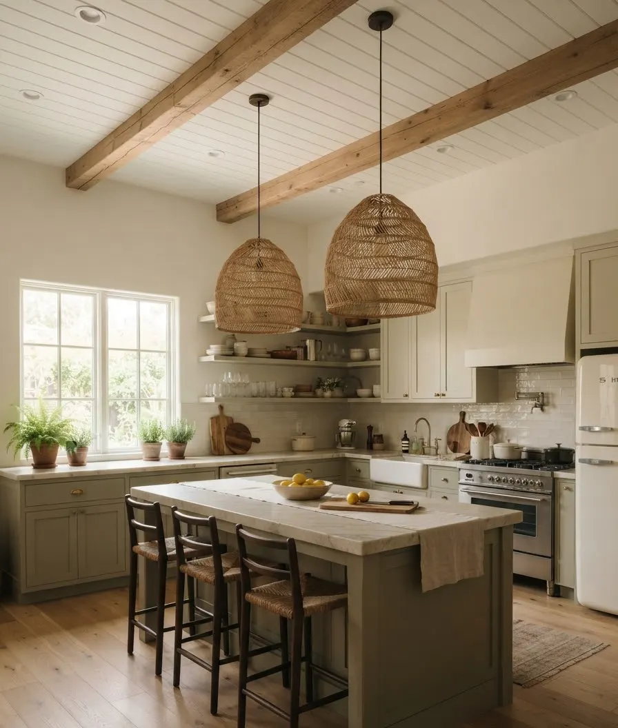
16. Woven or rattan pendant shades. Already mentioned the material, but as a lighting choice specifically, these diffuse light in a warmer way than glass or metal shades do, which matters a lot in kitchens that get harsh overhead sun in the afternoon.
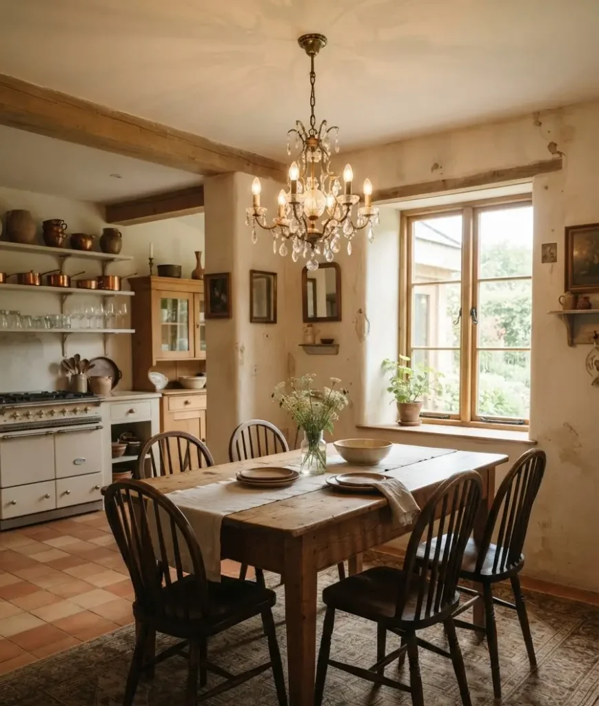
17. A single statement chandelier over the table or island. Not matchy-matchy with the rest of the fixtures.
A slightly mismatched, slightly grander piece is very on-brand for this style, and it’s usually the first thing people notice walking in, even before the cabinets.
18. A farmhouse or apron-front sink. Deep, wide, usually white fireclay. This one shows up so often it’s almost a cliché at this point, but it earns the reputation.
Fireclay chips less than enamel over cast iron, for what it’s worth, if you’re comparing materials before you buy.
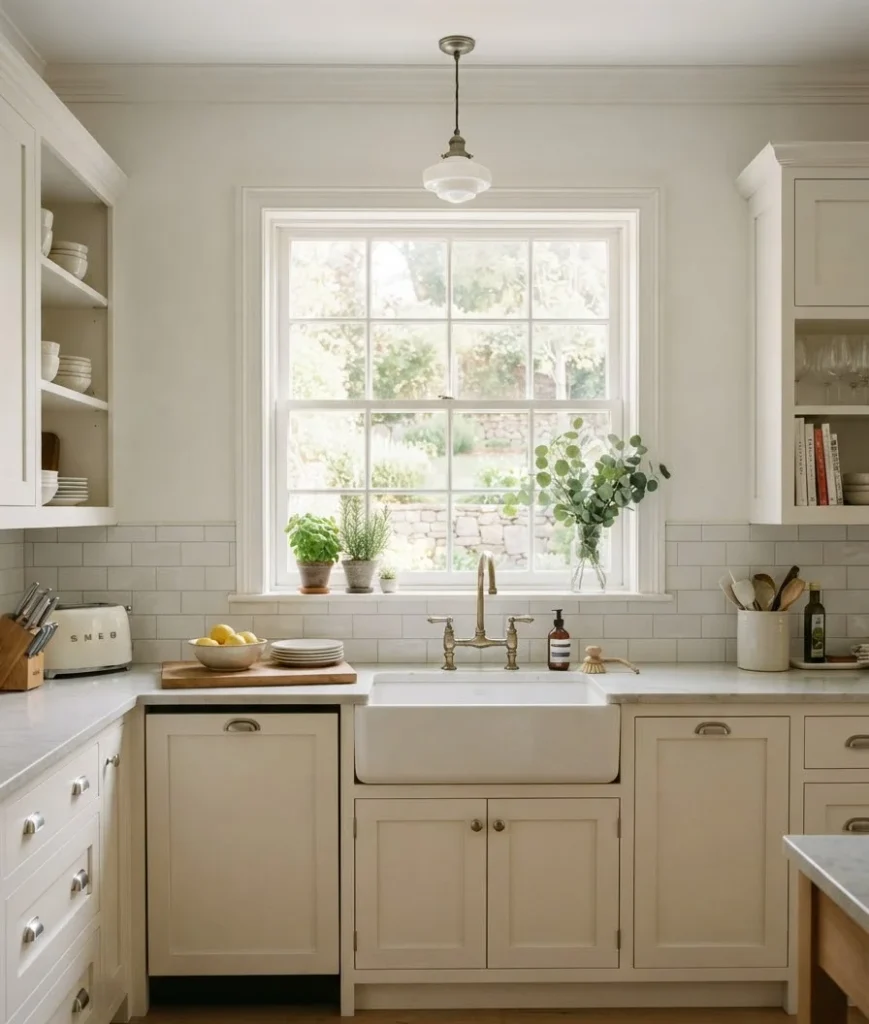
19. Bridge or gooseneck faucets in aged brass or bronze. Match the finish to your cabinet hardware for consistency, or don’t.
Some of the best kitchens I’ve seen mix finishes on purpose, pairing brass hardware with a black faucet, for instance, and it still reads as intentional rather than mismatched.
The small details that pull it together
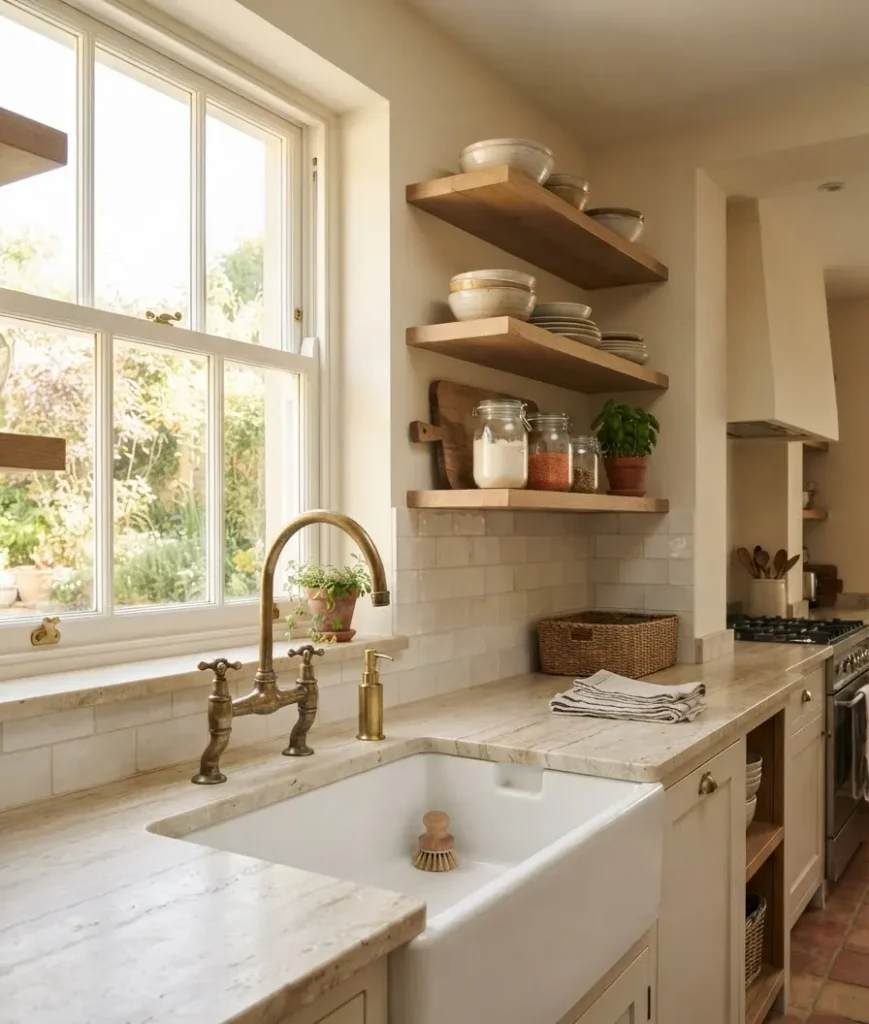
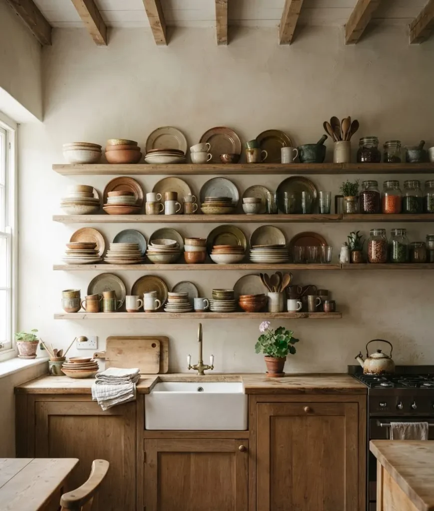
20. Open shelving with mismatched, collected dishware. Not a matched 12-piece set from one store.
Pieces that look gathered over years, even if you bought half of them last month from three different thrift shops on the same Saturday.
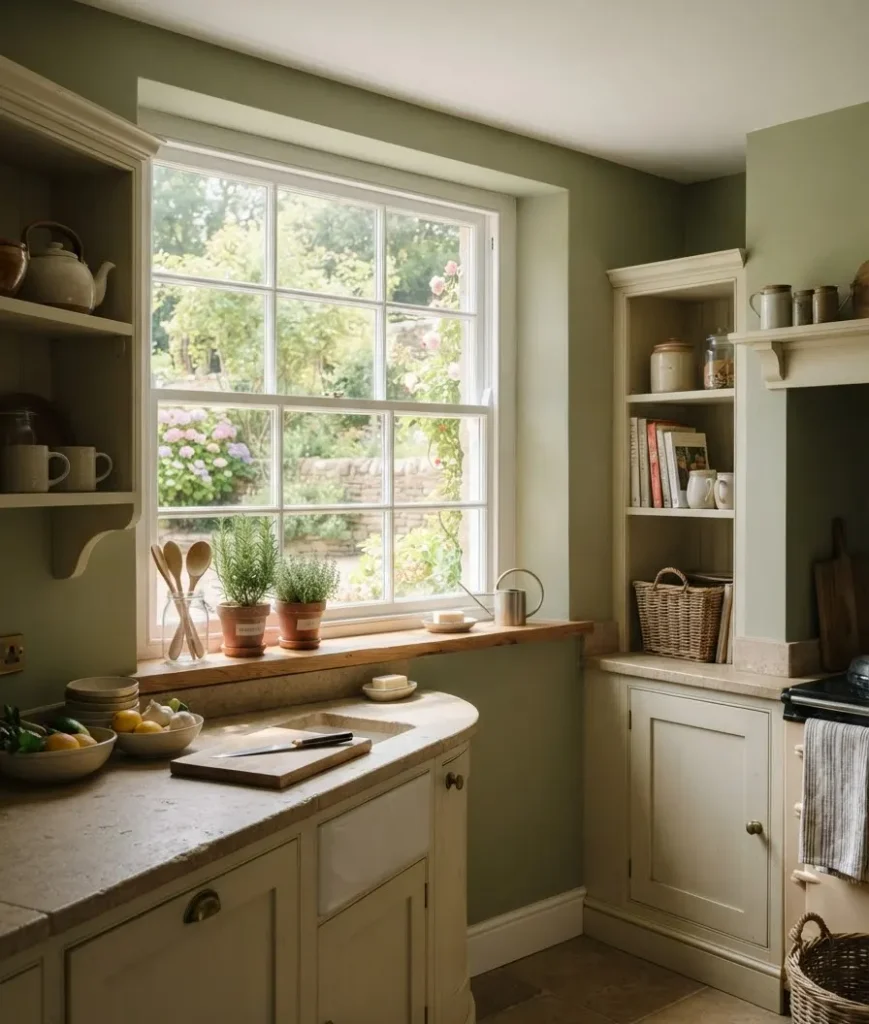
21. Fresh or dried herbs near a window. Cheap, easy, and it does more for the “lived-in” feeling than almost anything else on this list.
A pot of rosemary costs less than a coffee and does more visual work than most decor purchases twice its price.
22. Vintage or vintage-style rugs. A worn Persian or Turkish rug on a wood or stone floor softens the whole room and adds a layer of color that paint alone can’t.
Runner rugs in front of the sink also save your feet during long cooking sessions, which nobody mentions in the design blogs but matters a lot in real life.
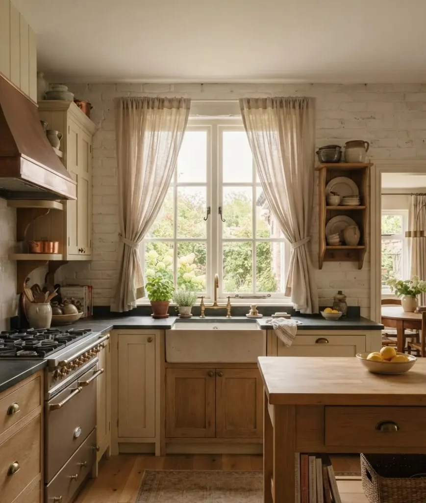
23. Curtains instead of blinds on at least one window. Linen or cotton, simple gathers.
This small swap changes a kitchen more than people expect, softening hard window frames and adding movement to an otherwise static room.
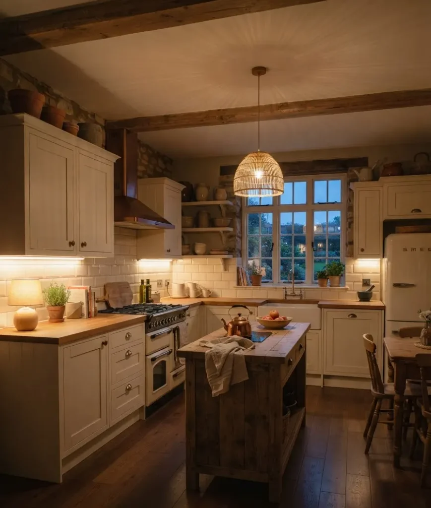
24. Layered lighting at different heights. Overhead fixture, under-cabinet lighting, maybe a small lamp on the counter.
Cottage kitchens rarely rely on one flat overhead light, and the layering is honestly what makes evening photos of these kitchens look so warm.
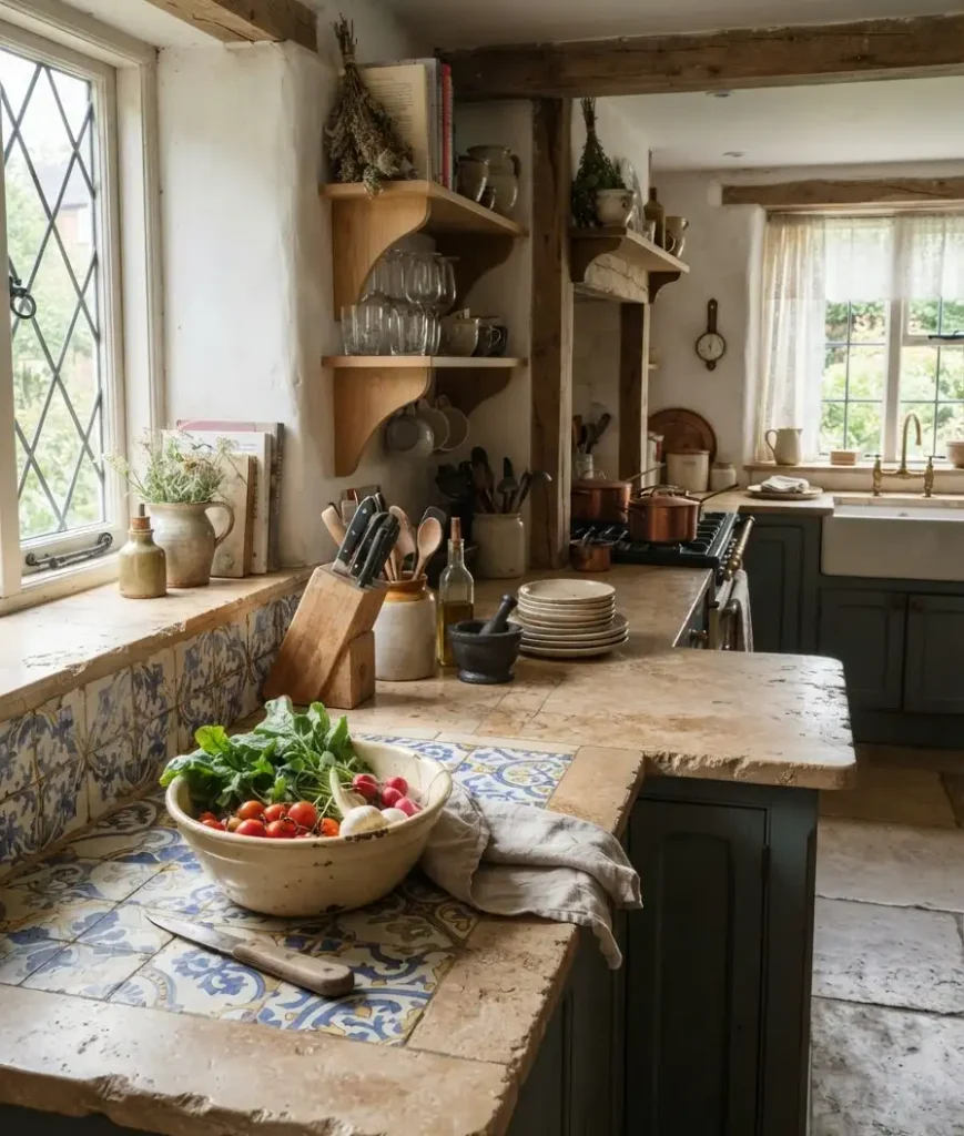
25. Something imperfect, left alone. A chipped bowl. An uneven tile. A door that doesn’t perfectly match its neighbor.
This is the hardest one to explain to clients, and to myself, honestly, but it’s the detail that keeps a cottage kitchen from tipping into showroom territory.
This is insane to admit as someone who spent months chasing “perfect,” but the imperfect stuff is what people actually remember about a room.
A few mistakes I made copying this look
I bought brand-new “distressed” hardware once, thinking it would save me the years of natural tarnish.
It looked fake within a month, shinier in the worn spots than a normal finish would ever be. Lesson learned: real aging beats simulated aging almost every time.
I also went too heavy on terracotta tile in a small kitchen and the room felt closed in rather than cozy.
Wow, that was a hard one to admit after spending the budget on it.
Scale matters as much as material choice, especially in a smaller footprint.
If I did it again, I’d use terracotta on the floor only and keep the backsplash lighter, letting one surface carry the warmth instead of stacking two warm surfaces on top of each other.
One more thing worth saying plainly: this style rewards patience more than most.
A lot of the “collected over years” feeling can’t actually be rushed, and that’s fine.
Buy the good hardware now. Let the open shelves fill in slowly with pieces you genuinely like, rather than ordering a matching set overnight just to check a box.
The kitchens that photograph best usually took the longest to put together, even when the renovation itself only took a few weeks.
If you want a broader visual reference before you commit to any of this, Hello Lovely Studio’s roundup of European cottage kitchens is worth a scroll, and this breakdown of regional European kitchen styles is a decent primer if you’re still deciding between the English, French, and Scandinavian-leaning versions of this aesthetic.
Modern Small Kitchen Inspiration Layouts That Make Compact Spaces Feel Huge
Click Here →FAQs
Do I need to gut my whole kitchen to get this look? No. Hardware swaps, a plaster-effect paint treatment, open shelving, and a rug can shift a standard kitchen a long way toward cottage style without touching the layout.
Is European cottage style still on trend, or is it fading? It’s held up well because it’s not tied to a single trend cycle the way, say, all-white minimalist kitchens were a few years back. The materials (stone, plaster, brass, wood) are classic rather than seasonal.
What’s the single best budget upgrade from this list? Hardware, hands down. Swapping cabinet pulls and knobs for unlacquered brass is cheap, reversible, and changes the feel of a kitchen almost instantly.
So, which of these 25 are you already working with, and which one’s going on your shopping list first? Save this guide to your kitchen inspiration board, and if you end up trying the inset cabinet swap or the brass hardware trick, I’d genuinely love to hear how it turns out.